
Color schemes that promote calm and relaxation in senior living spaces should focus on soothing hues like soft blues and greens, which create a tranquil atmosphere. Incorporating warm tones like pastel lilac or earth tones can enhance comfort in bedrooms. In common areas, using natural light with calming palettes fosters social interactions. Don't forget high-contrast colors for easy navigation. For deeper insights into effective color choices, there's plenty more to explore on this topic.
Key Takeaways
- Use calming blues and greens in bedrooms to promote sleep and reduce stress, creating a tranquil environment for residents.
- Incorporate soft pastels and earth tones in common areas to foster a soothing atmosphere and enhance social interactions among residents.
- Warm tones like reds and oranges in dining areas stimulate appetite and happiness, encouraging positive dining experiences and social engagement.
- Implement high-contrast color schemes for navigation, improving visibility of features and ensuring safety for residents with mobility impairments.
- Utilize nature-inspired colors and textures to promote emotional well-being, enhancing the overall living experience and connection to the environment.
The Psychology of Color in Senior Living

When designing senior living spaces, understanding the psychology of color is crucial because it directly affects residents' mood and behavior.
Different colors evoke specific emotions; for instance, blues and greens promote calmness and healing, making them ideal for bedrooms and lounges. Reds can stimulate appetite and energy, perfect for dining areas. Additionally, the proper color selection can promote happiness and tranquility, enhancing the overall well-being of residents. Emotional regulation can also be influenced by the surrounding environment, including color choices, which can support residents in managing their feelings more effectively.
As you choose colors, remember that the aging eye struggles with pastel tones, so contrasting colors are essential for wayfinding. Additionally, using low-VOC and odorless paints ensures a healthy environment.
Nature-inspired colors, like greens and beiges, help connect residents to the outdoors, fostering familiarity and comfort.
Benefits of Calming Color Palettes
Calming color palettes in senior living spaces offer numerous benefits that significantly enhance residents' quality of life.
These soothing colors, like soft greens and blues, promote social interaction by creating inviting common areas. They also help reduce anxiety, lowering heart rates and fostering a peaceful atmosphere. Additionally, color choices can impact cognitive stimulation and mood enhancement, making it crucial to select hues that cater to residents' emotional needs. Research indicates that hydration is crucial for maintaining optimal brain function, which can be aided by the calming effects of color.
In communal spaces, calming tones improve mood while maintaining serenity, which is essential for emotional well-being. Additionally, these palettes contribute to better sleep quality, promoting relaxation and reducing stress.
Familiar colors create a sense of belonging, while warm tones in dining areas enhance the overall ambiance, encouraging community and improving dining experiences.
Ultimately, calming color schemes play a vital role in enhancing both emotional and physical health for residents.
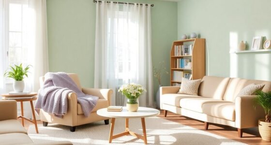
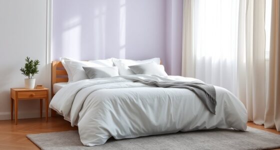
Ideal Color Choices for Bedrooms
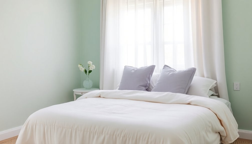
Creating a restful bedroom environment hinges on the right color choices. Opt for calming blues to promote sleep and reduce stress; these hues are perfect for creating a serene atmosphere. Soft pastels like lilac and lavender add soothing touches, while earth tones such as browns and beiges bring comfort. For a vibrant yet calming blend, consider pairing blue with green, reflecting nature's tranquility. High-contrast schemes can help with visibility, making it easier for seniors to navigate their space. Remember to incorporate personal favorites, as these can enhance comfort. Lastly, choose lighter shades to maximize light reflection, creating a brighter, more inviting room. With thoughtful color selections, you can craft a peaceful sanctuary that promotes relaxation, especially with warm colors that create a cozy and secure atmosphere. Additionally, creating a well-insulated space can enhance heat pump efficiency, ensuring a comfortable temperature throughout the year.
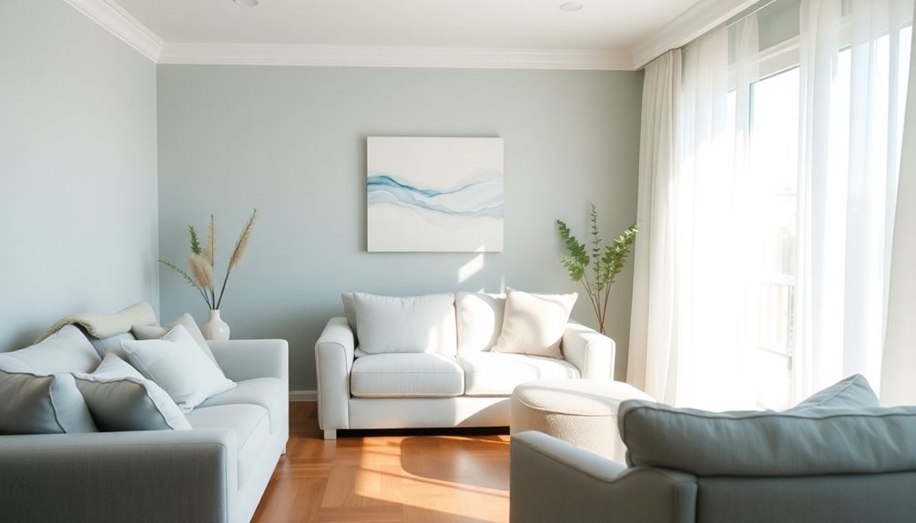
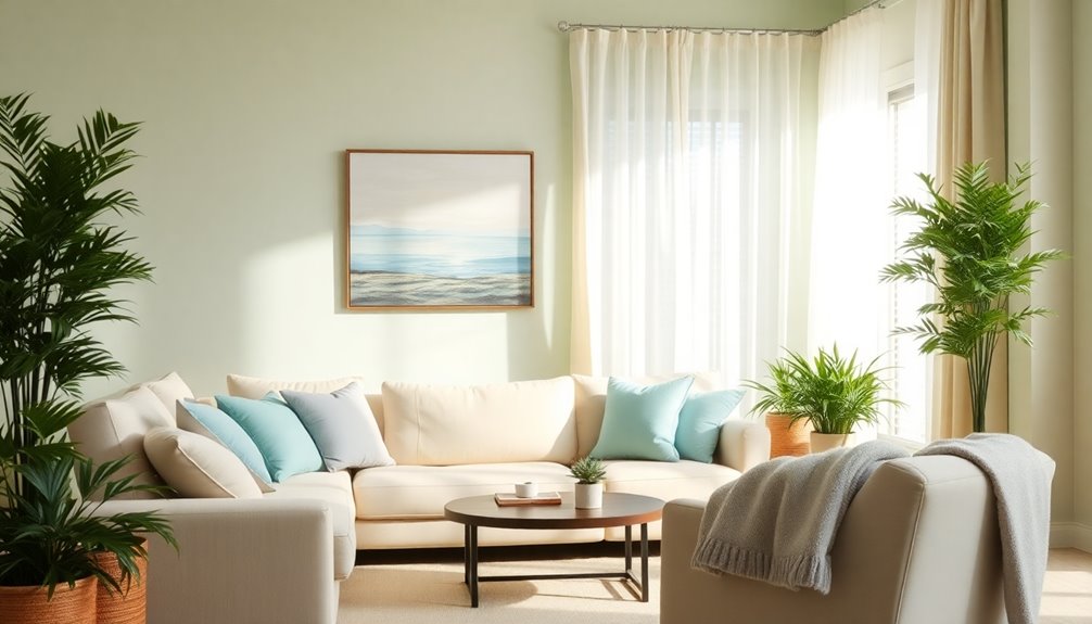
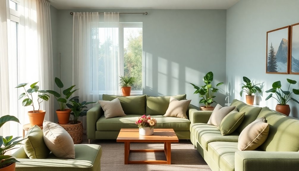
Creating Inviting Common Areas

To foster a sense of community and comfort in common areas, it's essential to incorporate inviting design elements that appeal to seniors. Think about utilizing natural light with large windows to brighten spaces and reduce emotional strain. Choose earth tones and pastels to create a calming atmosphere, and ensure comfortable seating arrangements encourage social interaction. Common areas serve as the heart of senior living communities, facilitating socialization and helping to prevent isolation among residents. Versatile layouts will accommodate various activities, while strategically placed rest stops, like benches, promote mobility and participation. Mimicking residential settings can help ease institutional feelings. Finally, ensure accessibility features are in place, making it easier for everyone to enjoy these welcoming spaces. This thoughtful design approach will create an inviting environment where seniors feel at home and engaged.
Enhancing Dining Experiences With Warm Tones
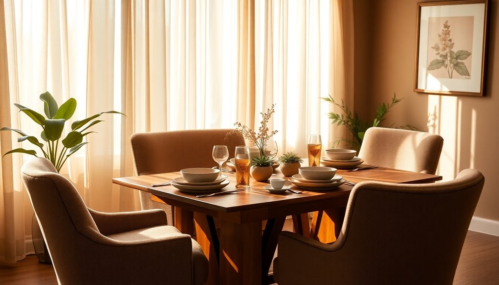
While dining areas should be inviting and functional, the use of warm tones can significantly enhance the experience for seniors. Colors like reds, oranges, and yellows not only stimulate appetite but also encourage social interaction, fostering a sense of community during meals. Additionally, warm colors can help create an environment that supports immune system function, which is especially beneficial for seniors. Earthy browns and greens create a welcoming atmosphere, making dining spaces feel invigorating. It's best to avoid cool colors like blue, which can make food appear unappetizing. Bright lighting complements warm color schemes, enhancing the visual appeal of food. Overall, warm colors evoke feelings of happiness and energy, contributing to a positive dining atmosphere that promotes color perception challenges and nutrition.
Color Strategies for Memory Care Environments

Selecting the right colors for memory care environments can significantly influence residents' well-being and comfort. Calming colors like blues and greens create peaceful spaces, while earth tones such as browns and beiges provide stability and comfort. Calming shades can also help reduce agitation and promote relaxation among residents. Incorporating float mounting techniques in textile art displays can enhance the calming atmosphere by adding visual interest without overwhelming the senses.
Harmonious palettes featuring pastels and analogous colors reduce monotony, making the environment feel more inviting. Using contrasting colors on walls and doorways helps residents differentiate spaces, reducing confusion. Colored accents make handrails and steps more visible, enhancing safety.
It's best to avoid dark colors that might seem like holes, as they can cause anxiety. By integrating appropriate lighting with these colors, you create a relaxing ambiance that supports the emotional needs of residents and promotes their independence.
The Role of Nature-Inspired Colors
Nature-inspired colors play a crucial role in creating inviting and supportive environments for seniors, as they evoke feelings of calm and connection to the outdoors. Earth tones like browns and greens provide comfort and stability, helping reduce anxiety. Soft blues and greens promote tranquility, making them perfect for bedrooms or relaxation areas. These colors enhance mood and create a sense of harmony, allowing residents to feel more at peace. Incorporating natural textures alongside these colors can deepen the earthy feel, adding warmth and visual interest. When you choose shades that reflect the surrounding nature, you foster emotional well-being, ensuring that seniors feel grounded and connected to their environment. Ultimately, nature-inspired colors enrich the living experience for seniors, as colors influence mood, behavior, and cognitive abilities. Additionally, using eco-friendly practices in the design can further enhance the comfort and health of the living space.
Implementing Color Contrast for Navigation

Creating a supportive environment extends beyond nature-inspired colors; it also involves implementing effective color contrast for navigation. High contrast is essential for highlighting features like door handles and railings, making them easier to see and increasing safety. Moreover, color and contrast assist those with dementia in navigating life safely.
For stairways and steps, using contrasting colors improves visibility, helping reduce fall risks. You can aid residents in differentiating various areas by employing contrasting colors in signage and wayfinding, especially for those with cognitive impairments.
When choosing colors, opt for warm tones like yellows and oranges, as they're more visible to aging eyes. Remember, maintaining consistent flooring and avoiding bold patterns can prevent confusion, enhancing the overall navigation experience in senior living spaces.
2022 Trends in Senior Living Color Schemes

As you explore color schemes for senior living spaces, two prominent trends stand out: the use of earthy tones and the nostalgic influences of the 70s. Earthy tones, such as moss greens, terracotta, and warm browns, create a calming atmosphere that can help residents feel more connected to nature and promote a sense of tranquility. Meanwhile, the nostalgic influences of the 70s bring a sense of familiarity and comfort, utilizing bold patterns and retro hues that can evoke cherished memories. Together, these trending color schemes for aging in place not only enhance the aesthetic appeal of senior living spaces but also foster environments that promote well-being and a positive outlook on life.
Earthy colors like browns, beiges, and greens create a comforting environment, making them ideal for calming anxious seniors. These shades not only provide stability but also evoke a sense of nature, promoting relaxation in living areas. The combination of beige and bold colors offers a timeless appeal that enhances the soothing atmosphere. Incorporating lighting design can further enhance the calming effects of these colors, creating a serene ambiance.
On the other hand, the 70s aesthetic brings warmth and familiarity to spaces. Shades of brown are often paired with vibrant pops of color like citrus and raspberry, adding energy and visual interest. This blend of comfort and nostalgia helps create inviting environments where residents feel at home and secure, enhancing their overall well-being.
Practical Considerations for Selecting Colors

Many factors come into play when selecting colors for senior living spaces, as understanding the needs of residents is essential.
Consider cultural sensitivities and personal preferences; engaging residents can help create a welcoming environment. Calming colours contribute positively to emotional and mental well-being, making it vital to incorporate them into the design.
Balance warm and cool tones to cater to varied tastes while using earth tones for comfort.
Safety is crucial, especially for those with mobility impairments—contrasting colors aid navigation.
Light colors can make spaces feel larger and brighter, which benefits seniors with vision issues.
Remember budget considerations, as neutrals offer a timeless look without overspending.
Ultimately, the right color choices can enhance emotional well-being, making spaces feel more like home and promoting relaxation throughout the community.
Frequently Asked Questions
How Do Colors Affect Cognitive Function in Seniors?
Colors can significantly impact your cognitive function as you age. For instance, cool colors like blues and greens might enhance your focus and promote a calm atmosphere, while warmer colors can stimulate your mood and social interactions.
You might find that certain color combinations help you navigate spaces better, making it easier to remember where things are.
What Are the Best Colors for Reducing Stress?
Imagine you're stepping into a serene oasis, where colors whisper tranquility.
The best colors for reducing stress are soft greens and blues; they wrap you in calmness, lowering your heart rate and easing anxiety. Earth tones can ground you, providing a sense of stability.
Avoid harsh reds and bright yellows, as they might spike your stress. Instead, focus on gentle hues that promote relaxation and harmony, creating a peaceful environment for your mind.
Can Color Preferences Vary Among Different Cultures?
Yes, color preferences can vary significantly among different cultures.
You'll find that certain colors hold unique meanings and evoke different emotions depending on cultural backgrounds. For instance, while white symbolizes purity in many Asian cultures, blue is often favored in Western societies for its calming effects.
Your personal experiences and cultural context also shape how you perceive colors, making color preferences a complex interplay of cultural, psychological, and individual factors.
How Often Should Color Schemes Be Updated in Senior Living Spaces?
You might think that color schemes in senior living spaces only need a makeover every few years, right?
Ironically, that's not the case! You should regularly evaluate these schemes to make sure they align with residents' evolving needs.
Annual reviews and consistent feedback keep things fresh and relevant.
What Role Does Artwork Play in Color Perception?
Artwork plays a crucial role in how you perceive color. It can evoke emotions, create specific moods, and guide your attention through strategic color choices.
You'll find that cultural context enhances your understanding of an artwork's color significance, affecting your emotional connection.
Conclusion
Incorporating calming color schemes in senior living spaces can transform environments into tranquil havens that feel like a serene retreat. By thoughtfully selecting colors that promote relaxation, you're not just decorating; you're creating an atmosphere that enhances well-being and fosters connection. Don't underestimate the power of color—it can turn a simple room into a soothing sanctuary. So, let your palette speak volumes, and watch as your space becomes a vibrant oasis of peace and comfort!