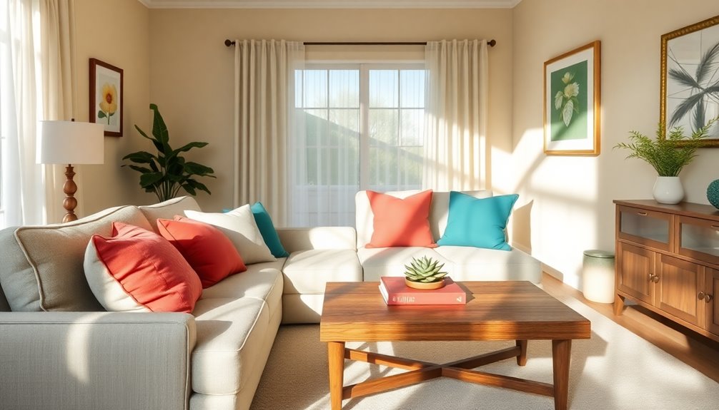
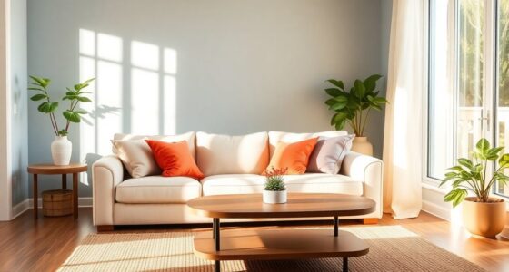
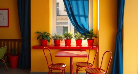
To make aging in place beautiful, consider warm golds and earthy tones for comfort, or vibrant orchid accents that energize your space. Cozy mustard paired with soft blues creates a calming environment, while energizing reds and oranges can spark creativity. For a serene atmosphere, try soft violets and greens. Balanced warm and cool combinations enhance harmony, and playful jewel tones add personality. Explore other rich hues and color schemes to create a perfect, welcoming oasis.
Key Takeaways
- Warm Golds and Earthy Tones: These colors create a comfortable, inviting atmosphere while connecting residents to nature, promoting tranquility and well-being.
- Cozy Mustard and Soft Blues: This combination balances versatility with calmness, making it ideal for sleeping spaces and enhancing a cozy environment with earthy elements.
- Calming Soft Violets and Greens: Soft violet and green hues evoke serenity, perfect for relaxation areas, while ensuring contrast improves visibility for seniors.
- Balanced Warm and Cool Combinations: Mixing warm colors like reds with cool tones such as blues creates harmony, tailored for specific rooms and their functions.
- Vibrant Orchid Accents: Use vibrant orchid shades for energizing accent walls, ensuring balance with neutrals for visual clarity, especially important for aging residents.
Warm Golds and Earthy Tones
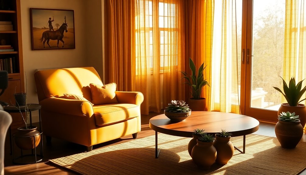
When you think about creating a welcoming space for aging in place, warm golds and earthy tones come to mind as perfect choices.
Warm golds bring a sense of comfort and luxury, enhancing lighting to create an inviting atmosphere. They evoke nostalgia, which can be beneficial for emotional well-being. Additionally, softened colors can further enhance the overall aesthetic, making the environment feel even more soothing and appropriate for aging residents.
Earthy tones, like terracotta and moss green, offer calming effects, connecting residents to nature and promoting a sense of tranquility.
Layering these colors adds depth and texture, grounding spaces for a cozy feel.
Together, warm golds and earthy tones create a harmonious blend that strikes a balance between elegance and nature, making your home not just stylish but also a nurturing environment for aging gracefully.
Vibrant Orchid Accents

Vibrant orchid accents can transform your space into a lively oasis, infusing it with energy and elegance. These hues, ranging from soft pastels to bold purples, capture nature's beauty and evoke feelings of romance and tranquility. Orchid colors can create a warm and inviting atmosphere, enhancing the overall aesthetic of your home. Additionally, incorporating standard chair and table heights can ensure comfort and accessibility in your living spaces.
You can easily incorporate orchid colors into various design elements, whether it's through accent walls, furniture, or decor pieces. For instance, an accent wall in a vibrant orchid shade can energize a room, while softer tones can create a calming atmosphere.
Balancing these colors with neutrals ensures visual clarity, making spaces welcoming for seniors. With their cultural significance and emotional impact, vibrant orchid accents not only beautify your home but also enhance well-being, making aging in place more enjoyable.
Cozy Mustard and Soft Blues
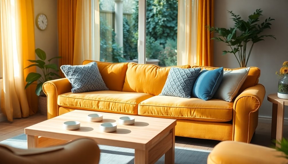
Orchid accents add a lively touch to your home, but if you're looking for a warmer, cozier vibe, consider the combination of mustard and soft blues. Mustard's neutral undertones make it a versatile choice, making it easier to style beautifully with soft blues to create a soothing yet inviting atmosphere.
This combination not only warms up a room but also enhances visual interest, especially in living areas. Soft blues promote calmness, making them ideal for sleeping spaces, while mustard adds a touch of cheer without overwhelming the senses. Additionally, incorporating earthy elements such as wood or plants can further enhance the cozy feel, creating a welcoming environment for aging in place.
Incorporating neutral tones like grey or beige can balance the palette, and earthy elements such as wood or plants can further enhance the cozy feel, creating a welcoming environment for aging in place.
Energizing Reds and Oranges
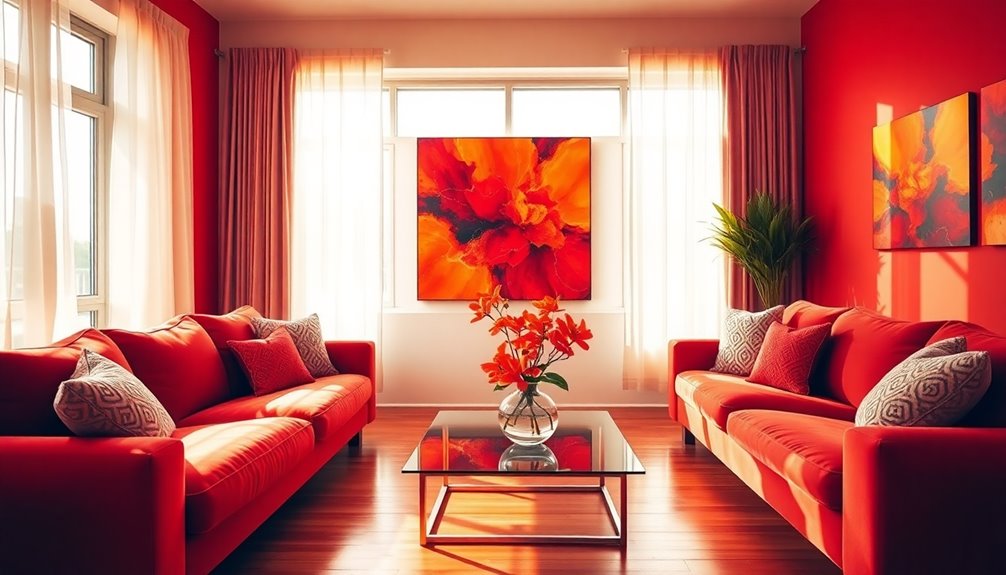
Energizing reds and oranges can transform your living space into a lively haven that stimulates both creativity and engagement.
Red brings excitement and passion, making it perfect for active areas. You can incorporate red through accent pieces like throw pillows or rugs, creating vibrancy without overwhelming the room. Pair it with neutral tones like beige or gray for balance.
Orange, on the other hand, adds warmth and enthusiasm, ideal for cozy spaces. Use bold shades in your décor or opt for burnt orange for a more subdued feel. Orange adds warmth and vibrancy that enhances the overall mood of a space.
Together, these colors create a dynamic atmosphere that promotes joy and mental activity, making your home not just beautiful, but also an inviting space for aging in place.
Calming Soft Violets and Greens
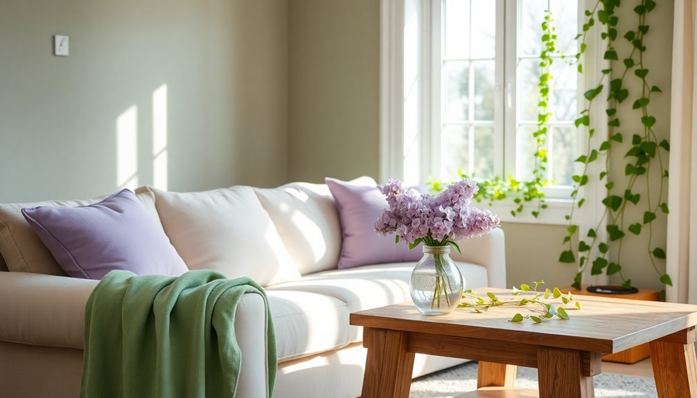
When you incorporate calming soft violets and greens into your home, you create a soothing environment that promotes relaxation and peace.
These colors harmonize beautifully, evoking feelings of serenity and tranquility, perfect for aging in place. Consider pairing soft lavender with mint green accents for a gentle, calming atmosphere in your living spaces. Incorporating natural elements like sage green can further enhance the calming effect of your interior design. Additionally, a clean home environment can support a healthier lifestyle by promoting cleanliness and hygiene, which is especially important for seniors.
It's essential, though, to ensure there's enough contrast between these hues to enhance visibility, making it easier for seniors to navigate.
Natural light can amplify their soothing effects, creating a warm ambiance.
Nature-Inspired Cool Neutrals
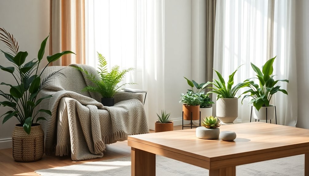
As you explore the calming effects of nature-inspired cool neutrals, you'll discover how blues and greens can transform your living spaces into serene retreats. These colors, reminiscent of ocean waves and lush forests, foster a refreshing ambiance perfect for bedrooms and home offices. Imagine a palette like Frosted Dawn, with cool blues and grays, or Oceanic Breeze, capturing the essence of the sea. These shades not only enhance relaxation but also promote cognitive clarity, making them ideal for aging in place. Furthermore, incorporating textured fabrics adds warmth and comfort to your decor. By pairing cool tones with earthy hues, you create a balanced, soothing environment. Embracing these colors allows you to connect with nature, fostering a sense of peace and well-being in your home. Additionally, incorporating grounding colors like Clay and Wood can further enhance the tranquil atmosphere while providing stability and warmth.
Playful Jewel Tones
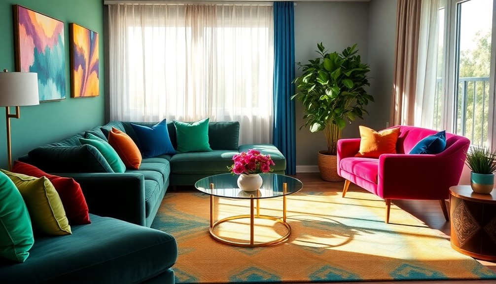
Why settle for dull colors when you can infuse your space with playful jewel tones? These rich, vibrant colors—like emerald green, sapphire blue, and ruby red—bring a luxurious feel to any environment. They're trending in both fashion and interior design, making bold statements wherever they're used. You can easily incorporate these hues into your home through accessories or larger design elements, creating lively and engaging spaces. Jewel tones evoke feelings of energy and luxury, ideal for promoting a sense of community in common areas. Just remember to balance them with natural materials to avoid overwhelming your space. With the right lighting, jewel tones can transform your home into a vibrant sanctuary that reflects your personality beautifully.
Rich, Saturated Hues
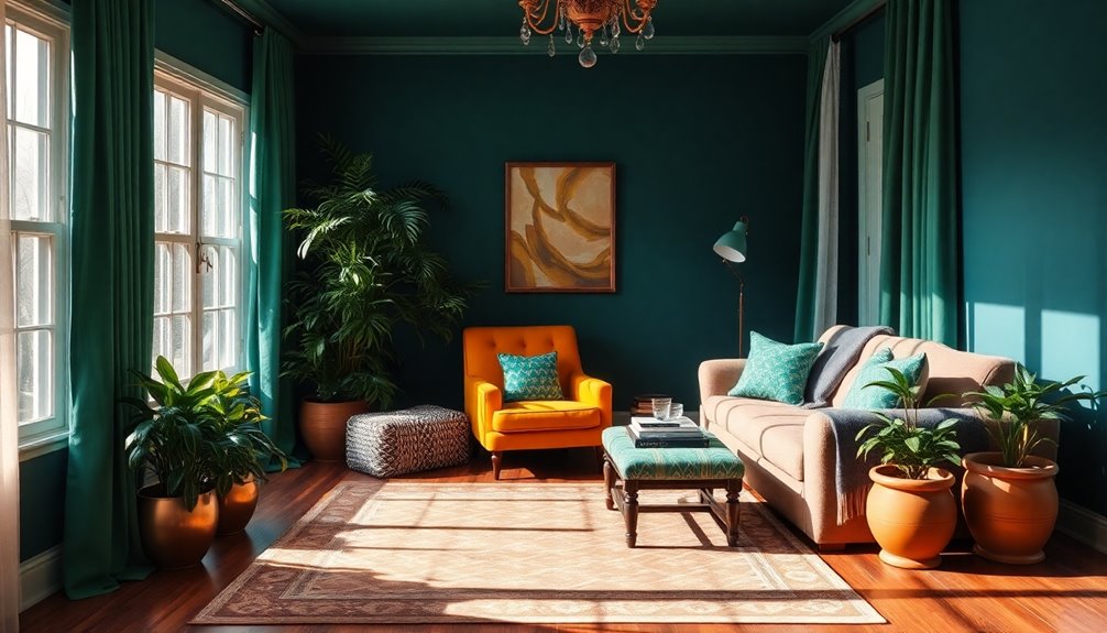
Rich, saturated hues can transform your living space into a vibrant haven that enhances visual clarity and emotional well-being.
These bold colors help your aging eyes distinguish between objects and spaces, making navigation safer—especially on stairs. By creating high contrast, saturated hues stimulate mental acuity and foster a lively atmosphere, essential for your mental health. Additionally, older individuals require three times more ambient light for reading than younger adults, making the choice of rich colors even more significant.
Avoid pastels or colors with yellow undertones, as they might blend together due to lens yellowing. Instead, opt for deep blues and greens that remain distinct and calming.
Pair these colors with matte finishes to reduce glare, and ensure proper lighting to showcase their vibrancy. Embracing rich, saturated hues won't only beautify your home but also support your comfort and safety.
Balanced Warm and Cool Combinations
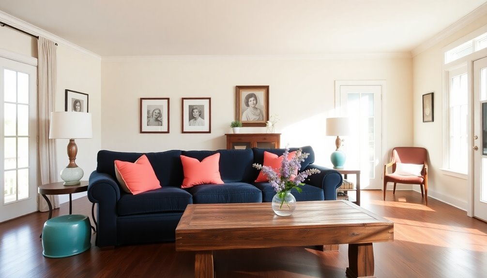
Incorporating balanced warm and cool combinations into your home can create a harmonious atmosphere that promotes both comfort and functionality. Warm colors like reds and yellows stimulate energy, while cool tones such as blues and greens offer calmness. By blending these palettes, you can enhance visual appeal and avoid overwhelming spaces. For instance, using wood floors can introduce warmth to cool-toned rooms, while metallic accents like brass provide warmth without being overpowering. Color choices reflect individual design vision and preferences, making it essential to consider personal style when selecting your color scheme. Different rooms require specific balances; warm hues work well in dining areas to stimulate appetite, while relaxation spaces benefit from cooler shades.
Invigorating Warm Color Foundations
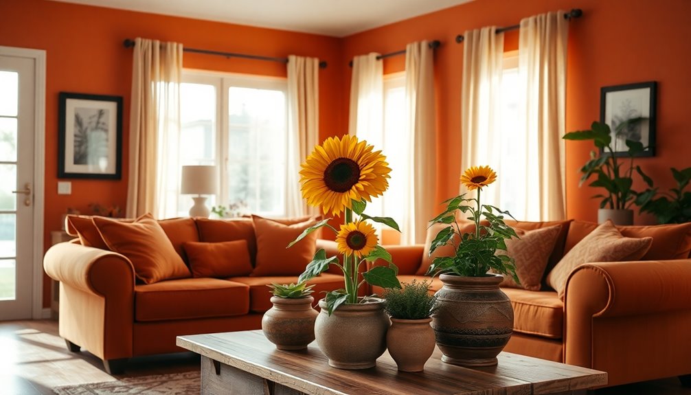
As you explore the world of invigorating warm color foundations, you'll find that these hues not only enhance your home but also reflect a sense of comfort and vitality.
Warm undertones suit skin that tans easily, providing a natural look with a matte finish that controls oil. These foundations offer long-lasting coverage, perfect for daily wear, while matching your specific skin tone is crucial for an authentic appearance. Many warm color foundations are dermatologist-tested, ensuring they're suitable for sensitive skin. Additionally, these foundations have 24-hour staying power, allowing you to go about your day without the need for frequent touch-ups.
In interior design, earth-inspired tones like terracotta create cozy atmospheres, while richer hues evoke luxury and depth. Embracing these warm colors can transform your space into a sanctuary of wellness and style, making aging in place truly beautiful.
Frequently Asked Questions
How Do Colors Influence Memory in Elderly Individuals?
Colors significantly influence memory in elderly individuals. When you surround yourself with warm colors like red and yellow, you might feel more energized, which can enhance your memory retention.
High contrast colors help you distinguish objects better, improving visual perception. Additionally, engaging with colors through activities can stimulate cognitive functions.
What Are the Best Lighting Options for Aging in Place?
When it comes to lighting options for aging in place, think of it as setting the mood for a cozy movie night.
You'll want ambient lighting for overall brightness, task lighting for specific areas like reading corners, and accent lighting to highlight personal touches.
Incorporating smart lighting can make control effortless.
Can Color Choices Affect Sleep Quality for Seniors?
Yes, color choices can significantly affect sleep quality for seniors.
Calming colors like soft blues and greens create a soothing environment, promoting relaxation. You should avoid stimulating colors such as red or orange in sleeping areas.
High contrast colors can help with navigation, especially for those with vision changes.
Ultimately, selecting colors that resonate with personal preferences can enhance your sleep experience, ensuring you feel comfortable and at ease in your space.
How Can I Incorporate Personal Color Preferences in Design?
Imagine your space as a canvas, waiting for your unique colors to paint it alive. You can incorporate personal color preferences by selecting hues that resonate with you, whether through vibrant pillows, soothing wall paint, or eye-catching rugs.
Customize your furniture in shades you love, and don't forget about lighting—warm tones can create a cozy glow. Let your favorite colors dance together, transforming your home into a reflection of your personality and style.
What Colors Should Be Avoided for Aging Individuals?
When designing for aging individuals, it's best to avoid certain colors. Red can clash with skin tones, while pastels and faint colors might blend in, making them hard to see.
Too dark hues can create navigation issues, and low contrast colors can confuse or disorient. Instead, focus on high contrast options that enhance visibility and safety, ensuring spaces are both functional and comfortable.
Prioritizing these considerations will improve their living experience significantly.
Conclusion
As you embrace the journey of aging in place, remember that colors can transform your space into a haven of comfort and joy. Why settle for dull when you can surround yourself with vibrant hues that uplift your spirit? By incorporating these trending color schemes, you'll not only enhance your home's beauty but also create an environment that feels just right for you. So go ahead—let your walls tell your story in the most beautiful way possible!
References
- https://www.sherwin-williams.com/property-facility-managers/color/find-and-explore-colors/color-collections/senior-living-color
- https://www.interaction-design.org/literature/topics/color-theory
- https://www.livspace.com/in/magazine/3-mood-enhancing-colour-schemes-for-elderly
- https://writings.stephenwolfram.com/2023/02/what-is-chatgpt-doing-and-why-does-it-work/
- https://aptura.directsupply.com/insights/2022-color-trends-for-senior-living-how-to-use-them/
- https://insideoutstyleblog.com/2014/02/understanding-undertone-warm-to-cool.html
- https://looka.com/blog/logo-color-trends/
- https://havenly.com/blog/earth-tones
- https://surroundings-interiors.com/blog/2025-design-trend-we-love-rich-earthy-tones
- https://assistinghands.com/39/california/sandiego/blog/colors-that-can-enliven-an-older-adults-home/
