
To create an elderly-friendly home, consider these ten color schemes. Use warm golds and mustards for a cozy atmosphere, or soothing greens that promote relaxation. Earthy browns provide safety and stability, while bright yellows boost happiness. Calm blues help maintain a peaceful environment. High contrast combinations enhance visibility, and seasonal adaptations keep your space comforting year-round. Incorporating nature-inspired hues and soft pastels adds extra warmth. Stick around to discover how each scheme can transform your home!
Key Takeaways
- Warm golds and mustards create a cozy atmosphere, enhancing comfort and stimulating appetite in dining areas for seniors.
- Earthy browns foster feelings of safety and stability, promoting relaxation and emotional well-being in living spaces.
- Soothing greens like sage reduce stress and anxiety, creating serene environments that enhance connections to nature.
- High contrast color combinations improve visibility, aiding navigation and safety for seniors, especially those with dementia.
- Seasonal adaptations in color schemes maintain comfort year-round, ensuring a warm and inviting atmosphere in the home.
Warm Golds and Mustards for a Cozy Atmosphere
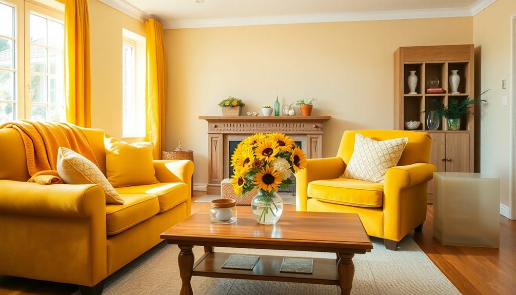
When you decorate for an elderly-friendly home, incorporating warm golds and mustards can transform a space into a cozy haven. These colors not only create a welcoming atmosphere but also enhance visibility and comfort, which are essential for an elderly-friendly home. To further enhance the space, consider adding comfortable furnishings with soft textures and adjustable lighting solutions that can be easily manipulated. For more ideas, explore some seniorfriendly decor tips that focus on safety, accessibility, and style to ensure the home remains both beautiful and functional.
These warm colors create an intimate atmosphere, enhancing feelings of security and comfort. High contrast between surfaces makes it easier for seniors to navigate their environment. Additionally, high contrasting color schemes can aid senior citizens in distinguishing different surfaces effectively.
Bright shades like mustard not only uplift mood but also stimulate appetite, especially in dining areas. You can enhance natural light by using these colors, making rooms feel brighter and more inviting.
Consider adding a mustard accent wall or integrating warm-toned accessories like pillows and throws. Pairing these tones with dark wood furniture can create a visually appealing contrast, ensuring your space feels both stylish and accessible.
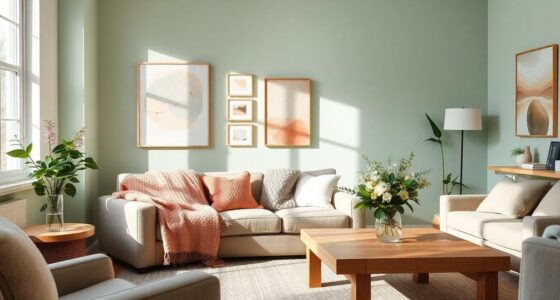
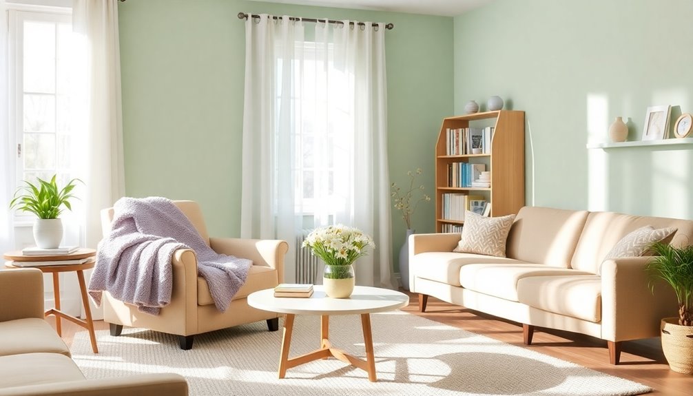
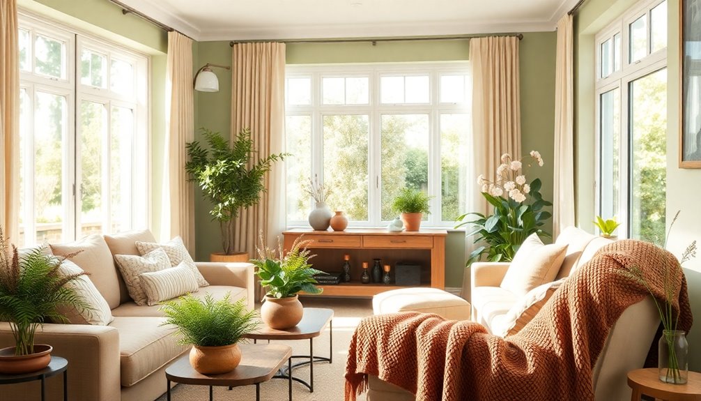
Soothing Greens for Relaxation and Comfort

Soothing greens, like sage and muted tones, create a serene environment that promotes relaxation and comfort in elderly-friendly homes. These colors are linked to tranquility, helping to reduce stress and anxiety. By evoking nature, soothing greens enhance well-being, making spaces feel more connected to the outdoors. You can incorporate sage green in bedrooms or living areas, pairing it with soft pastels for warmth or earthy tones for a natural touch. Consider using soothing green accents in furniture and decor to enrich the atmosphere without overwhelming it. Natural light complements these hues beautifully, amplifying their calming effect. Ultimately, implementing soothing greens can significantly improve mental health and sleep quality for you or your loved ones. Additionally, muted greens can create an earthy, sophisticated atmosphere that enhances the overall comfort of the home.
Earthy Browns for Safety and Stability

Earthy browns create a warm and inviting atmosphere that's perfect for elderly-friendly homes. These cocooning colors make your space feel cozy and safe, especially during autumn. By incorporating earthy tones, you provide comfort and stability, helping to ease any anxiety seniors may feel. The connection to nature that these colors evoke promotes relaxation, enhancing emotional well-being. Choose textures like wood or stone to deepen this connection and add warmth. Additionally, natural brown wood tones pair beautifully with vibrant green accents, enhancing the overall feel of the space. Earthy browns also pair well with greens or whites, offering versatile design options. Their rustic charm not only boosts aesthetics but also fosters feelings of reliability and security.
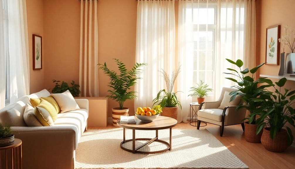
Bright Yellows to Boost Happiness

Color choices play a significant role in creating an uplifting atmosphere in elderly-friendly homes. Bright yellows can evoke feelings of happiness and warmth, making them a fantastic option to boost mood.
Use soft yellow shades in common areas where socialization occurs, as they inspire optimism without being overstimulating. Incorporating yellow accents, like drapes or decor, can add positive energy without overwhelming the space. Additionally, using yellow in these areas can promote the calming effects of color, helping to create a serene environment.
Consider using yellow in dining or activity rooms to encourage interaction and stimulate appetite. Pairing yellow with neutral tones helps maintain balance, while its brightness aids visibility for seniors with visual impairments.
Ultimately, a thoughtful application of yellow can create a welcoming and cheerful environment that enhances the well-being of elderly residents.
Calm Blues for a Peaceful Environment

When you incorporate calm blues into your home, you create a serene environment that promotes relaxation and reduces stress. Soft blues, commonly used in spas, evoke a sense of tranquility, helping maintain emotional balance and soothing the nervous system. Pair these hues with white for a refreshing, oceanic feel, especially in spring and summer when they thrive in natural light. Use soft blue textiles like throw blankets and cushions to enhance comfort in your living areas. Accent pieces, such as vases or decorative items, can further introduce calmness. Additionally, consider painting walls in soft blues or using various shades in a monochromatic scheme to achieve visual harmony, fostering a peaceful atmosphere throughout your space. Incorporating soft blue accents can enhance leisurely dining experiences, making it an ideal choice for kitchens. Moreover, using aesthetic hooks can help keep frequently used items organized while complementing the calming color palette.
Vibrant Reds for Energy and Vitality
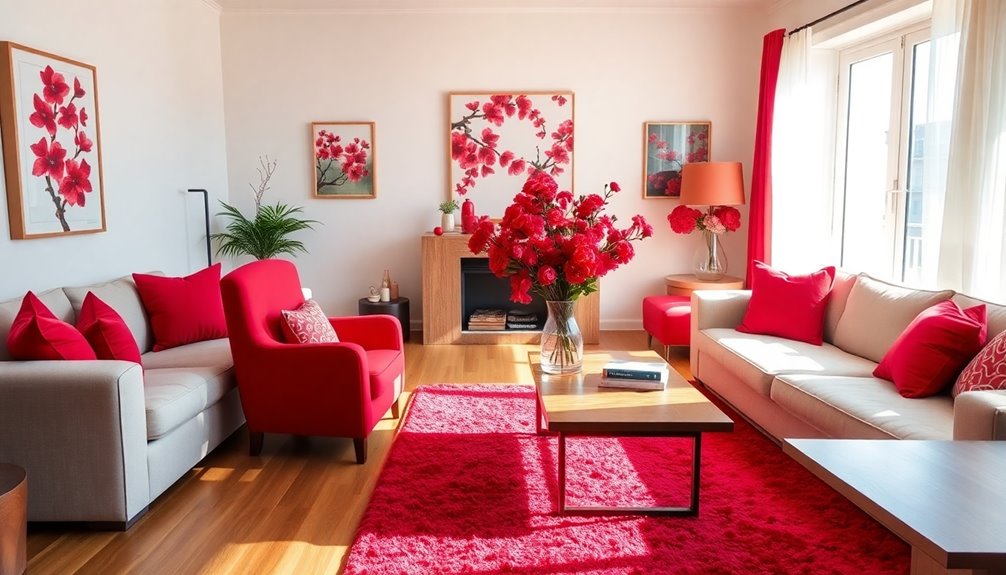
Incorporating vibrant reds into your home decor can instantly infuse energy and vitality into your living spaces. Red's psychological impact increases heart rate and stimulates excitement, making it perfect for areas where you want a lively atmosphere. A color strategy focuses on the application of color rather than just the selection, allowing you to create dynamic focal points without overwhelming the space. Pairing red with neutral tones helps maintain balance, while its cultural significance brings warmth and hospitality to your home. This color also combats cognitive decline by stimulating mental activity, creating a cozy environment. Whether through furniture or wall art, adding red can uplift moods and encourage social interaction, making your home feel inviting and vibrant.
Nature-Inspired Hues for Connection to the Outdoors
Embracing nature-inspired hues can transform your home into a serene retreat that fosters a deep connection to the outdoors. Earthy tones like greens, browns, and blues create a calming atmosphere, perfect for elderly-friendly spaces. Incorporating natural materials—think wood and stone—adds warmth and enhances this connection. As you choose colors, remember that high contrast helps with visibility for aging eyes, while vibrant accents can evoke fond memories and provide comfort. Utilizing color theory principles, a cohesive palette using soft blues or warm greens as your base promotes tranquility throughout your home. Additionally, creating a comfortable environment can be complemented by energy-efficient models that help maintain a pleasant indoor climate. By creating a harmonious environment inspired by nature's beauty, you'll not only enhance aesthetic appeal but also nurture a soothing and inviting space for yourself and loved ones.
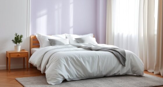
Soft Pastels for a Gentle, Soothing Space

Nature-inspired hues provide a strong foundation for creating inviting spaces, but soft pastels can take that serenity even further. These calming colors, like lavender and pale pink, create a soothing atmosphere that's beneficial for elderly individuals experiencing stress. Soft pastels promote visual harmony, making your home feel cohesive and peaceful. Plus, they adapt well to age-related vision changes, remaining visually appealing. You can easily incorporate soft blues and greens for added serenity, or use pastel accents like cushions to enhance warmth without overwhelming the space. Each element blends harmoniously with neutral tones can amplify their calming effect, making your environment both inviting and comforting. Ultimately, soft pastels can transform your home into a gentle, soothing space.
High Contrast Combinations for Enhanced Visibility

While creating a safe and accessible environment for the elderly, high contrast color combinations play a vital role in enhancing visibility. By using colors like red and black, you can effectively highlight safety features such as door handles and railings, reducing the risk of accidents. High contrast helps distinguish surfaces, improving navigation and reducing confusion, especially for those with cognitive impairments. For practical applications, consider using contrasting colors on stairs to prevent falls and ensuring furniture stands out against walls for easy identification.
Additionally, this approach is particularly beneficial for those with dementia, as it assists them in navigating their surroundings more safely. Remember to test colors under different lighting conditions, as this affects visibility. Opt for matte surfaces to reduce glare, making essential elements more noticeable and creating a more engaging environment.
Seasonal Color Adaptations for Year-Round Comfort
Creating a comfortable home for the elderly involves adapting color schemes to reflect the changing seasons.
In spring, use pastel shades and soft greens to promote calmness, while light blues and yellows can enhance warmth. Incorporate floral patterns for vibrancy and add plants to boost mood. High contrast in these colors can help seniors distinguish areas more easily. Additionally, using natural elements in decor can further enhance tranquility.
For summer, opt for soft yellows and oranges to evoke happiness, and calming blues and greens for bedrooms.
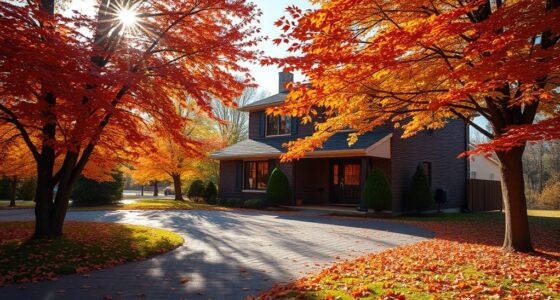
In autumn, warm browns and oranges create a cozy atmosphere, while deep reds stimulate creativity.
Finally, during winter, soft blues and purples promote relaxation, and deep reds can stimulate energy.
Balancing these seasonal colors ensures your home remains inviting and comfortable all year round.
Frequently Asked Questions
How Can I Choose Colors Based on My Loved One's Preferences?
To choose colors based on your loved one's preferences, start by asking about their favorite colors.
Think about what makes them feel comfortable or happy. Incorporate these colors into your space and consider seasonal variations to keep things fresh.
High contrast combinations can enhance visibility, while warm tones can create a cozy atmosphere.
Ultimately, aim for a balance between their favorites and practical considerations for a welcoming environment that reflects their personality.
What Materials Pair Well With Warm Color Schemes?
When you're choosing materials to pair with warm color schemes, think about using dark wooden furniture like oak or walnut for added depth.
Incorporate natural textiles like wool and linen in earthy tones for a cozy vibe.
Stone elements, such as granite, can bring luxury, while warm lighting enhances the atmosphere.
Don't forget plush rugs and thick curtains to add warmth underfoot and block drafts, creating a comfortable, inviting space.
Are There Specific Lighting Tips for Enhancing Color Schemes?
You mightn't realize how important lighting is when enhancing a color scheme.
Layered lighting, including ambient, task, and accent types, can transform a space. Use warm color temperatures for coziness and high CRI lights for accurate colors, reducing fall risks.
Consider adding dimmable options to adjust brightness based on activities. By integrating smart controls or motion sensors, you'll make your home more accessible and inviting for everyone, especially seniors.
How Often Should I Update Color Schemes for Elderly Spaces?
You should update color schemes whenever the space feels unwelcoming or the needs of residents change.
Regular feedback from them can help you know when it's time for a refresh.
Consider seasonal changes to keep things feeling fresh and vibrant.
If budget allows, incorporate new trends and technological advances in lighting to enhance color perception.
Regular updates can boost mood, improve safety, and create a comforting environment that feels like home.
Can I Mix Different Color Schemes in One Room?
Did you know that 80% of people find comfort in color harmony? Yes, you can mix different color schemes in one room!
Just make sure to stick to a consistent palette to avoid chaos. Use complementary colors for vibrancy and balance them with neutrals to create a cohesive look.
Varying shades and textures can add visual interest, while a focal piece can tie everything together beautifully.
It's all about creating a harmonious atmosphere.
Conclusion
Incorporating these color schemes can truly transform your home into an elderly-friendly space. For instance, consider a couple who painted their living room in soothing greens and warm golds. They found that the calming atmosphere not only made their home more inviting but also improved their overall mood and comfort. By thoughtfully choosing colors, you can create a nurturing environment that enhances safety and well-being for your loved ones, making each day a little brighter. Additionally, incorporating elements like soft lighting and comfortable furniture can further enhance this tranquil ambiance. Experts often recommend using calming color palettes for elderly homes, as they have been shown to reduce anxiety and promote relaxation. By blending these aesthetic choices with practical design features, you can cultivate a sanctuary that not only looks beautiful but also supports the physical and emotional needs of aging family members.
References
- https://www.livspace.com/in/magazine/3-mood-enhancing-colour-schemes-for-elderly
- https://www.cms.gov/files/document/nursing-home-staffing-study-final-report-appendix-june-2023.pdf
- https://theclare.com/blog/color-therapy-for-seniors/
- https://www.lpicommunities.com/blog/keep-these-things-in-mind-when-designing-a-senior-friendly-website
- https://rlcommunities.com/blog/decorating-tips-for-senior-adult-living-spaces/
- https://www.shelbywilliams.com/blog/news/color-trends
- https://www.houzz.com/magazine/10-ideas-for-decorating-with-mustard-tones-stsetivw-vs~116562688
- https://www.shakerpainting.com/blog/creating-a-welcoming-atmosphere-why-paint-colors-matter-in-senior-living-spaces
- https://www.resene.co.nz/decorating-blog/491c-colours-for-the-elderly.htm
- https://piktochart.com/blog/green-color-palette-combinations/