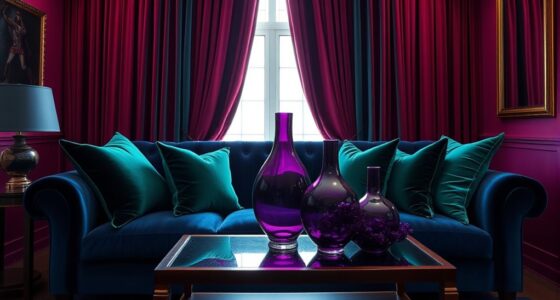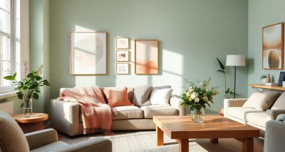

When your design has too much contrast, it can feel harsh because your eyes struggle to process the sharp differences, causing discomfort and visual fatigue. Bright, jarring contrasts disrupt harmony and make elements clash rather than complement each other. This overwhelming effect can distract viewers and create a sense of tension instead of guiding them smoothly through the content. If you want to understand how to balance contrast effectively, keep exploring—helping your designs become more comfortable and engaging.
Listen free for 30 days with Audible
Thousands of audiobooks and originals — cancel anytime.
As an affiliate, we earn on qualifying purchases.
Key Takeaways
- Excessive contrast overwhelms the eyes, causing discomfort and visual fatigue.
- Harsh contrast disrupts color harmony, making visuals feel jarring and unbalanced.
- Sharp differences between elements create visual tension, leading to a sense of aggression or unease.
- Overuse of contrast reduces focus, making content harder to process and navigate.
- High contrast can produce a stark, unsettling aesthetic that feels aggressive rather than inviting.
As an affiliate, we earn on qualifying purchases.
How Excessive Contrast Creates Visual Harshness

When you encounter images or designs with extremely high contrast, your eyes can feel overwhelmed by the stark difference between light and dark areas. This sharp difference can disrupt color harmony, making the design seem jarring rather than cohesive. Excessive contrast draws immediate attention but also creates a sense of visual tension that can feel harsh or unsettling. The emotional impact intensifies because your eyes struggle to rest on any single area, causing fatigue or discomfort. Instead of guiding viewers smoothly through the design, high contrast can overpower the senses, making the entire piece feel aggressive or unbalanced. To avoid this, balancing contrast helps maintain a pleasing visual flow, ensuring that emotion and visual harmony work together rather than clash.
Signs Your Design Has Too Much Contrast

If your design feels visually jarring or overwhelming, it’s a strong sign that the contrast might be too high. When contrast is excessive, it disrupts color harmony, making elements clash instead of complementing each other. This can create a sense of dissonance, making it hard for viewers to focus or navigate comfortably. Notice if text or buttons stand out too sharply against backgrounds, causing eye strain or discomfort. High contrast can also diminish user engagement by making content appear aggressive or difficult to process. If you find yourself squinting or feeling fatigued after viewing your design, it’s a clear indicator you should dial back the contrast. Striking the right balance ensures your design remains appealing, engaging, and easy on the eyes. Additionally, understanding how color temperature adjustments influence overall visual comfort can help create a more balanced and pleasant viewing experience. Incorporating landscaping techniques that blend natural elements can also help soften visual transitions in outdoor spaces. Moreover, considering visual ergonomics can further improve the overall user experience by reducing strain and enhancing comfort. Being mindful of visual contrast principles, especially in diverse audiences, can help ensure your design is both inclusive and aesthetically pleasing. Recognizing the importance of visual harmony can guide you in creating designs that are balanced and easier to view for extended periods.
Why High Contrast Can Feel Overwhelming

High contrast can quickly turn from eye-catching to overwhelming, especially when it’s used excessively. When contrast clashes with color harmony, your eyes strain to process the visual, reducing user comfort. Too much contrast creates a jarring experience that distracts rather than guides. To avoid this, consider these points:
- Balance bold contrasts with softer hues to create a pleasing visual flow.
- Use high contrast sparingly, focusing on key elements to draw attention without overwhelming.
- Prioritize user comfort by reducing sharp edges between contrasting colors, making visuals easier to process.
- Incorporate humidity control with proper ventilation and filtering to maintain a comfortable indoor environment that supports visual well-being.
Balancing Contrast for Better Visuals

Achieving the right balance of contrast is essential for creating visually appealing and comfortable designs. When you blend contrast thoughtfully, you enhance color harmony and strengthen emotional impact. Proper contrast management plays a vital role in ensuring that your visuals are accessible and effective across different viewing environments. Additionally, considering accessibility guidelines can help in maintaining readability for all users. Too little contrast can make your visuals flat, while too much risks harshness. Finding a balance guarantees each element complements the other, guiding viewer attention smoothly. Incorporating template compatibility principles to ensure your contrast choices work well across various design formats and devices is also important. Use this table to understand emotional responses:
| Low Contrast | Balanced Contrast | High Contrast |
|---|---|---|
| Calm, subdued | Harmonious, engaging | Intense, dramatic |
| Soft, gentle | Clear, vibrant | Stark, jarring |
| Subtle shifts | Comfortable flow | Disruptive jumps |
| Quiet mood | Dynamic energy | Overwhelming |
Recognizing how market trends influence visual preferences can also help inform your contrast choices. Focusing on visual harmony can help create a more cohesive and pleasant visual experience. Use moderation to evoke the right feelings and craft visually pleasing experiences.
Tips to Use Contrast Effectively Without Overdoing It
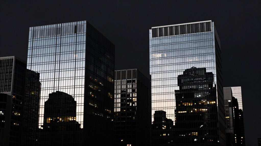
Using contrast thoughtfully is key to creating visual interest without overwhelming your audience. To achieve this, focus on maintaining color harmony, ensuring your design feels cohesive. Here are three tips:
- Limit your contrast palette to a few key shades to prevent harshness and support a smooth user experience. Incorporating wood types with different grains or tones can add subtle variation without overwhelming the overall look. Using different hair colors as inspiration can also help in selecting harmonious shades that complement each other well. Additionally, exploring the top espresso machines and their features can inspire subtle contrasts in design or presentation, enhancing aesthetic appeal. Understanding how celestial bodies influence personal traits can inform more nuanced color choices that evoke specific moods or energies.
- Use contrast strategically, highlighting important elements without making everything stand out equally.
- Balance high-contrast areas with softer, muted tones to create visual relief and guide the viewer’s eye naturally. Incorporating design trends like retro fonts or AR filters can also help add interest without relying solely on contrast.
Frequently Asked Questions
Can Too Much Contrast Impact Readability on Different Devices?
Yes, too much contrast can impact readability on different devices. High contrast, especially with intense color saturation, may look striking on some screens but can cause visual fatigue on others. This makes it harder for you to focus or read comfortably over time. Variations in device display quality and lighting conditions mean that excessive contrast might feel harsh or straining, so balancing contrast levels guarantees better readability across all screens.
How Does Contrast Affect Emotional Responses in Viewers?
Contrast greatly influences your emotional responses by creating visual tension and heightening emotional intensity. When you see high contrast, it can evoke feelings of excitement, urgency, or even discomfort, depending on the context. Conversely, low contrast tends to foster calmness and relaxation. You instinctively react to contrast, as it guides your focus and shapes how you interpret the mood of an image or scene, amplifying or softening emotional impact.
Are There Specific Colors That Tend to Create Harsher Contrast?
When it comes to creating visual tension, certain color pairings tend to be harsher. Bright reds and whites, or vivid yellows and blacks, often produce stark contrast that can feel overwhelming. These colors create a jarring effect, making the contrast more aggressive. You might find that high-contrast combinations like deep blues with bright oranges or neon greens with stark purples also amplify this effect. Think of it as painting with fire and ice—sometimes, less is more.
How Does Age Influence Perception of High-Contrast Designs?
As you age, your perception of high-contrast designs shifts due to decreased contrast sensitivity. You might find very stark contrasts more jarring or overwhelming, especially in bright environments. Younger individuals typically perceive contrast more vividly, while older adults may prefer softer shifts to reduce eye strain. To accommodate diverse audiences, it’s crucial to balance contrast levels, ensuring your designs remain accessible and comfortable for all age groups.
What Are Common Mistakes When Adjusting Contrast in Visual Projects?
You often make the mistake of over-adjusting contrast, which disrupts color harmony and visual balance. Instead of creating a striking effect, excessive contrast can make your design feel harsh and jarring. To avoid this, you should carefully fine-tune contrast levels, ensuring they complement the overall color palette. Remember, subtle adjustments often preserve harmony and balance, making your visual project more appealing and easier on the eyes.
Conclusion
If you push contrast too far, your design can feel like a storm cloud—dark, overwhelming, and hard to ignore. But when you find the right balance, your visuals become a calming breeze, guiding the viewer smoothly through your message. Remember, contrast is like seasoning—just enough enhances the flavor, but too much ruins the dish. Keep it subtle, purposeful, and you’ll create visuals that are powerful without feeling harsh or overwhelming.
NFL season / tailgating Picks
team gear
As an affiliate, we earn on qualifying purchases.