
To enhance safety and comfort for seniors, consider warm colors like yellow and gold to evoke familiarity. Utilize high contrast for visibility, such as black and white combinations. Soothing colors like light blue can reduce stress, while vibrant shades in common areas promote engagement. Avoid bold patterns to minimize confusion and create clear color-coded wayfinding systems. Incorporate textures with these colors to improve spatial awareness. Curious about more effective strategies? There's plenty more to explore!
Key Takeaways
- Use warm shades like yellow and gold to create a comforting atmosphere that evokes positive emotions for seniors.
- Implement high-contrast color combinations, such as black and white, to improve visibility and aid navigation in the environment.
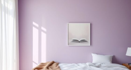
- Incorporate soothing colors like lavender and light blue to help reduce stress and anxiety among seniors.
- Design spaces with textured flooring and clear visual cues to enhance spatial awareness and prevent disorientation.
- Consider cultural influences on color preferences to create a familiar and comfortable environment that promotes well-being for seniors.

Large Print Backlit Keyboard for Seniors,Visually Impaired-High Contrast Black Keys,White LED with Cover,Wired USB 104 Full Size-Easy to Read Big Letters for Macular Degeneration Low Vision (No Glare)
- Large Print Oversized Keys: 4X larger than standard fonts
- White LED Backlit: Bright, even lighting for low light
- One-Click Light Control: Easily turn backlight on/off
As an affiliate, we earn on qualifying purchases.
As an affiliate, we earn on qualifying purchases.
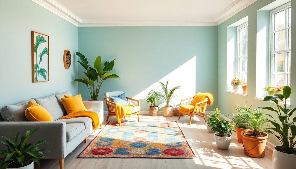
Choose Warm Colors for Comfort and Familiarity
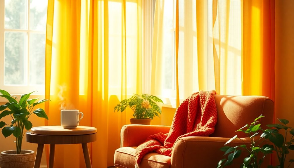
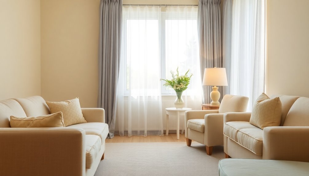
Choosing warm colors for your living space can significantly enhance comfort and familiarity, especially as you age. Warm shades like yellow and gold create a sense of security and can evoke cherished memories, making your home feel inviting. You'll find that these colors not only raise alertness but also inspire creativity, enriching your daily life. Consider using golden tones for wall paint and bright yellow for accent pillows to enhance your environment. Since color perception can change with age, warmer tones can be more comforting. Additionally, artificial lighting can further amplify the cozy effect, creating a nurturing atmosphere that supports your emotional well-being. Embracing warm colors can truly transform your living space into a haven of comfort. Furthermore, the proper color choices can significantly enhance comfort and safety in senior living interiors. Incorporating smart home devices for lighting can further improve the ambiance and accessibility within the home.
Utilize High Contrast for Safety and Visibility
Warm colors can create a comforting atmosphere, but incorporating high contrast in your living space is just as important for safety and visibility. High contrast colors enhance cognitive stimulation, helping you navigate your environment more easily.
By using contrasting colors, you can improve visibility, making it simpler to distinguish objects from their surroundings. This is especially crucial for steps and furniture edges, as contrasting colors reduce tripping hazards.
Aim for a contrast ratio of at least 4.5:1 between text and backgrounds for better readability. Stick to effective color combinations like black and white or yellow and black, and avoid shiny surfaces to minimize glare.
Your space should be safe, accessible, and easy to navigate, promoting independence and comfort. Additionally, age-related changes in vision can heighten uncertainty, making the use of high contrast even more essential for seniors.
Incorporate Soothing Colors to Reduce Stress
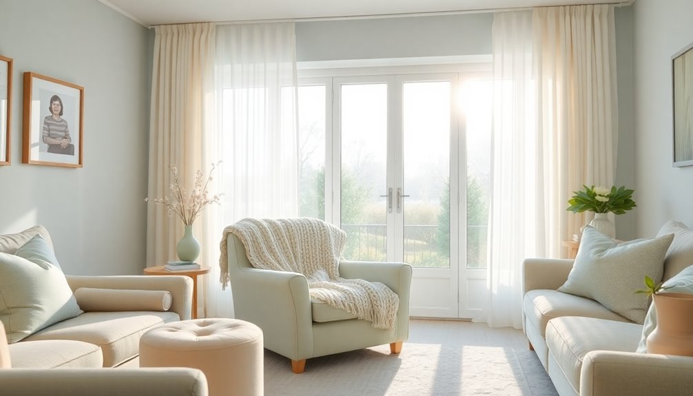
Incorporating soothing colors into your living space can significantly reduce stress and promote relaxation, especially for seniors. Soft colors like lavender and light blue can effectively calm anxiety, making environments more inviting. Cool shades, such as blues and greens, evoke a sense of tranquility, helping to lower stress levels. However, be mindful of seasonal changes; soft blues might feel too cold in winter, so use them wisely. These colors can also enhance cognitive function and improve mood, particularly beneficial for seniors with anxiety or dementia. Additionally, strategic color use can create a more comfortable environment, helping to avoid bright or contrasting colors as they can be overwhelming. Implementing effective relaxation techniques can further enhance the calming effects of your color choices.
Design With Personal Color Preferences in Mind
When designing living spaces for seniors, it's essential to consider their personal color preferences, as these choices can significantly impact their emotional well-being. Familiar colors can evoke positive emotions and create a comforting atmosphere. Contrasting colors help residents differentiate between spaces, adding an extra layer of safety in their environments. Incorporating sensory toys into communal areas can provide engaging stimuli that enhance the overall ambiance.
Be mindful that cultural backgrounds influence how seniors perceive colors, making it crucial to incorporate shades that resonate with them. Remember that aging can affect color perception; warmer hues like yellows and reds are usually more distinguishable.
Allowing residents to personalize their spaces with preferred colors enhances their sense of belonging. Connecting colors to nature or local landscapes can also foster familiarity.
Ultimately, blending personal preferences with functional design promotes both comfort and safety in their living environments.
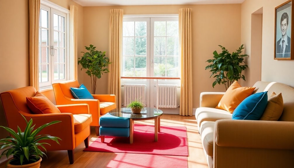
Use Vibrant Colors in Common Areas for Engagement
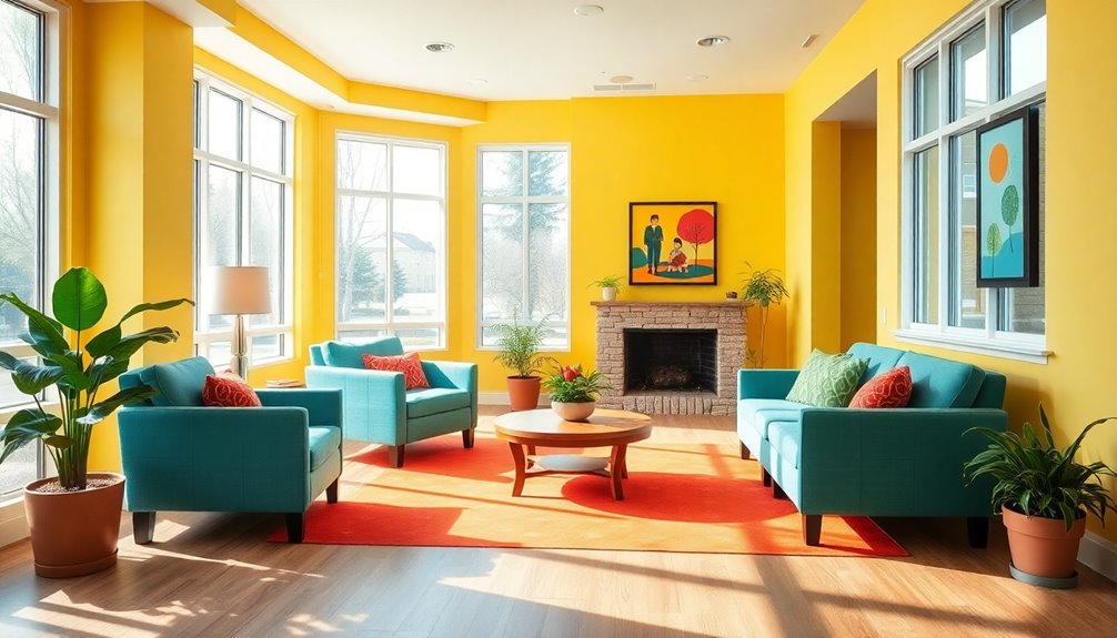
Bright colors can transform common areas into vibrant spaces that foster engagement and interaction among seniors. By incorporating vibrant hues like bright orange and blue, you create an energizing atmosphere that encourages social interaction.
Studies show people generally prefer saturated colors, making them ideal for your design. These colors not only grab attention but also evoke emotional responses, enhancing the overall mood. Additionally, color usage can enhance attention, comprehension, and information retention, which is beneficial for seniors navigating communal spaces. Research indicates that incorporating educational toys can also create a stimulating environment that promotes learning and engagement.
Remember to ensure adequate contrast for accessibility, especially for seniors with visual impairments. While younger seniors might enjoy bold colors, consider that older individuals may lean toward more subdued tones.
Ultimately, vibrant colors should be woven into a broader design strategy, enhancing both the aesthetic and functionality of communal spaces.
Select Cool Colors for Relaxation Spaces
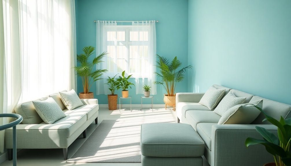
While vibrant colors can energize social areas, cool colors play a significant role in creating serene relaxation spaces.
Blues and greens are perfect choices for bedrooms and lounges because they promote calmness and enhance sleep quality. These colors help reduce anxiety, providing a peaceful environment where you can truly unwind. Incorporating soft blue connects you to nature, which is especially soothing in urban settings. You'll also find that cool colors create visual comfort, minimizing fatigue and enhancing your overall mood. Additionally, studies show that environments with adaptogenic properties can further aid in stress reduction, contributing to a more restful atmosphere.
To boost relaxation further, think about combining these colors with soft lighting and comfortable furniture. By designing spaces with cool hues, you'll cultivate a sanctuary that supports your mental well-being and tranquility.
Avoid Bold Patterns to Minimize Confusion
To create a calming environment, it's essential to avoid bold patterns that can confuse and disorient. Bold designs may appear as moving objects, leading to misinterpretation and attempts to interact with non-existent items. This confusion can make navigating spaces difficult, especially for seniors who already struggle with cognitive overload. Highly contrasting patterns on floors might be mistaken for changes in elevation, increasing the risk of falls. To promote clarity, opt for subtle, low-contrast patterns or solid colors. Clear visual cues and consistent design elements help reduce anxiety and enhance spatial orientation, as suitable colours and patterns are crucial for creating enabling environments.
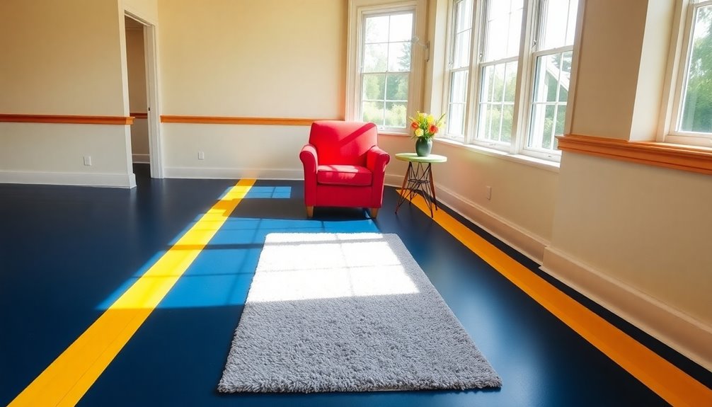
Create Clear Wayfinding Systems With Color
Creating clear wayfinding systems with color can significantly enhance navigation for seniors. As color perception changes with age, incorporating high-contrast colors is essential. Aim for an LRV difference of over 30 between surfaces to ensure effective differentiation. Proper nutrition is also crucial for maintaining cognitive function, which can aid in better navigation and understanding of the environment.
Use bold colors, like red or green, to designate specific zones, making it easier to navigate residential spaces. Prominent signage with large fonts and universal icons aids recognition and understanding. In the context of high-traffic zones, these color-coded systems can help seniors and dementia patients safely navigate their environment.
In complex environments, like long-term care facilities, clear visual cues help seniors identify hazards, reducing the risk of tripping. By integrating these color strategies into design, you can promote independence and comfort for seniors, ensuring they feel safe and confident in their surroundings.
Implement Textures and Colors for Spatial Awareness

Implementing textures and colors in living spaces can significantly enhance spatial awareness for seniors, making their environments more navigable and engaging. By incorporating a variety of textures, you create a multisensory experience that helps reduce disorientation.
Use artificial guidelines with different textures and colors on floors to aid navigation. It's crucial to select materials that are easy to navigate, like smooth flooring, to ensure safety. Additionally, air quality can significantly impact seniors' well-being, making it essential to maintain a clean environment.
Additionally, consider using warm colors like yellow and orange, which are easier to recognize. High-contrast colors improve visibility, helping seniors distinguish between room elements. Placing these colors centrally enhances attention, while good lighting boosts color perception.
Always ensure that textures don't create tripping hazards, keeping the space safe and comfortable. Research indicates that high color visibility can enhance safety and improve quality of life for older adults in residential settings.
Consider Cultural Influences on Color Choices

While color preferences can be deeply personal, they're also shaped by cultural influences that can significantly affect how seniors perceive their environments. Understanding these influences is key to creating comfortable and safe spaces.
For instance, in East Asia, white symbolizes purity, while in the West, it often represents happiness. Similarly, red is seen as a color of good fortune in China, contrasting with its danger association in Western cultures. Research indicates that elderly individuals are more susceptible to depression due to physical and psychological changes, making the choice of color even more crucial.
As you design for seniors, consider their cultural backgrounds and how they influence color preferences. Opt for softer, muted tones that align with their experiences.
Frequently Asked Questions
How Can Color Choices Affect Seniors' Mood and Behavior?
Color choices can significantly affect your mood and behavior.
For instance, soft blues and greens might make you feel calm and relaxed, while vibrant reds and oranges can energize you.
If you're surrounded by familiar colors, it can evoke feelings of comfort and belonging.
On the other hand, harsh colors might lead to anxiety or overstimulation.
What Role Does Lighting Play in Color Perception for Seniors?
Imagine flipping a light switch and instantly feeling like you've stepped into a cozy café.
Lighting plays a crucial role in how you perceive colors, especially as you age. Warmer tones create a comforting atmosphere, while cooler lights enhance visibility.
Good lighting helps you detect obstacles and reduces glare, improving your overall experience.
Are There Specific Colors That Aid in Memory Recall for Older Adults?
Certain colors can definitely aid in memory recall for older adults.
Red, for instance, grabs attention and boosts memory retention, especially for detailed tasks.
Blue, on the other hand, promotes calmness and enhances cognitive skills, though it's less effective for memory recall.
Warm colors like yellow also increase arousal, potentially enhancing memory.
Using contrasting colors can improve visual perception, making it easier for you to remember and recognize important objects or information.
How Can Color Schemes Be Adjusted for Different Cognitive Abilities?
You might think color schemes are just for decoration, but they can seriously impact cognitive abilities. By adjusting colors, you cater to different cognitive levels.
For instance, warm colors can spark excitement, while cool tones promote calmness. You'll find that contrasting colors help with navigation, making spaces easier to move through.
Plus, colors can evoke memories, so choosing the right palette can really enhance comfort and engagement.
Who knew such a simple thing could make such a difference?
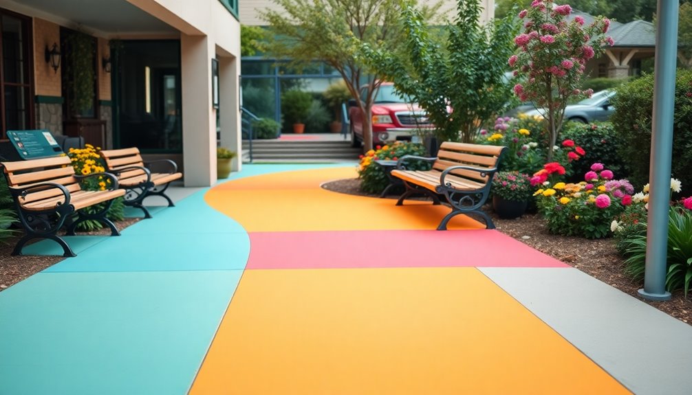
What Are the Best Colors for Outdoor Spaces in Senior Living?
When choosing colors for outdoor spaces in senior living, focus on earthy tones like greens and browns to create a calming environment. These hues not only blend seamlessly with nature, but they also evoke a sense of stability and comfort, which is especially important for seniors. Incorporating bright accents can enhance the space without overwhelming the senses, making it both visually appealing and soothing. Ultimately, these elements contribute to essential color choices for elderly homes, fostering an atmosphere that promotes relaxation and well-being.
Incorporate contrasting colors to help differentiate areas, enhancing navigation. Playful pastels can add a lively touch without overwhelming the senses.
You should also consider lighter shades, as they reflect sunlight and make spaces feel brighter.
Ultimately, aim for a harmonious palette that connects with nature, promoting comfort and enjoyment.
Conclusion
By thoughtfully incorporating color into your environment, you can significantly enhance the safety and comfort of seniors. From warm hues that evoke familiarity to high-contrast designs that ensure visibility, every choice matters. Have you ever considered how the right colors can transform a space into a haven? Embrace these color tricks to create a welcoming atmosphere that not only meets the needs of seniors but also enriches their daily lives. Your efforts can truly make a difference!
References
- https://blog.cmbaarchitects.com/applying-color-psychology-in-senior-living-interiors
- https://www.datopian.com/playbook/dojo/writing-a-data-oriented-blog-post
- https://www.mdpi.com/2071-1050/16/23/10251
- https://www.joeteacher.org/uploads/7/6/3/0/7630382/turabian_manual_9th_ed.pdf
- https://intapi.sciendo.com/pdf/10.2478/alfa-2023-0021
- https://jbryantboyd.com/blog/home-remodeling/comfort-through-color-selecting-a-soothing-color-scheme
- https://www.familyresourcehomecare.com/lighting-for-elderly/
- https://www.hirshfields.com/color-inspiration/understanding-color/using-color/
- https://waupaca.extension.wisc.edu/files/2021/02/Responding-to-Color-as-We-Age-Lesson.pdf
- https://www.stronggo.com/why-enhance-tactile-warning-systems-through-color-contrast