
To create calming bedrooms, choose soft neutrals like beige, taupe, or warm grey to promote tranquility. Incorporate serene blues and aquas for a invigorating feel, layering shades for depth. Muted greens like sage and moss bring a natural vibe, while warm pastels like blush or peach add cozy charm. Enhance these palettes with tactile textures and gentle lighting for a nurturing space. Keep exploring different combinations to craft your perfect tranquil retreat.
Key Takeaways
- Use soft neutrals like beige, taupe, and warm greys to create a calming and spacious bedroom environment.
- Incorporate serene blues and aqua tones for a tranquil, refreshing atmosphere with layered shades for depth.
- Choose muted greens such as sage and moss to bring natural, relaxing vibes and promote well-being.
- Opt for warm pastels like blush pink, peach, and apricot to add cozy, inviting accents and soften the space.
- Enhance calming palettes with textured elements and soft lighting to create a soothing, multi-sensory retreat.
Soft Neutrals for a Gentle Atmosphere

Soft neutrals create a calming and welcoming atmosphere in any space. When you choose these shades, you’re tapping into color psychology, which influences mood and relaxation. Soft beige, taupe, and warm greys help minimize visual clutter, making your bedroom feel more spacious and peaceful. To enhance this effect, consider your bedroom lighting; natural light amplifies the gentle tones, while warm, soft lighting complements the neutral palette. Avoid harsh or overly bright bulbs, as they can disrupt the soothing environment you’re aiming for. Instead, opt for dimmable lights or lamps with warm bulbs to create a cozy ambiance. Incorporating contrast ratio considerations can further improve the perceived depth and clarity of your space, ensuring a serene visual experience. This combination of soft neutrals and thoughtful lighting fosters tranquility, making your bedroom a true retreat for rest and relaxation.
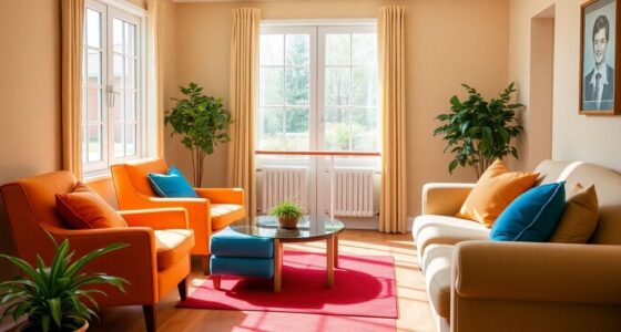
Serene Blues and Aqua Tones

Serene blues and aqua tones evoke a sense of calm and refreshment, making them perfect choices for creating a tranquil bedroom environment. With monochromatic schemes, you can layer different shades of blue and aqua, adding depth without overwhelming the space. Consider pairing light aquas with deeper navy accents to evoke serenity and sophistication. An accent wall idea using a bold blue hue can anchor the room and serve as a focal point, enhancing the calming atmosphere. Keep the other elements in soft neutrals or whites to maintain a peaceful vibe. These colors naturally evoke water and sky, promoting relaxation and restful sleep. Choosing eco-friendly paints and sustainable materials further supports sustainable living and can reduce your environmental impact. Whether you choose a subtle palette or a more vibrant aqua, this color family helps craft a soothing retreat you’ll love unwinding in.
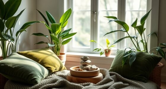
Muted Greens for a Natural Feel
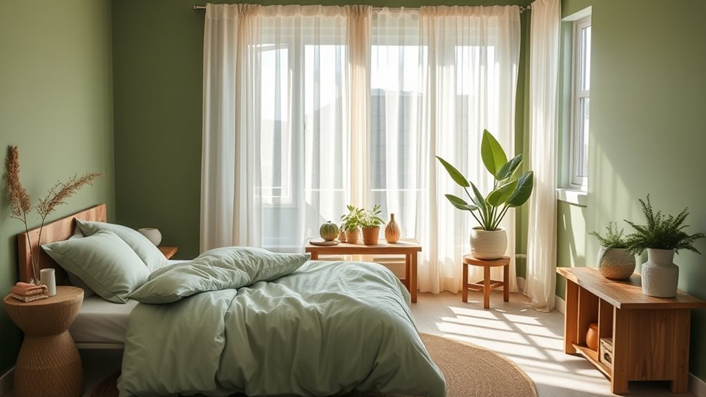
Muted greens bring an invigorating, natural feel to any space, creating a calming environment that connects you with the outdoors. These shades work beautifully with botanical accents, adding a touch of lushness without overwhelming the senses. When combined with minimalist design, muted greens keep your bedroom simple and uncluttered, emphasizing clean lines and subtle textures. This color palette fosters relaxation, making it easier to unwind after a long day. You can pair muted greens with natural wood tones or soft neutrals to enhance the organic vibe. The result is a serene retreat that promotes tranquility and balance. Whether you opt for sage, moss, or olive tones, muted greens help establish a peaceful atmosphere grounded in nature. Additionally, understanding the psychological effects of colors can enhance your ability to create a space that truly supports relaxation and well-being.
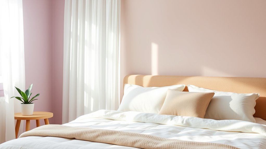
Warm Pastel Shades for Cozy Comfort
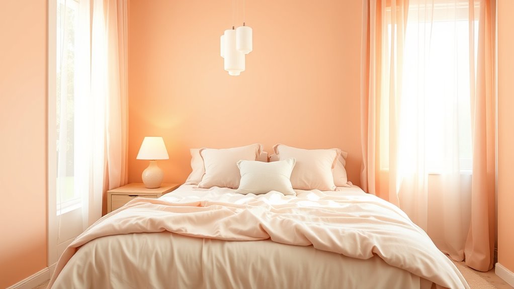
Warm pastel shades create an inviting and cozy atmosphere that instantly makes your space feel more welcoming. These soft hues, like blush pink, peach, and gentle apricot, work beautifully with decorative wall accents to add subtle charm. Incorporate warm pastels into your bedding color schemes to enhance comfort and serenity. Light-colored bedding in these shades creates a soothing backdrop that promotes relaxation. You can also add textured pillows or throws in similar tones to deepen the cozy vibe. These shades reflect soft, natural light, making your bedroom feel brighter and more nurturing. Additionally, choosing calming color palettes can help reduce stress and create a peaceful environment. Overall, warm pastel shades help craft a space where you feel calm and comfortable, perfect for unwinding after a long day.
Combining Calming Colors With Textural Elements

Adding textural elements to calming color palettes enhances the sensory experience of your space, making it more inviting and personalized. By incorporating textural contrasts, you create visual interest and depth, preventing your bedroom from feeling flat. Use lighting techniques like soft, diffused lighting to highlight textures and evoke serenity. For example, pair smooth, pastel walls with plush bedding or woven rugs for tactile variation. Consider mixing materials such as linen, velvet, and wood to deepen the calming atmosphere. Incorporating personal development principles can also help you cultivate a mindful environment that promotes relaxation and well-being. Here’s a simple guide:
| Textural Element | Lighting Technique |
|---|---|
| Soft linens | Warm, ambient lighting |
| Woven rugs | Accent lighting for subtle shadows |
| Velvet throws | Dimmable lights for cozy glow |
This combination nurtures a serene, multi-sensory retreat.
Frequently Asked Questions
How Do Calming Colors Impact Sleep Quality?
Calming colors positively impact your sleep quality by leveraging color psychology to promote relaxation. When you surround yourself with soothing hues like soft blues or gentle greens, your mind eases into a restful state, helping you fall asleep faster and enjoy deeper sleep. These colors support sleep enhancement by reducing stress and anxiety, creating a tranquil environment conducive to restorative rest. Choosing calming colors is a simple way to improve your overall sleep experience.
Which Colors Are Best for Small Bedrooms?
In small bedrooms, soft shades like pale blue work wonders. Imagine transforming your space with a minimalist decorating style, where calming color psychology enhances tranquility. Blue’s soothing effect makes your room feel larger and more peaceful. You’ll find that choosing light, neutral colors not only maximizes space but also creates a calming atmosphere perfect for rest, helping you unwind at the end of each day.
Can Calming Palettes Be Used in Children’s Bedrooms?
Yes, calming palettes work perfectly in children’s bedrooms. You can choose nursery color psychology to create soothing environments that promote relaxation and sleep. Gender neutral bedroom palettes with soft greens, blues, or lavenders are versatile and calming. These colors help your child feel safe and comfortable, supporting healthy development. By selecting these gentle shades, you foster a peaceful space that encourages rest and creativity for your little one.
How Do Lighting Choices Affect Calming Color Schemes?
Imagine soft sunlight filtering through your window, bathing the room in gentle warmth. Lighting fixtures and natural light greatly influence your calming color scheme by enhancing or muting its serenity. Warm, dimmable lights complement cool or pastel hues, creating a tranquil atmosphere. Natural light brings out subtle shades, making your space feel open and peaceful. Thoughtful lighting choices ensure your calming palette fosters relaxation and comfort in your bedroom.
Are There Any Colors to Avoid in Bedroom Design?
You should avoid bold, overly vibrant colors like bright reds or intense oranges, as they can disrupt sleep and increase energy levels. According to color psychology, these hues may cause restlessness. Also, steer clear of high-gloss paint finishes, which reflect light and create glare, making the space less calming. Instead, opt for soft, muted tones with matte or eggshell finishes that promote relaxation and peacefulness in your bedroom.
Conclusion
Choosing calming colors for your bedroom can truly transform your space into a peaceful retreat. Remarkably, studies suggest that soft, soothing hues can even lower stress levels and improve sleep quality. So, don’t hesitate to experiment with gentle neutrals, tranquil blues, or muted greens. When you combine these colors with cozy textures, you create a sanctuary that feels both relaxing and inviting—making it easier to unwind and recharge every day.