
To brighten a room with accent colors, choose vibrant hues like Tomato Tango, Lemon Zest, or Aqua for focal points that energize the space. Use these bold shades sparingly on one wall, accessories, or textiles to create visual interest without clutter. Balance colorful accents with neutral backdrops that reflect light, and place lighter colors opposite windows to boost brightness. Keep these tips in mind to add depth and vibrancy—you’ll find even more ideas if you continue exploring.
Key Takeaways
- Use bright, bold accent colors on one wall or in accessories to create focal points that enhance room brightness.
- Limit accent colors to about 10% of the space to add visual interest without overwhelming the room.
- Position lighter, reflective accent hues opposite windows or in areas with natural light to amplify brightness.
- Incorporate vibrant textiles, rugs, or decor items with accent colors to reflect light and make the space feel more open.
- Balance bold accents with neutral backgrounds to create contrast and maximize the effect of light reflection.
Choosing the Right Bright Accent Colors
When selecting bright accent colors, it’s important to take into account how they’ll interact with your existing space. Your wall color sets the foundation for choosing the right accent hues, whether you want them to contrast or complement. Bright accent colors like Tomato Tango, Lemon Zest, or Aqua can create eye-catching focal points that energize your room. Consider using vibrant hues on one wall or in accessories to add lively energy without overwhelming the space. Combining contrasting colors, such as yellow with navy or coral with teal, boosts visual interest and prevents dullness. Small doses of bold accent colors in decor or artwork also brighten the ambiance subtly. Choosing accent colors that reflect natural light, like warm yellows or soft corals, helps amplify brightness and creates a cheerful atmosphere. Additionally, understanding the seasonal variations can help you select colors that remain vibrant and appealing year-round. Research shows that personality traits can influence color preferences, so selecting hues that align with your personality may enhance your comfort and satisfaction with your space. Incorporating Cultural Intelligence insights when choosing colors can also ensure your decor resonates well with your environment and personal background. Moreover, considering lighting conditions can significantly impact how your chosen bright accents appear in your space. Paying attention to juice cleansing practices can help you select colors that promote a sense of vitality and well-being, enhancing the overall energy of your decor.
Creating Focal Points With Bold Hues
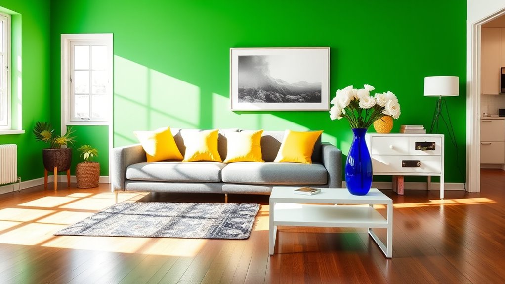
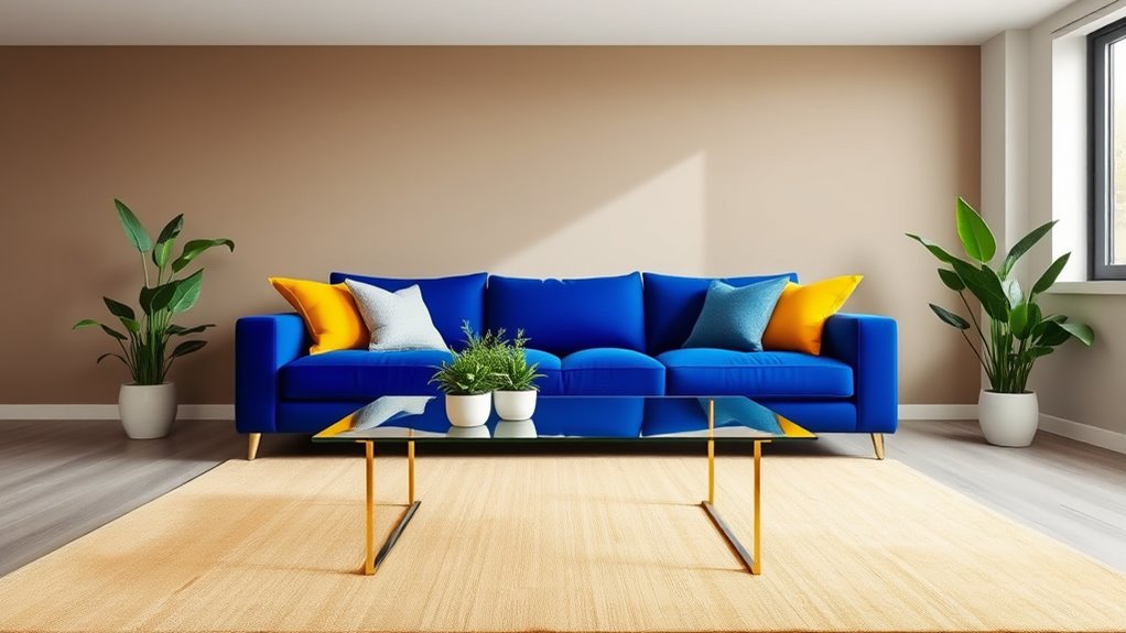
To create a striking focal point, pick a bold accent color like Tomato Tango CSP-1145 and apply it strategically. Focus on key features such as a single wall, fireplace, or headboard to draw attention without overwhelming the space. Balance this bold hue with neutral surroundings to make the focal pop and keep the room harmonious. Incorporating self watering plant pots can also introduce natural elements and vibrant greenery that complement your farmhouse bedroom design scheme. Additionally, choosing the right projector technology can enhance visual interest in a home theater setup, further elevating the room’s overall appeal. Being mindful of relationship dynamics can help create a more cohesive and inviting environment, both visually and emotionally, in your space. Moreover, understanding current cultural exploration in Jakarta can inspire unique decor elements that reflect local heritage and add depth to your interior design.
Choosing Bold Accent Colors
Choosing bold accent colors is a powerful way to create focal points that instantly draw attention and add visual interest to a room. For example, a bold accent color like Tomato Tango CSP-1145 on one wall can create a striking feature that energizes the space. To keep the room balanced, pair this vibrant hue with white paint or neutral tones on other walls, making the accent color stand out even more. Using bold accent colors in small doses—such as a single wall or through accessories—maximizes impact without overwhelming the room. High-contrast combinations, like a vivid hue against white, amplify the focal point and add depth. This approach helps you brighten your space while maintaining a cohesive, inviting atmosphere. Incorporating color psychology can also enhance the mood you want to create in your room, guiding your choice of accent hues. Additionally, selecting unique and wicked planters can further elevate the visual appeal, adding an unexpected element of style and creativity. Understanding color contrast principles can help you achieve more striking and balanced designs. Moreover, effective interior design preparation ensures that your chosen accents complement the overall space harmony. Consulting with interior design experts can provide valuable insights into effective color pairings and layout strategies.
Strategic Placement Techniques
Strategic placement of bold accent colors can considerably enhance a room’s focal points and overall visual appeal. When you apply accent colors thoughtfully, they naturally draw attention to specific areas, like a single wall painted in vibrant red or deep blue. Incorporating principles of visual hierarchy ensures that accent colors are used effectively to guide the viewer’s eye and emphasize key features. Use strategic placement to highlight architectural features such as a fireplace surround or built-in shelving, guiding the eye to key zones. Incorporate striking hues into small decorative accessories like pillows or artwork to add energetic pops of color without overwhelming the space. Position these accent colors at eye level or in areas with natural light to maximize their impact and brighten the room. Balancing bold hues with neutral tones ensures your accent colors emphasize focal points effectively, creating a lively, harmonious environment. Additionally, understanding the use of color psychology can help in selecting hues that evoke specific moods and enhance the room’s atmosphere. Recognizing how visual hierarchy influences perception can further refine your placement strategy for a stunning effect. Incorporating antique accents can also add depth and personality to the room, which can be further amplified by color contrast techniques to make elements stand out more vividly.
Balancing Focal and Neutral
Balancing bold accent hues with neutral tones is essential for creating a harmonious and visually appealing space. By focusing a vibrant hue on a single focal point, like a wall or decor piece, you draw attention without overwhelming the room. This focal point becomes the room’s highlight, while neutral tones on surrounding walls or furniture keep the space grounded and calming. Incorporating color psychology can further enhance the restorative atmosphere by promoting overall well-being. Limiting the use of bold colors to 10-30% of the room prevents clutter and chaos, maintaining a balanced look. Incorporate accent colors in accessories or artwork near natural light sources to maximize brightness and energy. When you strike this balance, your room will feel lively, inviting, and thoughtfully designed—highlighting your style without sacrificing harmony. Additionally, considering natural elements like textures and materials can deepen the cozy farmhouse vibe and foster a sense of comfort.
Balancing Color With Neutral Backdrops
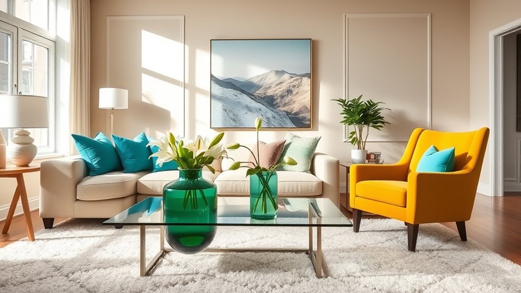
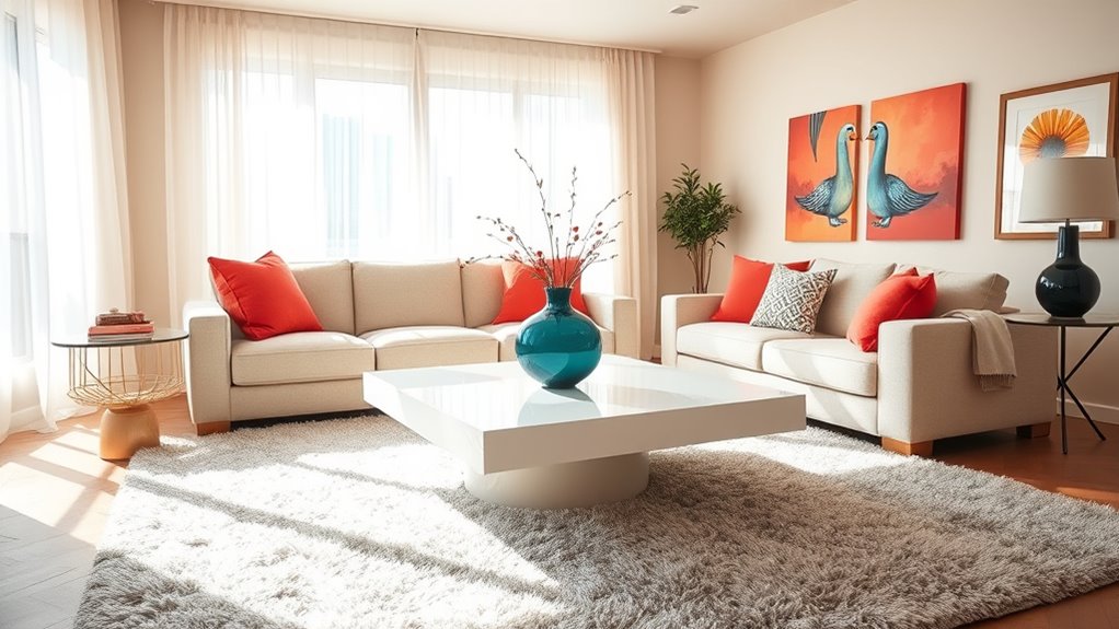
Neutral backdrops like beige, gray, or off-white walls create a versatile foundation that allows accent colors to stand out without overwhelming the space. By limiting accent colors to about 10% of the room, you guarantee they add visual interest while maintaining harmony with the neutral background. Using alternative investments like gold accents or decor can also subtly enhance the room’s appeal. Neutral backdrops also reflect natural and artificial light, amplifying the brightness of bold accent colors and making your space feel more open and inviting. Combining warm neutrals with cool or vibrant accents creates a harmonious contrast that enhances overall brightness without clutter. Additionally, a neutral backdrop offers flexibility, making it easy to update accent colors over time for a fresh, dynamic look. This balance keeps your room lively yet cohesive, highlighting your chosen accent colors effectively.
Incorporating Accents in Textiles and Accessories
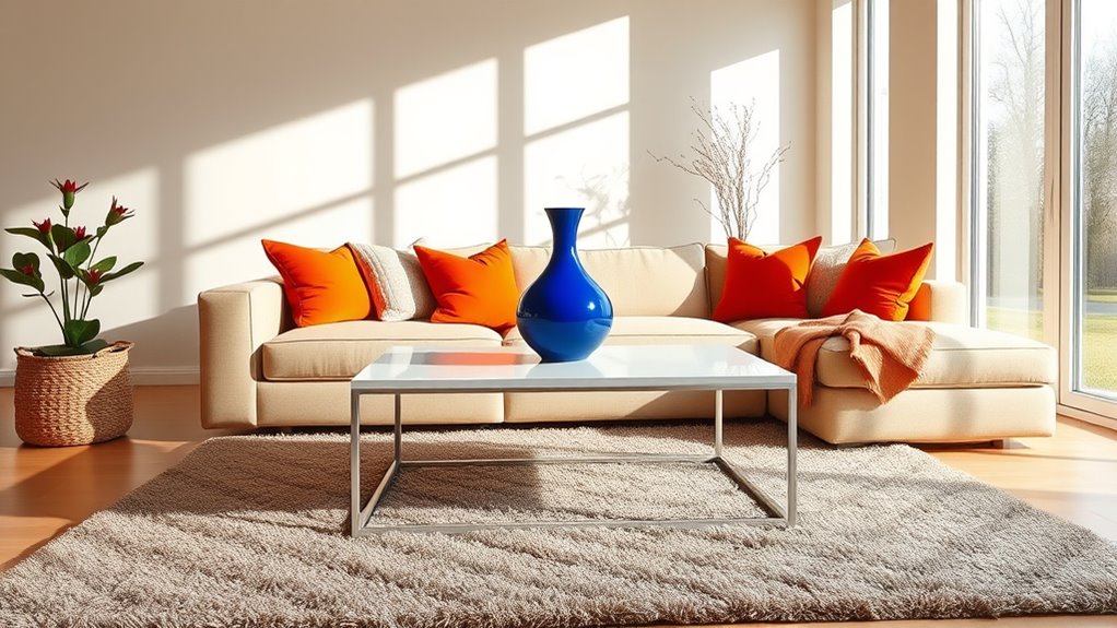
Incorporating accent colors into textiles and accessories is an effective way to add visual interest and brighten your space. You can achieve this by selecting textiles like throw pillows, rugs, and curtains that feature bold or vibrant hues. These accent colors draw the eye and create focal points within the room.
Accessories such as vases, picture frames, and lamps in accent shades further enhance the overall look. To add depth and dimension, choose patterned fabrics that combine your main palette with these accent hues.
Introduce these colors gradually through small decor items to keep the space balanced. Remember, according to the 60-30-10 rule, accent colors should make up roughly 10% of your overall color scheme, ensuring a lively yet harmonious environment.
Using Color Placement to Maximize Light Reflection
You can boost natural light in your space by placing lighter, reflective colors on walls opposite windows. Using strategic color placement on features like trim or furniture helps redirect attention and enhances brightness.
Bright ceilings and glossy finishes further bounce light around, making your room feel more open and inviting.
Strategic Wall Placement
Have you ever noticed how the placement of your walls can influence the brightness of a room? Choosing the right spots for accent walls can make a big difference.
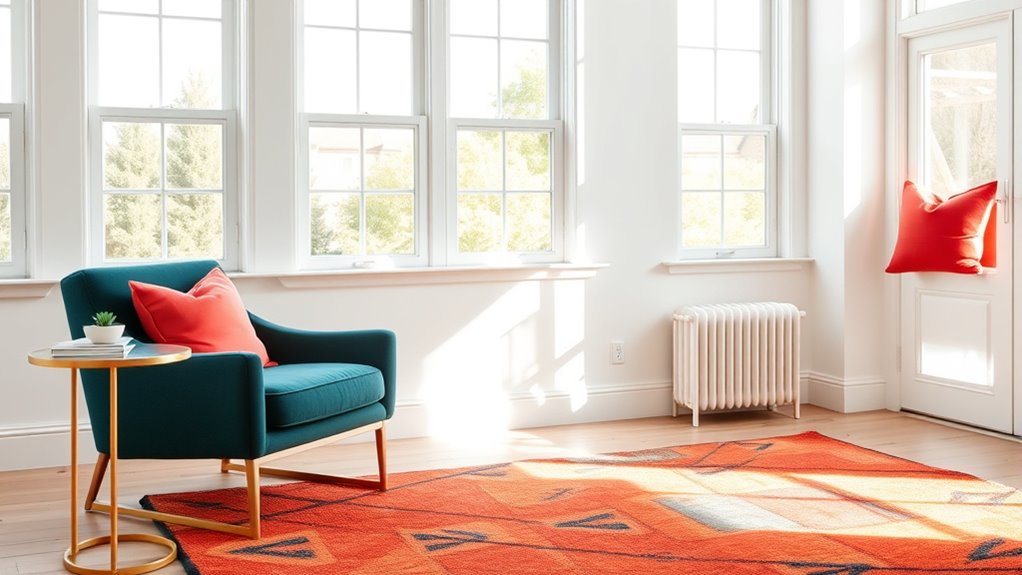
Position a light-colored accent wall opposite a window to reflect natural light and create a sense of openness. Bright accent colors on a single wall can draw attention and bounce light throughout the space.
Painting trims and moldings in high-gloss or semi-gloss finishes enhances their reflectivity, helping light reach darker corners. If natural light is limited in certain areas, placing accent walls strategically can distribute brightness evenly and prevent dim spots.
Incorporating reflective surfaces or glossy finishes on these walls maximizes light reflection, making your room feel brighter, larger, and more inviting.
Reflective Surface Use
Using reflective surfaces alongside carefully placed accent colors can considerably boost your room’s brightness. To maximize light reflection, consider these strategies:
- Place mirrors or glossy paint finishes on walls and ceilings to bounce light throughout the space, enhancing both natural and artificial illumination.
- Use high-sheen or semi-gloss paints on accent walls, which increase reflection and make your room appear larger and more open.
- Position bright accent colors near windows or light sources to reflect light into shadowed areas, amplifying their effect.
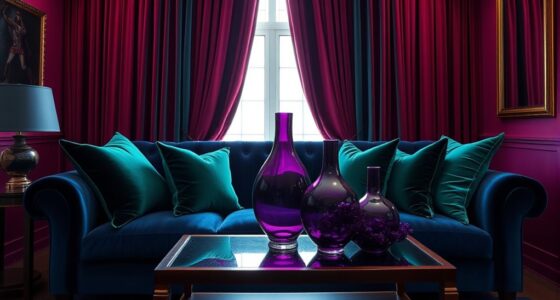
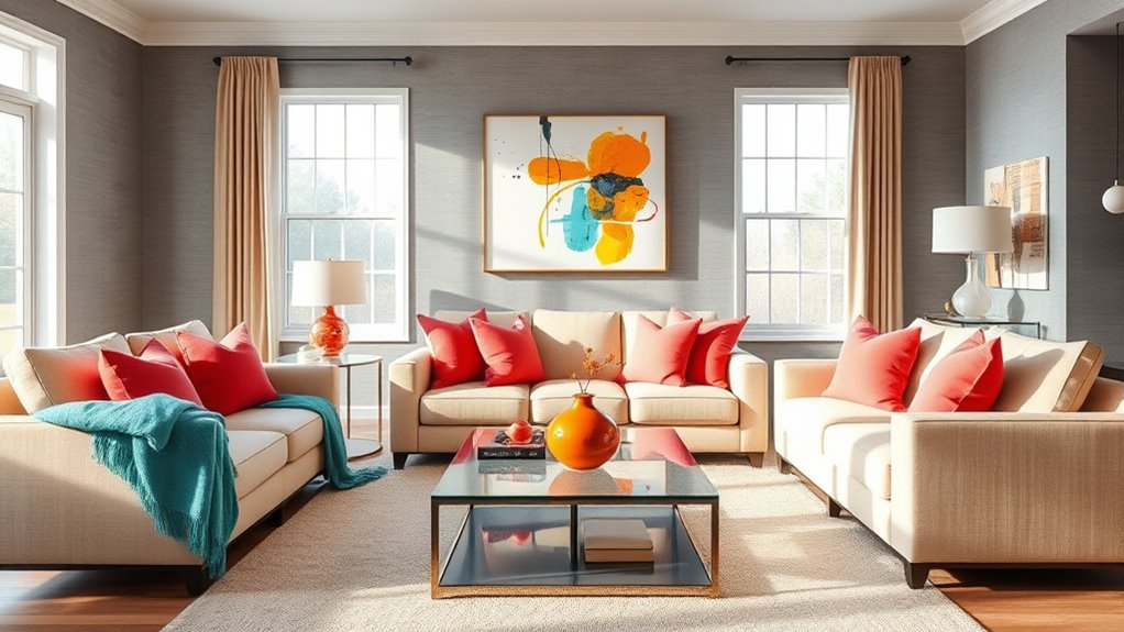
Combining Multiple Accent Colors for Dynamic Impact
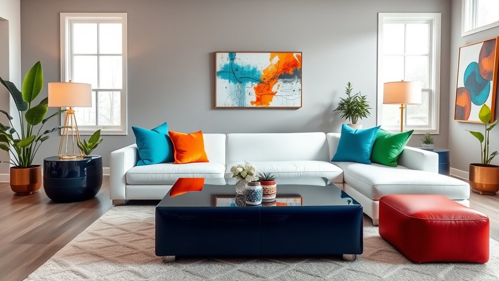
Combining multiple accent colors can create a lively and engaging space when done thoughtfully. Start by choosing accent colors that are adjacent on the color wheel, like blue and green, for a harmonious yet vibrant look. Alternatively, contrasting colors such as coral and teal add energy and visual interest without feeling chaotic.
Incorporating different shades within a single color family, like light and dark yellows, adds depth and dynamic brightness. Distribute these accent colors across various decor elements—cushions, artwork, accessories—to maintain balance and prevent overwhelming the room.
Following the 60-30-10 rule with multiple accent colors helps create a cohesive environment that feels lively and well-coordinated. This approach ensures your space is bright, dynamic, and visually compelling.
Practical Tips for Applying Accent Colors Effectively
Applying accent colors effectively involves strategic placement and moderation. To enhance your interior design, focus on using accent colors on no more than 10% of the room’s surface area, preventing visual overload.
Use accent colors on no more than 10% of a room to boost style without overload.
Follow the 60-30-10 rule by reserving 10% of the color scheme for bold hues that add interest. Incorporate accent colors through accessories like pillows, artwork, or decorative objects, allowing quick updates without repainting.
To maximize impact, choose contrast-rich accent colors that complement the dominant wall color, making the accents stand out. Use these accents on focal points such as a single wall, trim, or a standout piece of furniture.
This approach ensures your accent colors brighten the room while maintaining harmony in your interior design.
Frequently Asked Questions
What Color Makes a Room Look Brighter?
You wonder what color makes a room look brighter. Bright, warm hues like sunny yellows and lively oranges reflect more light, instantly boosting brightness.
Light neutrals such as soft whites with warm undertones bounce light around, creating an airy feel. Pastel shades and light greens also enhance light reflection.
Vibrant accent colors add energy. Using glossy finishes on walls and trim amplifies this effect, making your space feel more luminous and inviting.
What Is the Accent Color Rule?
The accent color rule guides you to use about 10% of a room’s color scheme for bold, vibrant accents. You should place these in accessories, decor, or small furniture pieces to add personality without overwhelming the space.
Balance the accents with a dominant color covering around 60%, like walls or large furnishings. Choosing harmonious or complementary colors guarantees your room looks balanced, inviting, and visually interesting.
What Color Should I Paint a Room With Low Light?
When choosing a color for a low-light room, you should pick warm, light shades like pale yellow, soft beige, or gentle green. These colors reflect light and make the space feel brighter and more open.
Stay away from dark or cool tones like navy or charcoal, which absorb light.
Add reflective surfaces or glossy finishes to boost brightness further, and consider an accent wall in a light hue to add visual interest.
How Many Accent Colors Should a Room Have?
You’re wondering how many accent colors to use in a room. To keep your space balanced, stick to one to three accent colors. This creates visual harmony without overwhelming the room.
Focus on a single bold accent color, complemented by analogous shades, for a polished look. Avoid using more than three to prevent clutter and dissonance, ensuring your room remains inviting and cohesive.
Conclusion
By thoughtfully choosing and placing accent colors, you can transform your room into a vibrant, inviting space. Think of these hues as a splash of sunshine—brightening even the gloomiest corners. Don’t be afraid to experiment with bold shades and playful combinations, just like mixing colors on an artist’s palette. With a little creativity and confidence, you’ll turn your room into a lively haven that reflects your unique style and personality.