
Understanding seasonal paint colors helps you create spaces that influence your mood positively. Spring hues like pastels and soft greens promote calmness and focus, while vibrant summer tones energize and uplift. Autumn earthy shades add warmth and comfort, and winter cool tones bring serenity. Choosing colors aligned with each season can boost your well-being and reflect your personality. Explore further to discover how to incorporate these palettes and textures for perfectly balanced interiors.
Key Takeaways
- Spring colors like pastels and greens promote calmness, relaxation, and reduce stress, ideal for creating open, soothing spaces.
- Summer hues such as yellows, oranges, and vibrant reds energize rooms, enhancing vitality and uplifting moods.
- Autumn tones like earth browns, ochre, and textured materials evoke warmth, comfort, and nostalgic feelings.
- Winter shades including blues, grays, and whites foster calmness and balance, especially when paired with warm accents.
- Incorporating seasonal colors with appropriate textures and materials enhances emotional well-being and visual harmony in interiors.
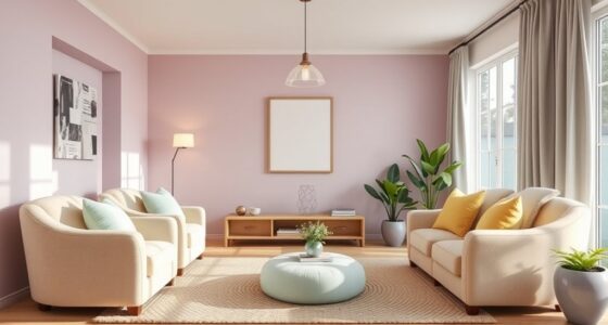
The Impact of Spring Colors on Mood and Space
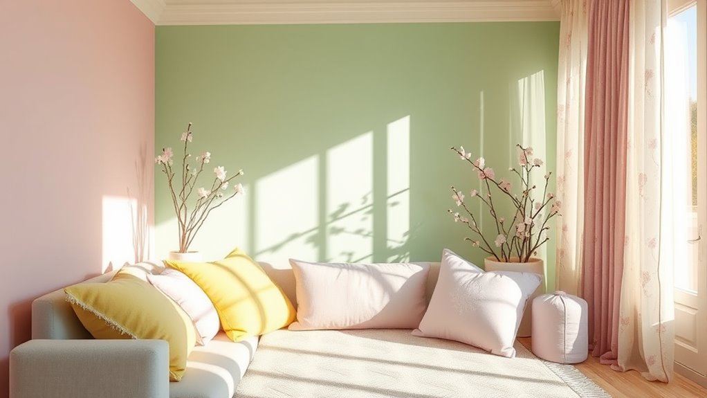
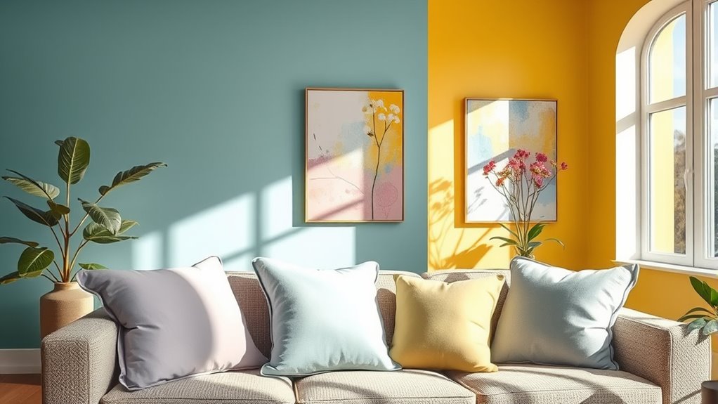
Spring colors have a powerful effect on both mood and space, effortlessly uplifting your environment. Light, airy pastels like soft greens and pinks create a calming atmosphere, helping to reduce anger and aggression. Bright yellows and pastel tones boost serotonin levels, promoting happiness and mental clarity. When you incorporate these hues indoors, they make rooms feel more open and inviting, thanks to their visual expansion qualities. These colors also minimize visual clutter, supporting mental focus and relaxation. Natural spring greens, in particular, are linked to lower depression and stress. Additionally, incorporating color psychology principles into your interior design can enhance your emotional well-being. By choosing simple, balanced palettes dominated by green and soft pink, you foster emotional well-being while creating a tranquil, rejuvenating space that aligns with your natural rhythms. Colors influence human emotions and perception, making thoughtful choices in your color palette a key aspect of mental health.
Embracing Summer Hues to Boost Energy and Vitality
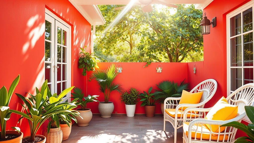
Summer hues, with their warm and vibrant tones, naturally boost energy and liveliness in your environment. Colors like yellow, orange, and red stimulate brain areas that regulate mood, increasing vitality, enthusiasm, and focus. Bright yellows specifically promote serotonin production, enhancing happiness and mental clarity. Greens and blues evoke feelings of rejuvenation and vitality, encouraging outdoor activity and active behaviors. Physiologically, warm colors trigger a fight-or-flight response, raising heart rate and adrenaline, which heightens alertness and physical readiness. The brain is wired to notice contrasting colors for survival purposes, such as identifying food or danger. Using these colors in your space creates a perception of warmth, fostering energetic and active moods. Additionally, emotional response to these colors can influence your overall mood and motivation, making your environment more stimulating and uplifting during the warmer months.
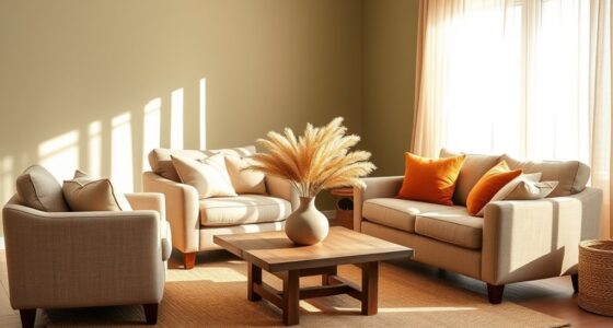
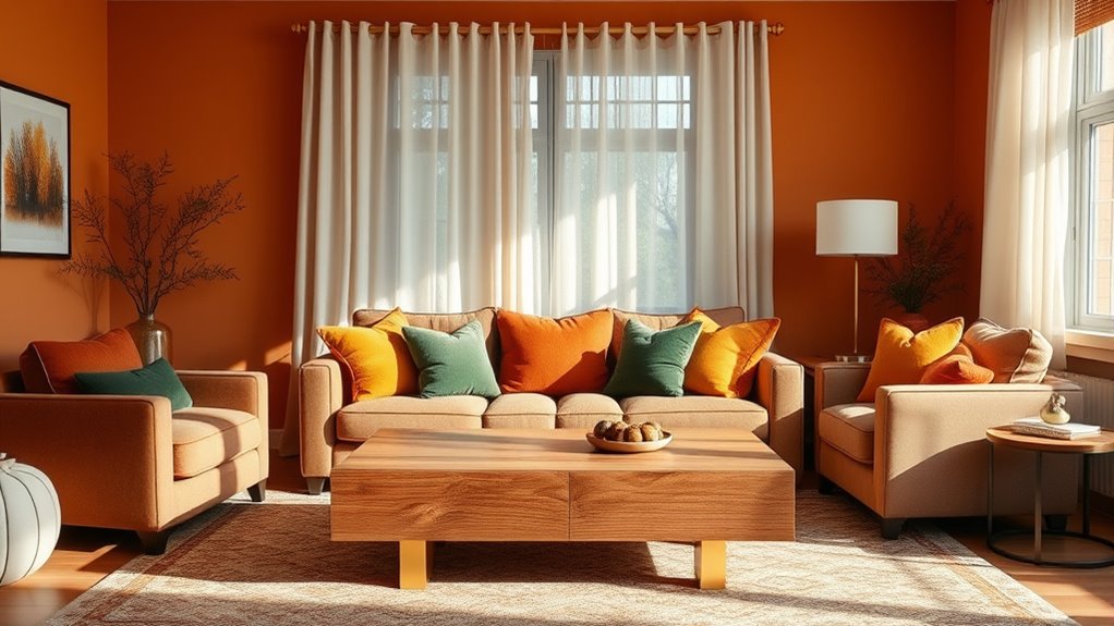
Autumn Palette: Creating Warmth and Comfort in Your Environment
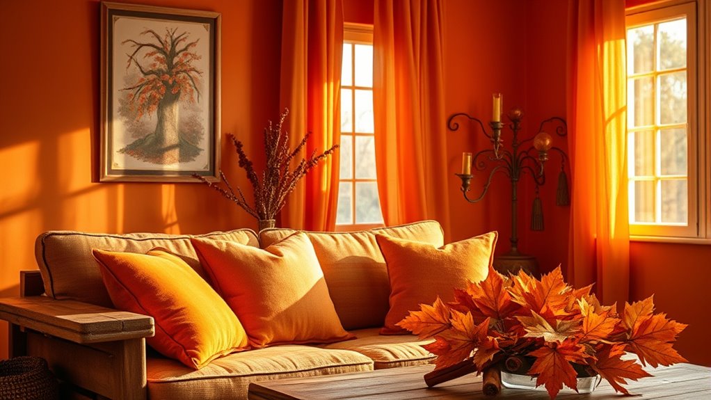
To create a warm and inviting space, embrace earth tones like rust, ochre, and deep greens that evoke the cozy feeling of autumn. Adding textured fabrics, such as wool throws or linen cushions, enhances comfort and visual warmth. Combining these elements helps you craft an environment that feels both natural and soothing. Warm hues in fall palettes evoke comfort, coziness, and warmth, making them perfect choices for seasonal decorating. Incorporating these colors thoughtfully can also support your efforts in space organization, creating a harmonious and balanced environment.
Embrace Earth Tones
Embracing earth tones from the autumn palette instantly transforms your space into a cozy, welcoming environment. Warm hues like rich oranges, deep reds, and warm yellows evoke feelings of comfort and intimacy, making your home feel inviting. These tones also boost mood by fostering feelings of happiness, optimism, and calm, while evoking nostalgia and reflection. Using muted, earthy shades helps unify diverse patterns and motifs, creating a cohesive and layered look. To enhance this effect, consider these tips:
- Incorporate natural materials like wood, stone, and linen to reinforce the connection to nature.
- Use earthy shades as wall colors, upholstery, or accent pieces to add depth and warmth.
- Pair rich reds and oranges with subdued greens for a balanced, vibrant atmosphere.
- Colour influences behaviour, emotions, and wellbeing, which can help create a harmonious and emotionally supportive environment in your home.
- Additionally, selecting vintage decor elements can deepen the rustic charm and authenticity of your space.
Add Cozy Textures
Adding cozy textures to your space enhances the warmth and comfort of an autumn-inspired palette. Incorporate natural fibers like wool, linen, and cotton for tactile softness and warmth. Layer chunky knit throws, velvet cushions, and woven blankets to create depth and inviting comfort. Use tactile surfaces such as suede, leather, and boucle fabric to add richness and visual interest. Thick-pile area rugs in natural materials like jute or sisal anchor the room and provide underfoot warmth. Combining smooth and nubby textures evokes a cozy environment that mirrors fall’s organic feel. Incorporate variety of materials such as distressed wood furniture, stone accents, and dried foliage to deepen the connection with autumn’s earthy vibe. Natural materials are celebrated in autumn interiors for their authenticity and sustainability, and these textures work together to craft an inviting, tactile environment that radiates warmth and seasonal charm.
The Calming Effect of Winter Tones in Home and Fashion
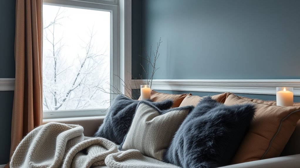
Winter tones like blues, grays, and whites naturally evoke a sense of calm and tranquility, reflecting the icy scenery and subdued natural light of the season. These colors foster relaxation and mental clarity, helping you feel more centered during the colder months. However, overusing cool tones can cause feelings of melancholy or low energy, especially when sunlight is scarce. To counterbalance this, consider adding warm accents like gold, rust, or peach, which boost mood and create visual warmth. Incorporating warmer accents, such as metallics or soft textiles, can enhance the overall harmony of a space. Using color psychology principles, jewel tones or metallic accents can add warmth and richness. Incorporate soft lighting or candles to brighten cool-colored spaces. Balance gray tones with warm textures or pops of color for emotional comfort. Blending winter hues thoughtfully can promote calmness while preventing feelings of coldness or isolation.
How Specific Paint Colors Influence Emotional Well-Being
The emotional impact of paint colors is largely influenced by their lightness and saturation levels, which shape how you feel in a space. Lighter shades tend to promote positive emotions, making environments feel more welcoming and uplifting, while darker hues can evoke negative feelings or a sense of heaviness. Highly saturated colors energize and create a sense of excitement, boosting confidence and alertness. Conversely, desaturated tones often foster calmness but may also feel subdued or uninspiring. Warm colors like red, orange, and yellow energize you, increasing arousal and enthusiasm, but can also cause anxiety if overused. Cool colors such as blue and green promote tranquility, relaxation, and trust. Color-emotion associations have been shown to be consistent across many years and cultures, which means you can reliably use color choices to influence mood regardless of background. Additionally, understanding how power consumption of heated mattress pads works can help you choose energy-efficient options that support your overall well-being and comfort. Understanding how specific colors influence your mood helps you choose paint shades that support your emotional well-being in any space.
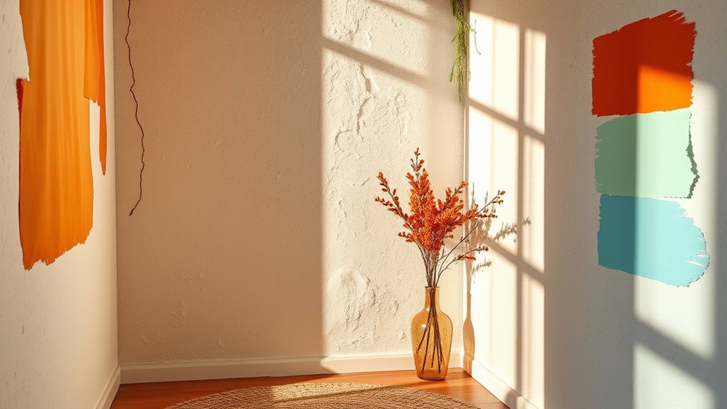
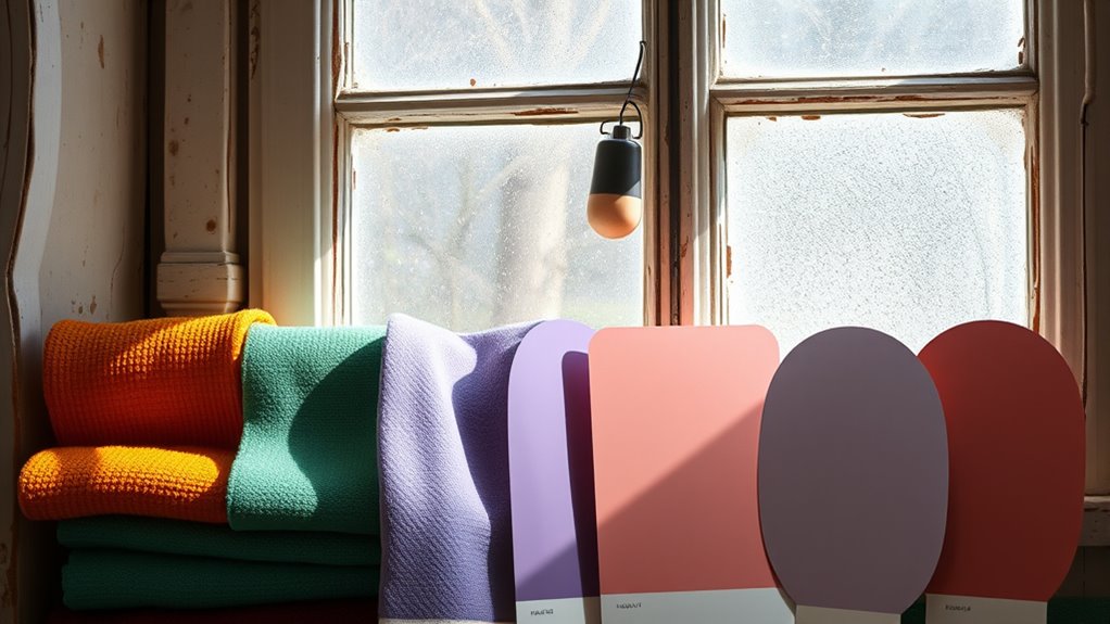
Integrating Seasonal Colors Into Your Interior Design
To create a cohesive look, start by harmonizing seasonal color palettes with your existing decor, using complementary or contrasting tones to add depth. Incorporate textural enhancements and layers—like fabrics, rugs, and accessories—to enrich the seasonal themes and bring visual interest. Soft pastels and earthy greens can be combined to evoke a fresh, natural feel that complements springtime decor. Additionally, understanding color psychology can help you select hues that influence mood and ambiance, ensuring your space reflects the desired seasonal atmosphere. By thoughtfully integrating these elements, you’ll craft a vibrant, balanced space that reflects the mood of each season.
Harmonizing Seasonal Palettes
Harmonizing seasonal palettes involves thoughtfully layering colors, textures, and accents to create a cohesive and emotionally resonant space. To do this effectively, start by adding seasonal colors gradually through smaller elements like pillows, rugs, or artwork. This allows you to test and refine how the colors work together before committing to larger areas. Use complementary shades from the same seasonal palette to build depth and visual interest, ensuring the space feels unified. Balance bold hues with neutral bases to prevent overwhelming the room. Consider how patterns and accessories can subtly incorporate seasonal tones, adding personality without disrupting harmony.
- Introduce colors gradually via small accents to test harmony
- Use complementary shades from the same palette for depth
- Balance bold hues with neutral tones for versatility
Textural Enhancements and Layers
Building on your seasonal color palette, incorporating textures and layers adds depth and tactile richness to your interior. Layer multiple textures from floor to ceiling—think rugs, upholstery, pillows, throws, and window treatments—to create visual interest. Mix smooth and rough, soft and hard surfaces to maintain balance and avoid sterile looks. Use organic textures like woven baskets or wood alongside sleek materials such as glass or metal for contrast. Incorporate sculptural wall decor with raised textures to add focal points and break flat surfaces. Use plush fabrics like velvet or chunky knits for warmth and softness, layering pillows and throws for comfort. Enhance walls with textured paint or panels, and pair contrasting textures like velvet with linen or wood with glass to energize your space and reflect seasonal shifts. Textures influence the overall ambiance by affecting the room’s visual weight and mood, making your space feel more inviting and dynamic. Additionally, awareness of skin sensitivities can help you select suitable materials and finishes for your decor.
Choosing the Right Colors to Reflect Your Personal Seasonal Palette
Choosing the right colors to reflect your personal seasonal palette involves understanding your natural coloring and how specific hues can enhance your features and mood. When selecting colors, focus on those that match your seasonal classification—Spring, Summer, Autumn, or Winter—and complement your undertones. This alignment boosts confidence and emotional well-being while highlighting your natural beauty. Color theory helps guide you in selecting hues that harmonize with your unique palette, ensuring a more cohesive and flattering appearance. Consider these tips: – Choose saturated or lighter shades from your palette to foster positivity and vibrancy. – Incorporate seasonal color shifts to adapt your environment and wardrobe, supporting psychological balance. – Avoid colors outside your seasonal undertones, as they may clash and diminish your natural harmony. Additionally, understanding how predictive analytics can inform personal styling choices might help you make more confident decisions based on data-driven insights.
Frequently Asked Questions
How Can I Incorporate Seasonal Colors Without Overwhelming My Space?
You can incorporate seasonal colors without overwhelming your space by using accent pieces like pillows, throws, or artwork in seasonal hues. Limit yourself to one or two accent colors per room and rotate decorative items regularly. Designate specific zones for seasonal colors, such as a reading nook or dining area, and keep main surfaces neutral. This balance allows you to enjoy seasonal vibrancy without cluttering or overpowering your space.
Are There Specific Seasonal Colors That Improve Productivity at Work?
Bright reds and energizing yellows are your secret weapons for unstoppable productivity during peak seasons. These colors literally ignite your energy and focus, turning your workspace into a powerhouse of efficiency. Incorporate vibrant accents or accessories in these hues to boost motivation without overwhelming the space. Pair them with calming greens or blues to balance the intensity, ensuring your environment stays productive, inspiring, and perfectly seasonally energized.
How Do Seasonal Colors Influence Sleep Quality and Relaxation?
Seasonal colors can profoundly boost your sleep quality and relaxation. You’ll find that cool tones like blues and greens promote calmness, lower stress, and help regulate your circadian rhythms. In your bedroom, choose pastel blues or muted greens to create a tranquil environment. Avoid energizing reds and oranges before bed, as they can increase alertness. Instead, opt for soothing neutral shades to enhance your overall relaxation and support restful sleep.
Can Seasonal Palettes Help in Emotional Healing or Stress Reduction?
Studies show that environments with calming colors can reduce stress by up to 20%. You can use seasonal palettes to support emotional healing and stress reduction by combining soothing cool hues like blue and green with uplifting warm accents. These colors promote relaxation and balance, helping you feel more centered. By thoughtfully choosing seasonal colors, you create a restorative space that encourages emotional well-being and resilience during challenging times.
What Are the Best Seasonal Colors for Small or Dark Rooms?
In small or dark rooms, opt for light, warm, and pastel colors to brighten and expand the space. Think soft yellows, light lavenders, powder blues, or muted oceanic tones. These hues reflect natural and artificial light, making your room feel more open and inviting. Avoid overly dark shades, but if you want drama, balance deep hues with ample lighting and lighter trims for a cozy yet spacious vibe.
Conclusion
By embracing seasonal colors, you can boost your mood and create a space that truly reflects your personality. Did you know that homes painted in warm autumn tones can increase feelings of comfort and coziness? Incorporating these colors thoughtfully can enhance your emotional well-being and transform your environment. So, don’t hesitate to experiment with the hues of each season—you might find a new favorite that uplifts your everyday life.