
For age-friendly interiors, focus on contrasting colors to improve safety and clarity, especially around stairs and hazards. Incorporate calming hues like soft blues and neutrals to promote relaxation, while using earthy tones and natural materials for warmth and authenticity. Bold jewel tones can add luxury without overwhelming. Consider regional and cultural influences to foster inclusion, and layer colors through textiles and accessories for versatility. Keep exploring for practical tips to create harmonious, functional spaces tailored to seniors’ needs.
Key Takeaways
- Use contrasting colors to improve visibility and safety for seniors in interior spaces.
- Incorporate calming shades like blue and neutral tones to promote relaxation and reduce stress.
- Select regionally inspired palettes that reflect local landscapes and cultural traditions for authentic environments.
- Apply color-coded zones and accent walls to enhance wayfinding and spatial awareness.
- Prioritize natural materials and earthy hues to create inclusive, harmonious, and culturally respectful interiors.
Embracing the Power of Contrasting Colors for Clarity and Safety
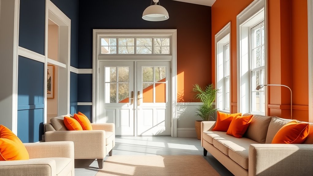
Contrasting colors play an essential role in creating safer and more navigable interiors for seniors. They enhance visual clarity by clearly defining surfaces and boundaries, making it easier to recognize rooms and features. Using visual contrast principles can also influence perceptions of personal space and environment comfort, subtly affecting how residents experience their surroundings. For example, pairing light-colored walls with dark furniture creates strong contrast, helping residents distinguish different areas and reducing confusion. High contrast schemes, such as dark trim against pale walls or bold accent walls, make important features like doorways, fixtures, and hazards more noticeable. Using contrasting colors around stairs or bathroom edges increases awareness and minimizes fall risks. Thoughtfully applying contrast in senior living spaces not only improves safety but also promotes independence, ensuring residents can navigate their environment confidently and comfortably. Incorporating aesthetic wall organization solutions with contrasting colors can further improve both functionality and visual appeal, while considering contrast ratio ensures that color differences are sufficiently distinct for all users. Additionally, selecting colors with appropriate color saturation can enhance visibility and reduce visual strain for older eyes.
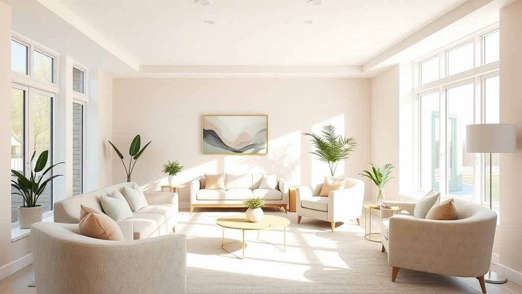
The Allure of Muted Earth Tones and Organic Inspiration
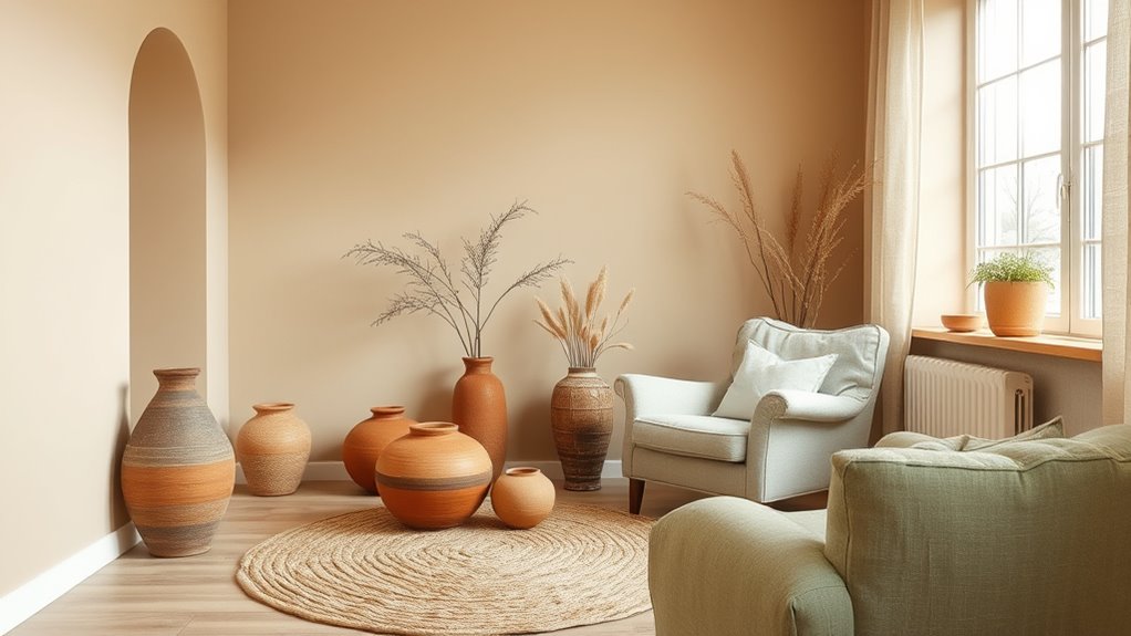
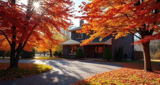
Muted earth tones and organic-inspired colors create a soothing, natural ambiance that promotes relaxation and well-being in senior living spaces. Earth tones like olive green, terracotta, and dusky sienna evoke a genuine connection to nature, fostering comfort and authenticity. Incorporating digital literacy into interior design can enhance the sensory experience and create a more engaging environment. These hues blend seamlessly with natural materials such as wood, rattan, and stone, enhancing harmony and a sense of calm. Incorporating organic inspiration in senior living interiors encourages a timeless, approachable design that feels cozy and inviting. Textured finishes and natural pigments add visual depth and warmth, enriching the sensory experience. Additionally, understanding candle sinking issues can help create safer, more stable environments by avoiding design flaws that might compromise comfort. Incorporating glycolic acid in skincare routines can also promote healthy, rejuvenated skin, complementing the calming and restorative atmosphere of the space. Selecting biophilic design elements can further strengthen residents’ connection to nature, supporting overall well-being. By choosing these muted palettes, you create environments that support healing, relaxation, and a welcoming atmosphere for seniors, making the space both stylish and deeply restorative. Incorporating elements that support biodiversity can also enhance the overall well-being and connection to nature for residents.
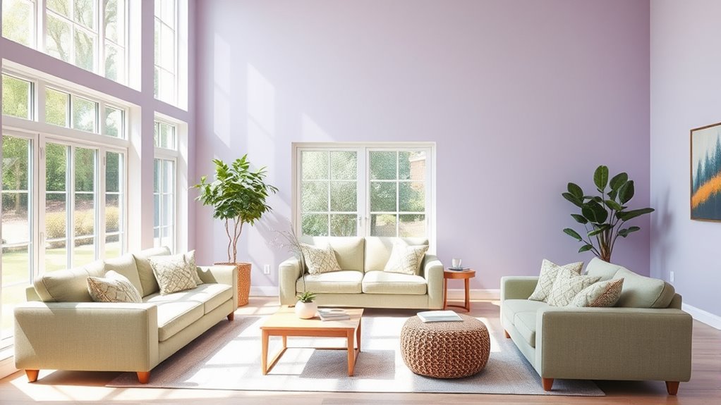
Bold and Luxurious: Incorporating Saturated Jewel Tones
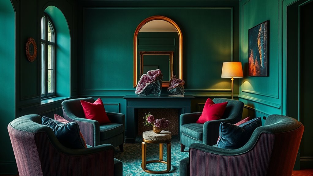
Incorporating saturated jewel tones like emerald green, sapphire blue, and ruby red can instantly elevate an age-friendly interior with a sense of luxury and sophistication. These jewel tones evoke feelings of confidence and elegance, making them perfect for creating standout focal points in senior living communities. When used thoughtfully, they add depth and visual richness, enhancing the overall ambiance. To achieve a balanced look, pair deep jewel hues with lighter neutrals such as soft beiges or muted grays. You can incorporate these bold colors through fabric choices, accent walls, or ceiling details to boost visual interest and opulence. Understanding color psychology helps you select hues that promote calmness and confidence, ensuring your interior design remains both stylish and welcoming for all residents. Additionally, utilizing high-quality equipment can ensure that your color displays are true to life, effectively showcasing your design choices. Proper lighting can also influence how these saturated colors appear, making lighting design an essential consideration for achieving the desired luxurious effect. Incorporating innovative interior accessories, such as decorative planters or textured textiles, can further enhance the richness of jewel tones while adding a personalized touch to the space. Moreover, integrating natural materials can help ground the vibrant colors, creating a harmonious and inviting environment.
Harmonizing Color Palettes With Regional and Cultural Influences
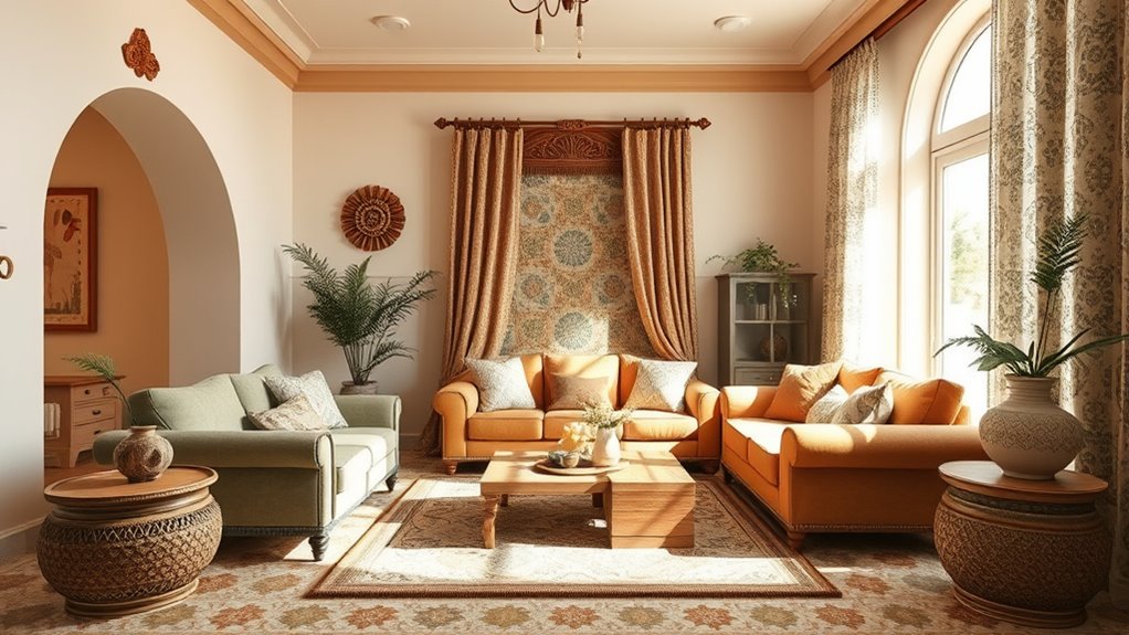
Your interior color choices can reflect regional landscapes and cultural traditions, creating a sense of belonging. Incorporating local materials and symbolism helps make spaces feel authentic and respectful of heritage. Utilizing regional themes such as water-inspired hues or mountain tones can further enhance the connection to the locale. Additionally, understanding Gold IRA Rollovers can inspire a sense of financial stability that complements culturally rich interior designs. Embracing vibrational energy through color selection can also positively influence the ambiance, aligning with Law of Attraction principles to foster harmony and well-being in your space. Moreover, applying principles from creative practice encourages experimentation with colors and textures, leading to more innovative and personalized interior schemes. Incorporating energy-efficient solutions like ground source heat pumps can also promote sustainability and comfort within your interior environment.
Regional Color Significance
Have you ever noticed how regional landscapes and cultural histories shape the colors used in interior design? Regional influences often dictate the color schemes you see, reflecting local landscapes and cultural traditions. These choices create familiar, comforting spaces for seniors. Incorporating natural materials like sandstone or volcanic stone can further enhance regional authenticity and harmony. Natural materials, such as sandstone or volcanic stone, also influence color palettes, blending architecture with the environment. Additionally, understanding tire size compatibility can inform design choices that emphasize local terrain features. To incorporate regional color significance:
- Use colors that mirror local landscapes and climate
- Highlight architectural styles and natural materials in your design
- Respect cultural traditions through color choices
- Create cohesive spaces that foster community and personalization
- Recognize how outdoor survival gear influences choices in durable, weather-resistant finishes that can be integrated into exterior design elements.
Cultural Color Preferences
How do cultural preferences shape color choices in age-friendly interiors? Your color palettes should reflect regional influences and cultural traditions to create spaces that feel familiar and welcoming. Incorporating culturally significant colors enhances residents’ comfort and sense of belonging within age-friendly interiors. For example, specific color trends are often associated with regional identities and can be used to evoke a sense of place. Regional influences also guide the use of natural materials and earthy hues, such as browns and greens in desert or forested environments. Understanding cultural norms around color symbolism can help you select hues that resonate positively with residents. By harmonizing your color palettes with local aesthetics, you ensure your interiors respect cultural identities while fostering a warm, inclusive atmosphere for seniors.
This approach makes your spaces both culturally meaningful and universally soothing.
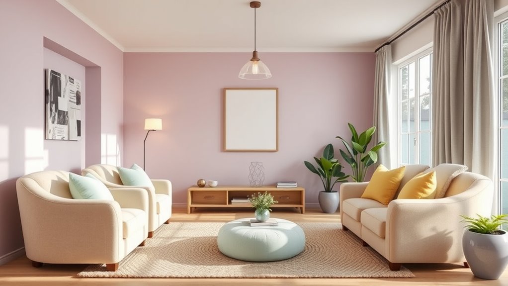
Creating a Calming Environment With Blue and Soft Neutrals
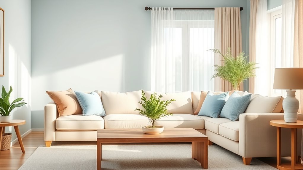
Creating a calming environment with blue and soft neutrals relies on selecting shades that promote relaxation and ease mental tension. Soft blue hues like navy, sky blue, and aquamarine are perfect for fostering serenity in senior living spaces.
Creating soothing spaces with soft blue tones and neutral accents promotes relaxation and reduces mental stress.
To enhance visual clarity and comfort, opt for pastel colors in moderation, ensuring they aren’t too delicate for aging eyes. Combining blue hues with neutral tones such as soft beiges and muted grays creates a balanced, age-friendly aesthetic that feels soothing yet sophisticated.
Proper lighting, whether natural or warm artificial, amplifies these calming effects, making spaces more peaceful.
- Use navy or sky blue for walls or accents
- Incorporate neutral tones for furniture and accessories
- Adjust lighting to highlight calming hues
- Avoid overly bright or pastel shades that reduce contrast
Designing Multi-Functional Spaces Through Thoughtful Color Use
Using a cohesive color palette helps clearly distinguish different zones in multi-purpose rooms, making navigation easier.
Incorporating adaptable, color-changing hues allows spaces to shift mood and function throughout the day.
Strategic accents and contrast create visual flow, enhancing both recognition and safety for all residents.
Enhancing Space Recognition
Thoughtful color choices can considerably enhance space recognition in multi-functional senior living environments. By applying strategic color schemes, you help residents distinguish different zones and navigate easily.
High-contrast colors, like dark furniture against light walls, improve spatial awareness and reduce confusion. Using vibrant hues in key areas creates strong visual cues for wayfinding.
Incorporating color-changing or chameleon tones, such as smoky lilac or taupe-green, adds depth and helps residents recognize boundaries as lighting shifts.
Earth tones with layered textures establish a clear visual hierarchy, guiding residents through complex spaces.
To optimize space recognition, consider:
- Color-coded zones for easy identification
- Accent walls to define areas
- Saturated colors for navigation cues
- Thoughtful placement of contrasting hues
These strategies support senior care by making environments more intuitive and welcoming.
Creating Visual Flow
To design multi-functional senior living spaces with a seamless visual flow, selecting a harmonious color palette is essential. Using color schemes like layered Pesto greens combined with neutrals creates a natural, cohesive look across different zones.
Strategic use of contrasting yet complementary colors helps delineate areas such as dining and activity rooms, making wayfinding intuitive. Incorporating muted earth tones and chameleon hues allows colors to adapt to changing lighting, maintaining a unified atmosphere.
Consistent color schemes in furnishings, walls, and accessories reinforce the sense of continuity, guiding residents effortlessly through the space. Thoughtful color progressions, like blending warm ochres into cooler blues, support smooth visual movement, minimize confusion, and enhance overall comfort in senior living environments.
Practical Tips for Seamless Integration of Color Trends in Senior Living Environments
Integrating color trends seamlessly into senior living environments requires deliberate planning and strategic choices. To create spaces that support residents’ well-being, select a cohesive palette blending trending hues like Pesto green, muted earth tones, and jewel tones for harmony.
Integrate trending colors thoughtfully to create harmonious, supportive senior living environments.
Use contrasting colors thoughtfully in furniture, trim, and flooring to improve visual clarity and wayfinding. Choose colors with calming and recognition benefits, such as soft blues and saturated jewel tones, to foster comfort and orientation.
Layer colors through textiles, artwork, and accessories, which adds depth and makes updates easier over time. Remember to apply color psychology principles by using warm hues in social areas and cool shades in private or therapeutic spaces.
This approach ensures a vibrant, functional environment tailored for seniors’ needs.
Frequently Asked Questions
What Color Is Easiest for Old People to See?
You’re asking which colors are easiest for older adults to see. Bright, high-contrast colors work best, like dark furniture against light walls, or navy and aquamarine blues. These saturated, bold hues are easier to distinguish and reduce confusion.
Avoid pastels or muted shades, as they blend into backgrounds and are harder to see. Using white or cream walls with dark accents can also improve visibility and make spaces more age-friendly.
What Colors Do Seniors Prefer?
Did you know that nearly 75% of seniors prefer calming, familiar colors for their living spaces? You’ll find that they favor warm earth tones like soft browns, olive green, and gentle terracotta because these create a soothing environment.
Blues such as navy and sky blue also appeal, offering relaxation. Bright or highly saturated colors are avoided, as they can be overwhelming. Instead, they choose soft, muted shades that promote comfort and tranquility.
What Color Is Calming for the Elderly?
You want to know which colors are calming for the elderly. Soft shades of blue, like navy, sky blue, and aquamarine, are excellent choices because they promote relaxation and reduce stress.
Cooler hues such as muted greens and gentle lavenders also create a peaceful atmosphere.
Avoid overly bright or pastel colors, as they can be hard to see clearly. Instead, opt for low-saturation, subtle tones that help lower anxiety and support mental well-being.
What Color Palette for Old Age?
When choosing a color palette for older adults, focus on soft, muted tones like earthy greens, gentle blues, and warm neutrals. These colors promote calmness and reduce visual strain.
Add contrast with warm hues like terracotta or amber in key areas to help with navigation. Natural, earth-inspired shades create a cozy, secure atmosphere that supports relaxation and well-being for aging residents.
Conclusion
By embracing these color trends, you can transform senior living spaces into vibrant, safe havens—much like a painter carefully choosing shades to evoke emotion and clarity. Think of your design as a canvas where contrast guides movement, earth tones ground serenity, and jewel tones add a touch of luxury. With thoughtful choices, you’ll create an environment that feels both welcoming and inspiring, turning everyday spaces into a masterpiece of comfort and safety.