
Colors impact your emotions, perceptions, and behavior in powerful ways. Warm tones like red and orange energize you, boosting activity and excitement, while cool shades like blue and green promote calmness and focus. Cultural meanings and personal experiences influence how you interpret colors, affecting decision-making and mood. Whether in design, branding, or daily environments, understanding these effects helps you shape your surroundings for better well-being and clarity. Exploring more can reveal how to harness color’s influence effectively.
Key Takeaways
- Colors influence emotional reactions, with warm tones energizing and cool tones promoting calmness and relaxation.
- Specific colors can trigger physiological responses, such as increased heart rate or reduced stress levels.
- Cultural differences shape how colors are perceived and the behaviors they evoke across societies.
- Strategic color choices in branding and environments can enhance recognition, influence mood, and improve performance.
- High contrast and color associations can improve visibility, safety, and focus in various settings.
The Fundamentals of Color Perception and Response
Understanding how you perceive color begins with the way your eyes detect light. Your cone cells respond to specific light wavelengths within the visible spectrum, mainly red, green, and blue. When light hits these cones, they send signals to your brain’s visual cortex. Legal regulations and zoning laws can influence how colors are used in building designs and community planning, indirectly affecting perceptions of space and environment. Through neural processing, your brain interprets these signals, resulting in your perception of color. The combination and intensity of cone responses allow you to differentiate colors accurately. This process, known as color perception, depends on how your eyes and brain work together to interpret light wavelengths. The integration of signals from the three types of cones creates a wide range of colors you see every day. Additionally, neural processing plays a crucial role in how your brain interprets and experiences these visual signals, further shaping your overall color response. This complex neural response forms the foundation of how human color response and differentiation operate within the visible spectrum, highlighting the importance of visual processing in shaping your overall color experience.
How Warm and Cool Colors Influence Emotions
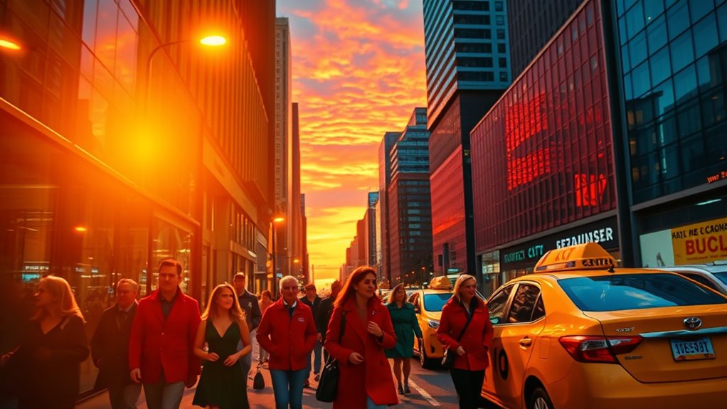
Warm colors like red and orange often energize you, creating feelings of excitement and warmth. Meanwhile, cool colors such as blue and green promote calmness and relaxation. These emotional reactions are rooted in biology, with warm hues signaling urgency and cool hues indicating safety. Additionally, color psychology can be used to incorporate color effects that influence mood and expression. Understanding individual personality traits can further enhance the effective use of color in different environments. Moreover, knowledge of ethical hacking principles can help in designing environments that foster positive psychological responses. Recognizing the impact of color associations on behavior can also guide more intentional use of color schemes.
Emotional Responses Elicited
Have you ever noticed how certain colors make you feel more energized or more relaxed? In color psychology, warm colors like red, orange, and yellow typically trigger emotional responses such as excitement, passion, and increased alertness.
These hues can stimulate physiological responses like faster heartbeat and adrenaline, influencing your mood and behavior. Conversely, cool colors like blue, green, and purple evoke calmness, serenity, and reduce stress, often lowering blood pressure and respiratory rates. Additionally, understanding sound design can help you choose environments that naturally complement specific emotional states, enhancing your overall experience. Sound cues and ambient sounds are often used to reinforce the emotional tone set by color choices.
Research also shows that eye patch benefits can influence your perceptions of vitality and youthfulness, which can subtly impact your emotional state. Moreover, cultural associations and personal experiences shape how you interpret these colors, affecting how colors influence emotional responses. Your environment’s color choices considerably influence your emotional state, guiding how you feel and behave in different spaces.
Physiological Impact Differences
Colors do more than influence how you feel; they also trigger specific physiological responses. Warm colors like red, orange, and yellow tend to increase heart rate and adrenaline, leading to heightened arousal and energy.
In contrast, cool colors such as blue, green, and purple promote relaxation and calmness by reducing blood pressure and respiration. Your physiological responses to these colors are rooted in evolutionary signals:
- Warm colors stimulate alertness, making environments feel more energetic.
- Cool colors decrease physiological arousal, fostering serenity.
- The color influence on blood pressure and stress levels directly impacts your emotional state.
Understanding these physiological impact differences helps you harness color psychology effectively, whether to energize a space or create a soothing environment. Your body’s reactions are a natural response to the emotional effects elicited by warm and cool colors.
Cultural Interpretations Vary
Although warm and cool colors often evoke similar emotional responses across many cultures, their meanings can vary widely depending on cultural context. Your emotional reactions to colors are shaped by cultural symbolism and personal experiences, influencing how you perceive them. For example:
| Warm Colors | Cool Colors |
|---|---|
| Energy, passion | Calm, serenity |
| Urgency, excitement | Sadness, indifference |
| Cultural significance | Cultural symbolism |
In some cultures, white signifies purity, but in others, it represents mourning. These cultural interpretations affect the psychological effects colors have on you, shaping your emotional responses. Recognizing this variability helps you understand that color psychology isn’t universal—it’s deeply rooted in cultural context, influencing emotional reactions in complex ways.
The Evolutionary Roots of Color Significance
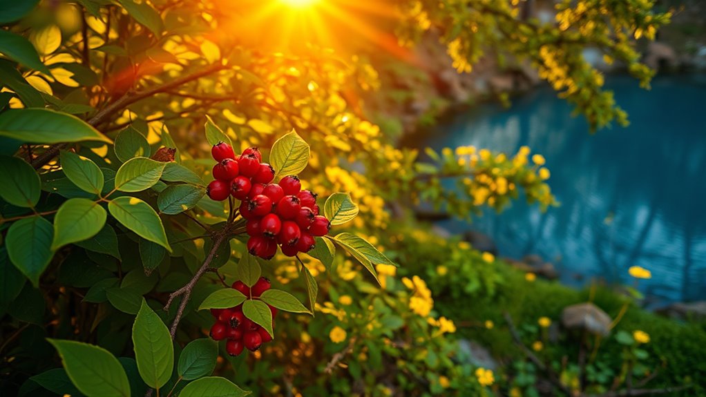
The evolutionary roots of color significance are deeply embedded in our survival instincts, shaping how you perceive and respond to different hues. Your neural system is wired to detect contrasting colors, helping you find food or spot hazards quickly. Bright colors in animals and plants serve critical functions, such as attracting mates or warning predators, reflecting evolutionary adaptations. This understanding aligns with the idea that certain colors, like red, have a moral implications that influence human behavior and decision-making. Red, in particular, signals danger or attraction, activating neural pathways that heighten arousal and attention. This perception influences your behavior by increasing your awareness of potential threats or resources.
Specifically: 1. Red triggers physiological responses like increased heart rate. 2. It helps you recognize dominance or aggression cues. 3. It enhances your focus on vital environmental signals, boosting survival chances.
These responses highlight how color evolutionarily guides your behavior for safety and reproduction.
Cultural Variations in Color Meaning and Impact
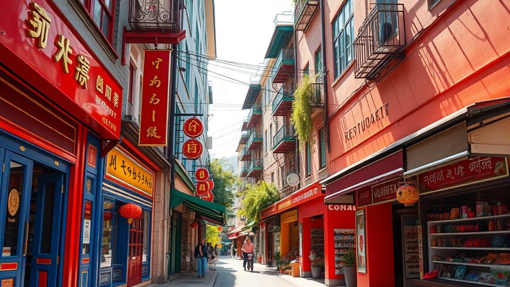
Colors can have vastly different meanings across cultures, shaping how messages are received and understood. You might see red as luck in China but as danger in the West, highlighting these differences. Additionally, understanding consumer preferences for organic tea products can influence branding and marketing strategies in diverse markets. Recognizing these variations helps you navigate cross-cultural communication and branding more effectively. For example, awareness of cultural color associations is crucial when designing visual marketing campaigns to ensure positive reception. Moreover, being mindful of privacy policies and data collection practices can build trust with international audiences and improve engagement. Incorporating knowledge of Cultural Intelligence and how it varies culturally allows for more effective and respectful communication strategies worldwide.
Cultural Color Symbolism
Cultural color symbolism varies greatly around the world, shaping how you interpret and respond to different hues. Your emotional responses to colors are deeply influenced by cultural color symbolism, affecting perceptions and behaviors. For example: 1. White symbolizes purity in Western societies but signifies mourning in East Asian cultures. 2. Red is associated with celebration and good luck in many Middle Eastern and South Asian traditions. 3. Purple indicates royalty in Western contexts but can represent death or mourning elsewhere. These color associations across cultures impact psychological responses and influence design choices. Understanding the cultural differences in color meanings helps you grasp how colors reinforce cultural identity. Additionally, cultural color symbolism plays a significant role in shaping societal values and traditions. Recognizing the visual perception and cultural context enhances your appreciation of how colors evoke specific emotions and behaviors across diverse societies. Furthermore, awareness of color symbolism in marketing and branding can improve cross-cultural communication and influence consumer perceptions.
Color Perception Differences
Have you ever noticed how a red carpet can symbolize celebration in one culture but warning in another? This highlights how cultural differences shape color perception and influence emotional responses. Creative practice, which involves engaging with colors and visual elements, can also be a way to explore and understand these cultural nuances. Color symbolism varies widely; white signifies purity in Western societies but mourning in East Asian cultures. Similarly, red is linked to luck and celebration in Chinese culture but signals danger elsewhere. Green’s meaning ranges from growth and health to religious and political connotations in different regions. These cultural influences alter color interpretation, affecting how you perceive colors instinctively. Cross-cultural perception reveals that color psychology isn’t universal—what evokes positive feelings in one culture might trigger negative reactions in another. Understanding these differences helps you grasp how cultural backgrounds shape emotional responses to colors worldwide.
Cross-Cultural Associations
Understanding how different societies interpret colors reveals that meanings are far from universal. Cultural symbolism shapes emotional responses, influencing behavior and perceptions across societies.
For example:
- White symbolizes purity in Western cultures but mourning in East Asia.
- Purple is associated with luxury in the West but signifies mourning in Thailand and Brazil.
- Yellow represents courage in Japan but grief in Egypt.
These cross-cultural differences highlight how colors and emotions are intertwined through cultural perceptions.
Such variations impact the psychological effects of color choices, especially in design, marketing, and communication. Recognizing these cultural associations helps you understand the behavior influence behind color use worldwide.
Colors in Advertising and Brand Identity
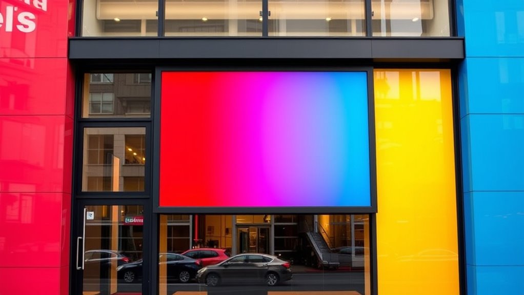
Did you know that color choices play a essential role in shaping how your brand is perceived? Your color choices directly influence brand recognition and impact consumer response.
When you use consistent colors across marketing materials, you can boost recognition by up to 80%, strengthening emotional connections.
Brands like Facebook and Twitter use blue in their logo design to evoke trust and dependability, while red creates urgency in sales ads, encouraging quick responses.
Luxury brands often incorporate black and gold to symbolize sophistication and exclusivity.
These visual branding strategies help you craft a strong brand identity that resonates emotionally with your audience.
The Role of Color in Performance and Productivity

Color profoundly influences your performance and productivity, shaping your mood and focus in various environments. Through color psychology, you can understand how different hues impact your efficiency:
Color greatly affects your mood and productivity across different settings.
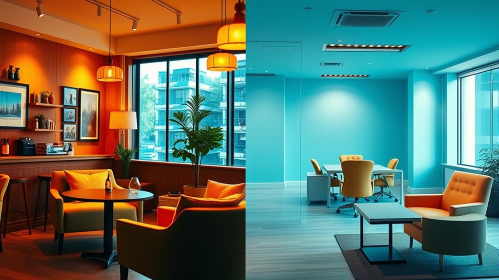
- Blue and green environments boost concentration, problem-solving, and creative thinking, leading to higher productivity.
- Warm colors like red and orange can increase physical speed and force but may reduce patience and creative capacity.
- Red’s emotional effects of color, especially before exams or tasks, can decrease performance by over 20% due to associations with danger and mistakes.
Choosing the right environment with calming colors like blue and green promotes relaxation and focus, enhancing overall performance and productivity.
The consistent use of these colors in workspaces influences mood and behavior, supporting better results.
Colors and Their Effect on Decision-Making Processes

Colors influence not only your mood and productivity but also the way you make decisions. Different colors can trigger psychological effects that shape your decision-making process.
For example, red may increase impulsivity and risk-taking, leading to faster but less cautious choices. In contrast, blue environments promote careful consideration and analytical thinking, encouraging more deliberate decisions.
Bright colors like yellow can elevate your emotional response, speeding up decisions but possibly reducing accuracy. Darker or muted tones tend to foster cautious, conservative choices, affecting your behavioral patterns.
Cultural associations also play a role; red might signal urgency in Western contexts or luck in Chinese culture, altering your environment’s influence on decisions.
Physiological Reactions Triggered by Different Hues
Different hues can directly influence your body’s physiological responses, shaping how alert or relaxed you feel. Color hues impact your heart rate, blood pressure, and stress hormones, triggering specific reactions.
For example:
- Red hues can increase heart rate and adrenaline, boosting arousal and alertness.
- Blue shades lower blood pressure and respiration, promoting relaxation and calmness.
- Bright yellow stimulates nerve activity, leading to increased energy and mental alertness.
These physiological reactions help your body adapt to the environment. Warm tones like red and yellow tend to stimulate, raising adrenaline and arousal levels.
Conversely, cool shades like blue and green promote relaxation by decreasing stress hormones and physiological stress responses. Your body’s reactions to color hues are powerful, influencing your mood and physical state seamlessly.
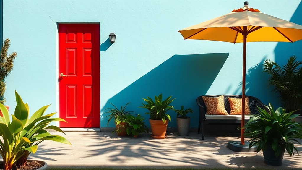
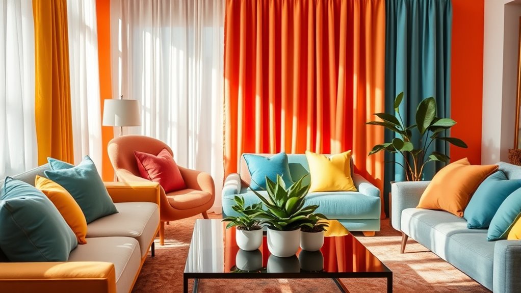
Color and Perception of Environment and Space
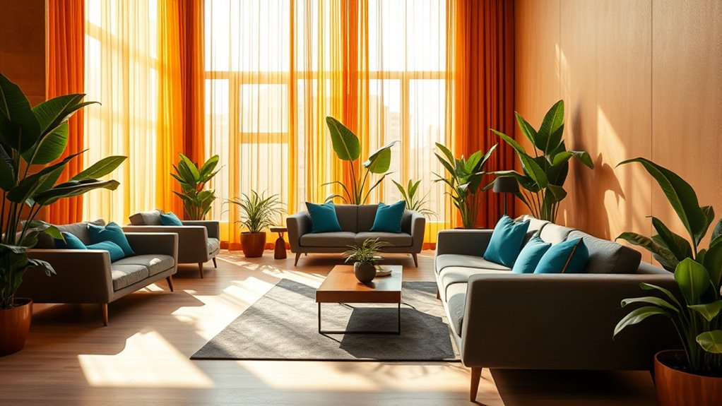
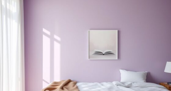
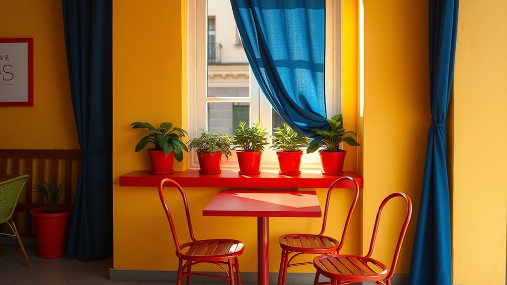
The hues used in your environment can profoundly influence how you perceive the space around you. Warm tones like red and orange tend to make rooms feel smaller and more intimate, while cool tones such as blue and green create a sense of openness and expansiveness. Your perception of environment and space is shaped by these colors and their psychological effects. For example, interior design often uses warm colors to evoke coziness or cool colors to promote calmness. Lighting and contrast further influence how large or small a room appears. Cultural associations also play a role; white can symbolize spaciousness in some cultures but emptiness in others. Understanding these visual cues helps you manipulate perception through strategic color choices.
| Color Type | Effect on Space | Psychological Effect |
|---|---|---|
| Warm tones | Smaller, cozy | Energy, intimacy |
| Cool tones | Larger, open | Calm, serenity |
| Bright hues | Focus, vibrancy | Excitement |
| Neutral | Balance, simplicity | Comfort, stability |
Practical Ways to Use Color Psychology in Daily Life
You can boost your mood and productivity by choosing the right colors for your spaces and outfits.
Strategically using warm or cool tones helps you energize or relax, depending on your needs.
Enhance Mood With Colors
Incorporating colors thoughtfully into your daily environment can profoundly enhance your mood and overall well-being. Using color psychology, you can select hues that influence your emotional response and mood regulation.
For example, calming colors like blue and green create relaxing shades that reduce stress and boost mental clarity. To enhance mood effectively, consider:
- Incorporating relaxing shades in your workspace for better focus.
- Adding vibrant accent pieces like red or yellow to stimulate attention and positivity.
- Choosing soft neutrals to promote serenity during moments of rest.
These color effects can help you harness the power of color influence, creating an environment that supports your emotional well-being and mood regulation throughout the day.
Optimize Spaces Strategically
Strategically using color in your spaces can considerably influence how they function and how people feel within them. By leveraging color psychology, you enhance space optimization and evoke specific emotional responses. Warm colors like red and orange energize social areas, while calming cool tones such as blue and green promote relaxation in healthcare or quiet zones. Neutral tones like white and beige create balance and professionalism. Effective color contrast improves visibility and focus—using red for warnings or navigation cues. Consider cultural meanings and psychological impacts to craft environments that inspire desired behaviors.
| Space Type | Recommended Colors | Emotional Response |
|---|---|---|
| Social Areas | Warm colors (red, orange) | Stimulate activity |
| Relaxation Zones | Cool tones (blue, green) | Reduce stress, promote repose |
| Work Spaces | Neutral tones (white, beige) | Balance, clarity |
| Safety Signs | High contrast (red, white) | Enhance visibility |
Frequently Asked Questions
How Do Colors Influence Behavior?
When you see different colors, they can influence how you feel and behave. For example, red can make you feel more alert and act impulsively.
While blue and green help you stay calm and think clearly. Warm colors like yellow and orange boost your energy and encourage socializing.
Keep in mind, your personal experiences and culture shape how these colors impact you the most.
What Is Carl Jung’s Color Theory?
Did you know that nearly 85% of purchasing decisions are influenced by color?
Carl Jung’s color theory suggests that colors are linked to archetypes and universal symbols shaping your unconscious mind.
You might associate red with passion, blue with calmness, or black with mystery.
Jung believed these colors evoke emotional responses and can reveal hidden aspects of your personality, offering a therapeutic way to understand and balance your inner self.
How Colors Affect Brain Functioning?
You might notice that colors influence your brain functioning in various ways. When you see red, your amygdala activates, increasing alertness and arousal.
Blue can help you relax by engaging your prefrontal cortex. Warm colors boost your beta waves, making you more alert, while cool colors promote alpha waves, helping you feel calm.
These responses modify your mood, decision-making, and focus by altering neural activity and neurotransmitter levels.
What Is the Most Powerful Color in Psychology?
You’re asking about the most powerful color in psychology, and it’s red. This color grabs your attention quickly, boosting your physical responses and emotional reactions like passion or aggression.
It’s often used in marketing to create excitement, urgency, or stimulate your appetite. Red’s influence is rooted in biology, signaling danger or importance, which makes it incredibly impactful.
However, overdoing it can cause stress or hostility.
Conclusion
By understanding how colors influence your feelings and decisions, you can craft spaces that energize or relax you, choose outfits that boost confidence, or create environments that feel welcoming. Imagine walking into a room painted in calming blues or vibrant reds—each hue shaping your mood without you even realizing it. When you harness the power of color psychology, you’re not just decorating; you’re painting your world with intentions that reflect and enhance your true self.