
Using color strategically enhances safety and visibility by enabling quick hazard recognition and guiding responses. Bright, high-contrast colors like red, yellow, and green are used to mark dangers, safe zones, and safety equipment, making important information stand out instantly. Consistent color coding and advanced reflective materials improve visibility in various lighting, while considering visual challenges guarantees everyone perceives safety cues effectively. Keep exploring to discover how to optimize your safety measures with color.
Key Takeaways
- Implement standardized, high-contrast color codes (red, yellow, green, blue) for hazard identification and safety equipment.
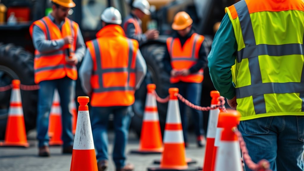
- Utilize high-visibility, fluorescent colors like lime-yellow and orange to improve detection in complex environments.
- Apply strategic lighting and brightness enhancements to increase scene conspicuity and reduce shadows or glare.
- Incorporate color contrast analysis to select colors that stand out against backgrounds, aiding quick hazard recognition.
- Use color psychology principles to select signals that subconsciously attract attention and promote safe responses.

JKSafety 9 Pockets Class 2 High Visibility Zipper Front Safety Vest With Reflective Strips,Meets ANSI/ISEA Standard (Large, 150-Yellow)
MATERIALS: 100% Polyester H-Vis Reflective Material, Durable, Breathable, Lightweight and Machine Washable. Customers who prefer a Loose Fit…
As an affiliate, we earn on qualifying purchases.
As an affiliate, we earn on qualifying purchases.
The Role of Color in Safety Communication
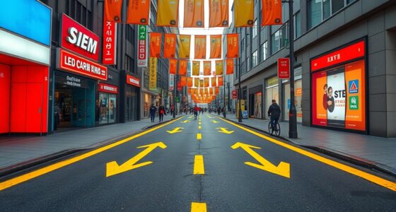
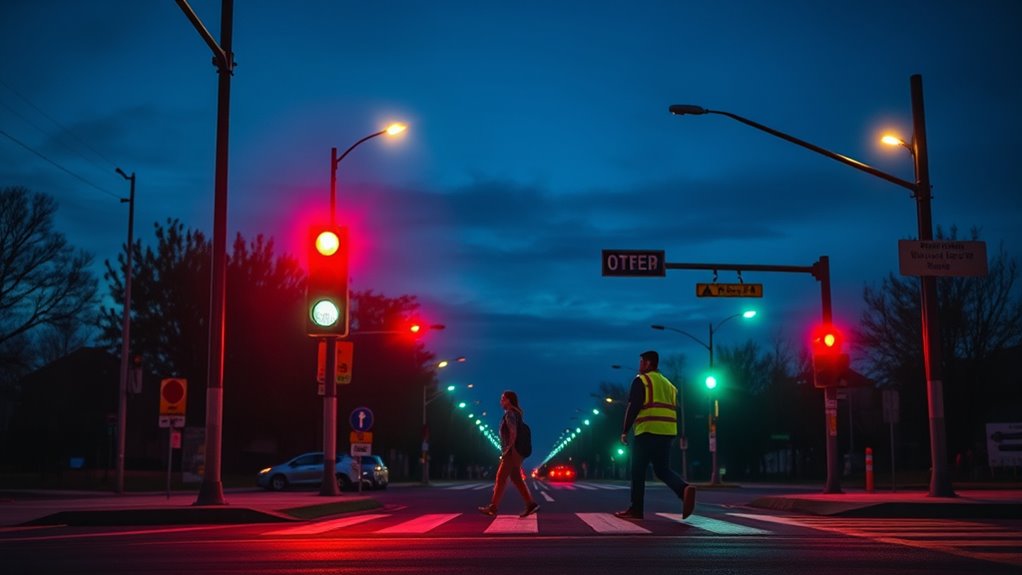
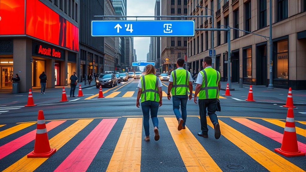
Color plays a critical role in safety communication by enabling quick recognition of hazards and guiding responses. Through effective color coding, you can instantly identify danger zones, safe areas, and safety equipment, which improves hazard communication on-site. Compliance with standards such as OSHA and ANSI ensures that color applications are uniform and easily understood. Safety signs use standardized colors—red for fire safety, yellow for caution, green and blue for safety zones and equipment—to ensure consistency and clarity. These colors enhance visibility, making important information stand out even in complex environments. OSHA standards and ANSI guidelines specify precise color applications, so everyone understands safety signals uniformly. When you use contrasting colors, safety signs become more noticeable, reducing response times during emergencies. Proper color use not only helps prevent accidents but also reinforces a clear, effective safety culture.

SWEETAPRIL Slow Moving Vehicle Sign, Rust Free Aluminum Slow Moving Vehicle Triangle Signs, 14"X16", 40-Mil Thick Diamond Grade Reflective For Golf Cart, For Golf Cart, Tractor, Utv, Safety Signs
Durable Aluminum:Golf cart slow-moving signs are crafted from 40-mil,weather-resistant,non-corrosive aluminum,providing robust protection against water,sun,and extreme conditions,ensuring no bending,warping,or…
As an affiliate, we earn on qualifying purchases.
As an affiliate, we earn on qualifying purchases.
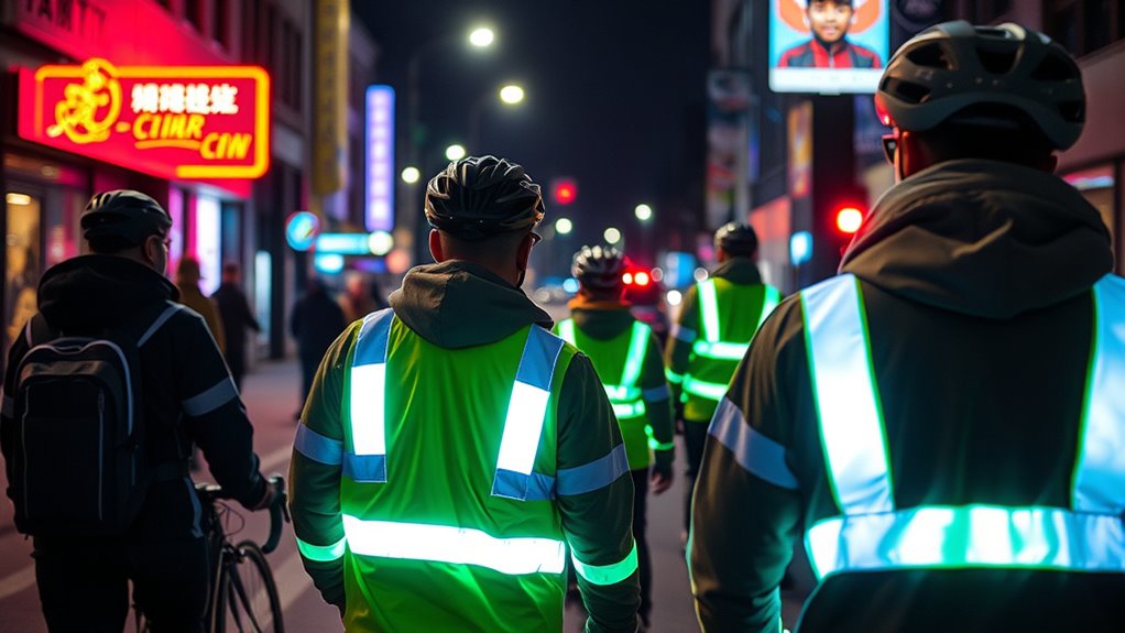
Principles of Effective High-Visibility Color Selection

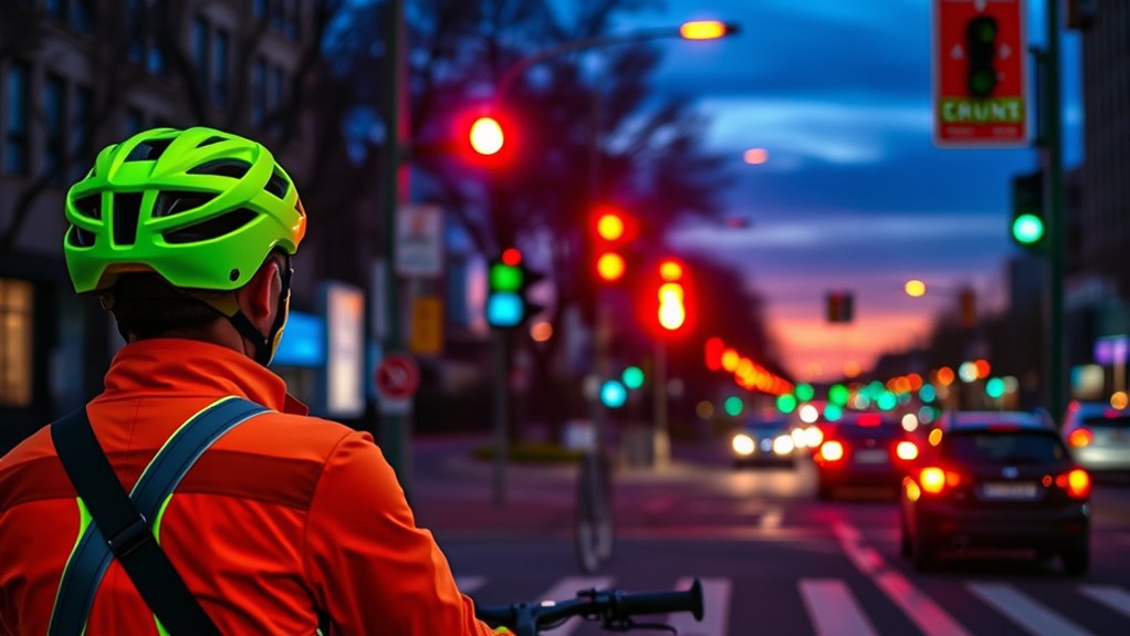
To guarantee safety gear and apparel stand out effectively, selecting high-visibility colors involves more than just choosing bright shades. You need to maximize contrast between your clothing and the background to ensure quick detection, improving visual perception. Incorporating color contrast analysis into your selection process can further optimize visibility in various environments. Standards like ANSI/ISEA 107-2015 specify using fluorescent colors such as lime-yellow and orange for daytime visibility. It’s vital to consider background colors to prevent camouflage—avoiding red on brown decks, for example. Luminosity also plays a key role, as properly chosen colors enhance detection even under varying lighting conditions. Empirical analysis helps quantify contrast levels, guiding your selection process. Additionally, understanding the exfoliating properties of glycolic acid can improve skin radiance and texture, contributing to overall safety and confidence in high-visibility gear. Recognizing the influence of sneaker culture trends can also inspire innovative safety apparel designs that appeal to modern consumers.
DCSGK Reflective Tape 30 PCS – Waterproof Self-Adhesive Safety Stickers, DOT-C2 Reflector Tape for Outdoor Use on Bike/Truck/Car/Motorcycle/Clothing/Helmet, Fluorescent Green 1.18" X 3.15"
【DOT-C2 Certified Safety & Enhanced Visibility】: DCSGK Engineered with prismatic reflective technology, these waterproof reflective tapes provide 360°…
As an affiliate, we earn on qualifying purchases.
As an affiliate, we earn on qualifying purchases.
How the Brain Responds to Different Colors in Safety Settings
The human brain reacts swiftly to different visual cues, especially in safety settings where quick decision-making is essential. Your color perception activates specific areas in the visual cortex, helping you recognize safety signals faster. High-contrast colors, like bright yellow or red, are processed more efficiently, leading to quicker responses to hazards. Additionally, color contrast plays a crucial role in enhancing visibility, making safety signals stand out more prominently. Colors like red trigger immediate cognitive associations with danger, prompting fast reactions. Familiarity with standard color codes strengthens these associations, enabling your brain to interpret safety signals instinctively. Moreover, color recognition depends on both individual visual acuity and experience with common safety signals, influencing response times. Variations in color perception can impact how effectively safety signals are interpreted, especially for individuals with color vision deficiencies. For example, color differentiation can be challenging for those with certain types of color blindness, potentially reducing response accuracy. Additionally, incorporating visual cues with clear, contrasting colors can improve overall safety and ensure quicker responses from all individuals. However, individual differences, such as color deficiencies, can affect how your brain perceives and responds to these colors, potentially reducing visibility and reaction speed. Understanding how your brain processes different hues can help you better design safety environments that promote rapid, accurate responses.

Danger High Voltage Sign 5 Pack, Electrical Shock Hazard Warning Sticker, 10X7 inches, Weatherproof, Indoor or Outdoor Use
✔High Voltage Warning Sign: Good quality "Danger – High Voltage, Electrical Shock Hazard" Sign message is unambiguous, specially…
As an affiliate, we earn on qualifying purchases.
As an affiliate, we earn on qualifying purchases.
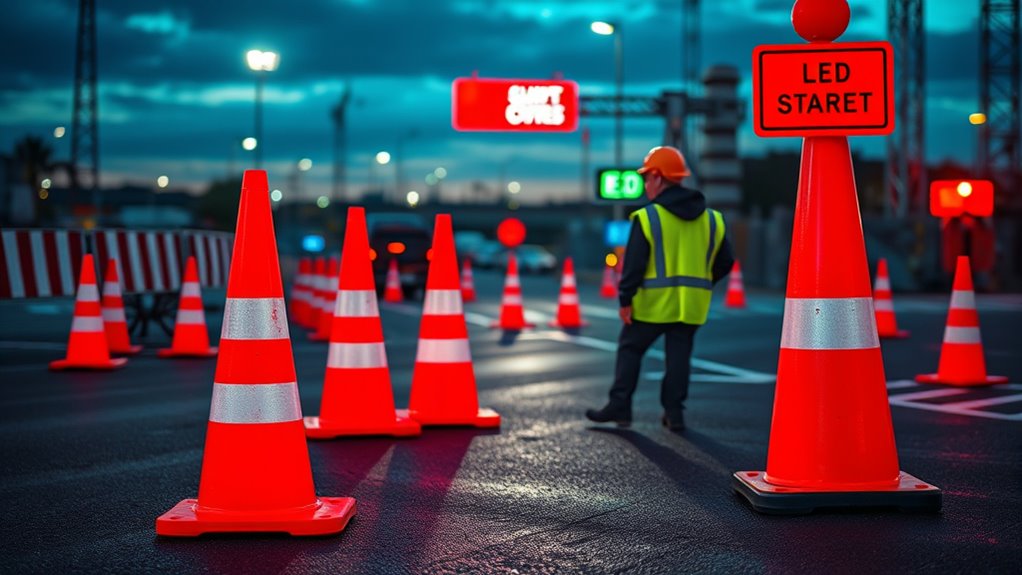
Standardized Color Codes and Their Impact on Workplace Safety

Standardized color codes play a crucial role in workplace safety by providing clear and consistent visual signals that everyone can understand instantly. By following established color standards, hazard communication becomes more effective, reducing confusion during emergencies. A focus on high-visibility colors, such as fluorescent yellow and orange, is essential to enhance worker conspicuity, aligning with ANSI-ISEA-107-2015 standards. When these colors are applied uniformly across equipment, signage, and safety gear, response times improve, and perception-related accidents decrease. Consistent color coding ensures all personnel interpret safety messages accurately and efficiently, reinforcing the importance of workplace safety protocols. Additionally, incorporating standardized color schemes can streamline safety procedures across various industries, making hazard identification even more intuitive. Employing color coding systems helps in reducing miscommunication, which is vital for preventing accidents and ensuring swift action in critical situations. Using color psychology principles can further enhance the effectiveness of safety signals by leveraging subconscious associations with specific colors. Ultimately, standardized color codes are essential for creating a safer environment where hazards are easily recognized and addressed promptly.
Technological Advances in Retroreflective Safety Materials
Recent technological advances have revolutionized retroreflective safety materials, making them more durable, effective, and adaptable to challenging environments. Modern retroreflective materials incorporate nanostructures and UV-stable polymers, boosting reflectivity and longevity.
These innovations include microprisms and advanced glass bead technologies that enhance the intensity and uniformity of reflected light, improving nighttime visibility. Additionally, self-cleaning coatings and multifunctional nanomaterials help maintain high reflectivity even in harsh conditions, reducing maintenance needs. Enhanced data processing speeds enable real-time adjustments to reflectivity based on ambient lighting conditions, further optimizing safety. Importantly, eco-friendly, recyclable retroreflective materials are now being developed to reduce environmental impact without compromising safety standards, ensuring that performance and sustainability go hand in hand in the future of safety gear. Furthermore, ongoing research into AI-driven safety materials is set to further optimize and customize reflective properties for specific environments and user needs. The integration of sustainable manufacturing practices is also gaining momentum, aiming to minimize ecological footprints while maintaining high safety performance. Advances in material engineering continue to push the boundaries of what is possible in safety gear technology, leading to safer and more sustainable solutions. The development of adaptive reflective technologies allows for more precise control over visibility in various conditions, enhancing overall safety.
Addressing Visual Challenges Posed by Eye Conditions
If you or someone you know has an eye condition, you might notice colors appear faded or distorted, making it harder to see hazards. Improving contrast and increasing brightness can help improve object detection and overall safety. Using lighting adjustments or specialized devices can make a real difference in perceiving safety signals clearly. Additionally, incorporating high-contrast color schemes in signage and environment design can further enhance visibility for those with visual challenges. Implementing color contrast techniques has proven effective in making critical information more accessible. Considering the use of vetted newborn sunscreens can also prevent skin issues that may further impair visual comfort or health. For individuals with certain eye conditions, selecting appropriate lighting solutions can significantly improve their ability to perceive safety cues effectively. Awareness of regional legal resources and consulting experienced professionals can also support effective adaptations for visual safety needs.
Contrast for Better Detection
Have you ever struggled to distinguish objects or signs because of eye conditions like macular degeneration or glaucoma? Improving contrast can make a big difference in visibility and safety. High contrast between objects and backgrounds helps you detect hazards easily, even with reduced color perception. Using bold, contrasting colors like dark text on a light background enhances recognition. Adding contrasting markings, such as bright tape on stairs or door edges, improves spatial awareness and prevents accidents. Adjusting environmental contrast levels is a proven strategy to support detection. Here’s a quick guide:
| Object Type | Ideal Contrast Color Pairing | Purpose |
|---|---|---|
| Signage | White on black | Better detection |
| Stairs | Bright tape on dark stairs | Prevent falls |
| Door edges | Bright contrasting colors | Improve spatial awareness |
| Floor markings | Yellow on dark surfaces | Clear pathways |
| Handrails | Dark on light background | Enhanced safety |
Using contrast ensures safer, more accessible environments, and integrating automated technology can further assist individuals with visual challenges.
Brightness Enhances Perception
Enhancing brightness in your environment can greatly improve visibility for individuals with eye conditions such as cataracts, glaucoma, or diabetic retinopathy. Increased brightness boosts contrast and reduces shadows, making objects easier to see. Additionally, Kia Tuning modifications like upgraded lighting systems can further enhance safety by improving nighttime visibility. Proper lighting helps compensate for reduced contrast sensitivity, allowing for better visual perception and safer navigation. Using high-contrast, bright colors or adjusting ambient lighting minimizes glare and enhances clarity. For people with macular degeneration, increased brightness improves the differentiation of colors and objects, reducing confusion and improving safety. Optimizing brightness settings on visual aids and safety signage ensures quicker recognition and better perception of hazards.
Practical Strategies for Enhancing Visibility at Work and Home
To improve visibility at work and home, start by using high-contrast colors for important objects and pathways. Consistently applying color coding helps you quickly identify tools and supplies, saving time and reducing mistakes.
Additionally, boosting lighting and brightness levels makes everything easier to see, especially in areas with low natural light.
Use High-Contrast Colors
Did you know that choosing high-contrast colors can dramatically improve safety and visibility in everyday settings? Using contrast effectively makes objects and signage easier to spot, especially in busy or low-light environments.
Applying high-contrast colors to safety signage, hazard marking, and pathway boundaries helps ensure quick recognition and reduces accidents. For example, yellow on black or white on dark backgrounds enhances visibility and detection speed.
Reflective or luminous materials with contrasting colors boost nighttime safety. In your home, dark labels on light containers improve identification, aiding those with visual impairments.
Proper use of high-contrast colors minimizes search times and reinforces safety measures, making your environment safer and more accessible for everyone.
Implement Consistent Color Coding
Implementing consistent color coding is a practical way to improve safety and organization at work and home. When you use standardized color codes—like red for danger and green for safety—you enable quick hazard recognition, boosting visibility.
Maintaining consistency across tools, storage areas, and safety signs reduces confusion and helps everyone understand safety cues immediately. Applying high-contrast color combinations enhances the effectiveness of labels and markings, especially for those with visual impairments.
It’s essential to regularly update and uphold your color-coded systems so they remain clear and reliable over time. Additionally, training yourself and others on the meaning of these colors fosters better compliance and safer behaviors.
Adhering to clear standards ensures your color coding system stays effective in promoting safety and visibility.
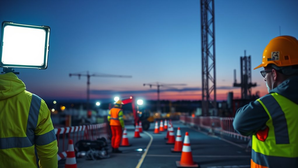
Enhance Lighting and Brightness
Enhancing lighting and brightness is essential for improving visibility and safety in both work and home settings. You can boost contrast and reduce hazards by increasing ambient lighting or adding task-specific lights. Proper placement minimizes shadows and glare, making important features more noticeable. Using high-contrast, bright-colored safety markings improves detection in poorly lit areas. Adjusting the brightness of fixtures or replacing bulbs with higher lumen outputs compensates for diminished color perception. Incorporating adjustable lighting systems allows you to tailor illumination to specific tasks and environments, optimizing overall visibility and safety.
| Lighting Strategy | Benefits |
|---|---|
| Increase ambient lighting | Enhances overall visibility |
| Add task-specific lights | Focuses on critical areas, reducing hazards |
| Use high-contrast signage | Improves detection in low-light situations |
| Implement adjustable systems | Customizes brightness for safety and comfort |
Integrating Color Psychology to Promote a Safer Environment
Integrating color psychology into safety environments effectively guides behavior and enhances awareness by using colors that naturally attract attention and evoke specific responses.
By leveraging principles of color psychology, you can select safety signage and clothing that immediately draw eyes, such as red for hazards and green for safety equipment. High-contrast colors create visual cues that improve hazard recognition, especially in complex or busy settings.
Empirical studies show that standardized color cues reduce reaction times and support faster decision-making during emergencies. Bright, bold color combinations increase scene conspicuity, making critical information stand out.
When you incorporate these psychological insights into your safety design, you foster a more intuitive environment where individuals quickly identify dangers and respond appropriately, ultimately promoting a safer workplace.
Frequently Asked Questions
What Color Promotes Safety?
You’re wondering which color promotes safety. Yellow often signals caution and alertness, making it great for hazardous areas.
Green indicates safety and helps you identify emergency exits and first aid stations quickly.
Bright colors like fluorescent orange and neon yellow improve your visibility in low-light conditions, reducing accidents.
Red highlights danger or emergency equipment, so you can respond swiftly.
Using these standardized colors keeps everyone safe and minimizes confusion.
What Color Is Best for High Visibility?
When considering the best color for high visibility, you should prioritize fluorescent yellow-green and orange. These colors offer maximum contrast against most backgrounds, making you more noticeable during daytime and low-light conditions.
Fluorescent yellow-green is especially effective in daylight, while orange works well in various environments. By choosing these colors for your safety gear, you increase your chances of being seen quickly, reducing the risk of accidents.
What Are the OSHA Colors for Safety?
OSHA assigns specific colors for safety signs to help you quickly recognize hazards and safety information. Red indicates fire hazards and emergency equipment, ensuring you notice them immediately.
Yellow warns you about caution or hazards, prompting careful attention.
Green shows safety info like first aid stations, guiding you to safe areas.
Blue signals mandatory actions, instructing you on required safety procedures.
These standardized colors keep you aware and safe in the workplace.
What Are the Effective Colors for High Visibility Safety Apparel?
Imagine a beacon shining through dense foliage—that’s what fluorescent yellow-green and orange do for your safety apparel. These vivid colors stand out against natural backgrounds, making you highly visible during the day.
When paired with reflective strips, they guarantee you’re seen even at night. By choosing these effective colors, you cut down search times and boost safety, turning your clothing into a powerful signal of caution and awareness.
Conclusion
By understanding how color impacts safety and visibility, you can make smarter choices to protect yourself and others. From selecting the right high-visibility gear to using color psychology effectively, every detail matters. Are you ready to harness the power of color to create a safer environment at work and home? Remember, small changes in color choices can lead to big improvements in safety—so why not start today? Your safety depends on it.