
Bright and cheerful accent colors like yellow and orange can instantly lift your mood and energize your space. Red adds a stimulating vibe that encourages social interaction and motivation, while soft pastels promote calmness and gentle happiness. Incorporating calming blues supports relaxation and reduces stress. Neutral tones provide stability without overwhelming, balancing out vibrant hues. To create an uplifting environment, choosing the right accent colors is key—if you stay tuned, you’ll discover more on making your space truly mood-boosting.
Key Takeaways
- Bright yellow accents evoke happiness, optimism, and increased energy in interior spaces.
- Vibrant orange accents stimulate motivation, positivity, and create energetic focal points.
- Uplifting red accents encourage excitement, social interaction, and a lively atmosphere.
- Soft pastels promote calmness, relaxation, and a gentle mood lift in various rooms.
- Neutral tones provide stability and balance, enhancing overall emotional well-being and comfort.
The Energizing Power of Yellow

Yellow is known for its ability to boost energy and create a cheerful atmosphere. By adding yellow decor and sunny accents to your space, you instantly brighten the mood and energize your environment. Bright yellow walls or accessories draw attention and evoke feelings of happiness and optimism. Incorporate yellow decor through throw pillows, artwork, or furniture pieces to make your room feel lively and inviting. Sunny accents, like a vibrant vase or curtains, can help elevate your mood and foster a sense of warmth. Yellow’s natural vibrancy stimulates mental activity and encourages positivity. Whether used sparingly or extensively, yellow decor energizes your space and lifts your spirits, making it perfect for areas where you want to boost motivation and create a joyful vibe. Adjustments in angle and tilt of your surroundings can also influence your emotional response and overall ambiance.
Calming Blues and Their Mood Benefits
Calming blues can transform your space into a tranquil oasis, making it easier to relax and unwind. They help create a soothing atmosphere that promotes mental clarity and peace. By incorporating these hues, you can effectively reduce stress and foster a sense of calm in your environment. Additionally, home decor choices that feature calming blues can enhance the overall ambiance and support your well-being.
Tranquil Atmosphere Enhancement
Using soothing shades of blue can instantly create a tranquil atmosphere in any space. This color’s psychological impact promotes calmness, helping you feel more relaxed and centered. Color psychology shows that blues are linked to serenity and stability, making them ideal for areas where you want to foster peace. When you incorporate calming blues into your decor, you set a mood that encourages quiet reflection and reduces feelings of tension. Whether you choose soft pastel shades or deeper navy tones, these hues help establish a soothing environment. By consciously selecting tranquil blues, you enhance your space’s overall ambiance, making it a retreat from daily stress. Incorporating color psychology principles can further optimize the mood-boosting effects of these hues, creating a more harmonious environment. This intentional use of color can profoundly boost your mood and promote a sense of well-being.
Stress Reduction Effects
Have you ever noticed how certain colors can instantly influence your mood? In color psychology, calming blues are known for their stress reduction effects, making them ideal for creating a peaceful environment. When you incorporate these hues into your space, you promote environmental stress reduction, helping you feel more relaxed and centered. Blue shades evoke feelings of tranquility and stability, which can lower cortisol levels and ease tension. Using calming blues in your decor—such as walls, accessories, or textiles—can improve your overall mood and reduce anxiety. Additionally, incorporating these colors can support emotional well-being by fostering a sense of calm and safety. By intentionally selecting these soothing colors, you transform your surroundings into a sanctuary that supports mental well-being and promotes a sense of calm amidst daily stressors.
Uplifting Reds for a Stimulating Atmosphere
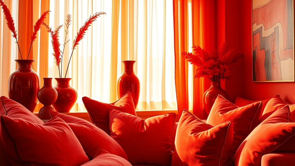
Uplifting reds can energize your space and create a lively atmosphere that keeps everyone alert. They naturally stimulate conversation flow, making social interactions more dynamic. Incorporating reds thoughtfully can transform your environment into a space that feels vibrant and engaging. Understanding personality traits and how individuals respond to color can help you choose the most effective shades for your setting.
Energizing Space Effects
Red hues like vibrant reds and fiery scarlets can instantly energize a space, creating a stimulating atmosphere that sparks activity and focus. In color psychology, reds are known to boost adrenaline and motivation, making them perfect for workspaces or lively living areas. Incorporating these shades aligns with current interior design trends that favor bold, statement colors to elevate energy levels. When used thoughtfully, reds can make a room feel more dynamic and inviting. You might consider accent walls, accessories, or furniture in these shades to activate your environment without overwhelming it. Remember, the key is balance—too much red can feel intense, but used correctly, it transforms your space into an inspiring hub of activity and productivity. To ensure your choices are safe and effective, research companies thoroughly before investing in any home decor products.
Stimulates Conversation Flow
Vibrant reds do more than energize a space; they also encourage lively conversations and social interactions. In color psychology, red stimulates excitement and passion, making it ideal for areas meant for interaction. According to current interior design trends, incorporating red accents can create a stimulating atmosphere that naturally promotes dialogue. Additionally, understanding the personal finance management principles behind creating a balanced environment can help you design spaces that foster both social interaction and comfort. To maximize this effect, consider these tips: – Use red in focal points like accent walls or furniture to draw attention. – Pair red with neutral tones to prevent overwhelming the senses while maintaining a lively vibe. – Incorporate red accessories such as cushions or artwork to subtly boost conversation flow. – Keep lighting warm to enhance the energetic feel of red hues and foster open communication. These strategies help you craft spaces that invite social engagement effortlessly.
Serene Greens to Promote Relaxation
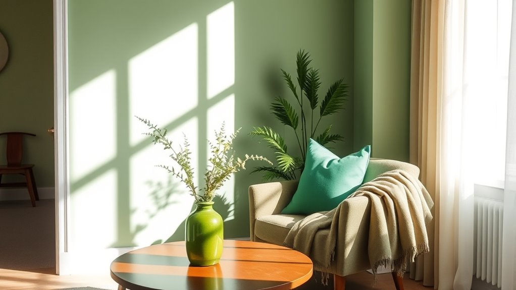
Because green is often associated with nature and tranquility, using serene greens as accent colors can effectively promote relaxation in any space. Incorporate botanical accents and nature-inspired palettes to create a calming environment that soothes your mind. These shades evoke the peacefulness of forests and gardens, helping you feel grounded and refreshed. When you add touches of soft green to your decor—whether through cushions, artwork, or furniture—they foster a sense of balance and serenity. Serene greens work well in bedrooms, living rooms, or meditation areas, encouraging you to unwind and breathe easier. By choosing subtle, muted tones, you enhance your space’s calming vibe without overwhelming it. This color strategy supports relaxation, making your environment more inviting and peaceful. Additionally, considering AI-driven design tools can help you select the perfect shades to optimize mood and ambiance.
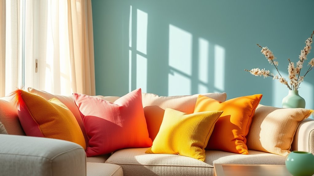
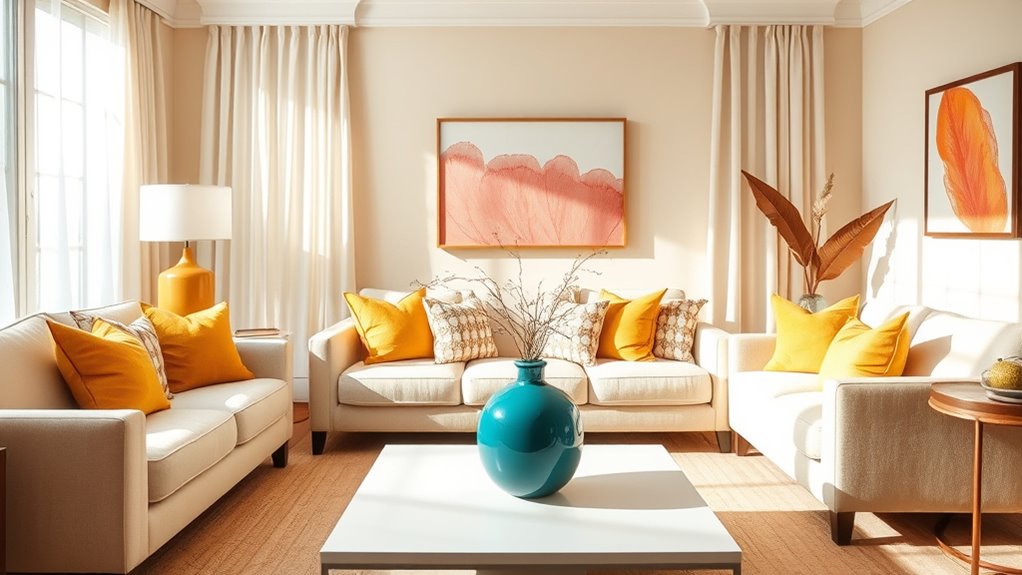
Bright and Cheerful Orange Accents

Have you considered how bright and cheerful orange accents can energize your space? According to color psychology insights, orange stimulates enthusiasm, creativity,, and warmth, making it perfect for lively environments. Using interior design tips, you can incorporate orange strategically to boost mood without overwhelming the room. Sound design techniques can be applied to incorporate subtle auditory cues that enhance the energetic atmosphere in your environment.
- Add orange throw pillows or cushions to sofas for a pop of energy
- Paint an accent wall in a vibrant orange hue to create a focal point
- Incorporate orange artwork or decorative accessories to evoke positivity
- Use orange in textiles like curtains or rugs to warm up the space
These subtle touches can transform your environment into an inviting, energetic haven, helping you feel more motivated and uplifted daily.
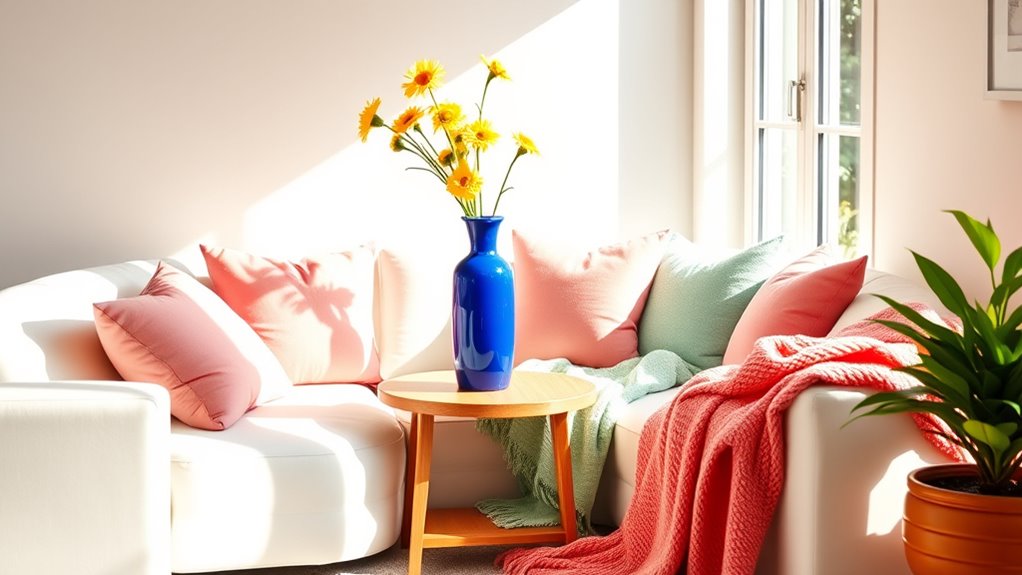
Soft Pastels for a Gentle Mood Lift

Soft pastels offer a subtle yet effective way to create a calming atmosphere that gently lifts your mood. In color psychology, these gentle hues evoke feelings of tranquility, comfort, and relaxation. They’re popular in interior design trends because they promote a soothing environment without overwhelming the senses. By incorporating soft pinks, blues, mint greens, or lavender accents, you can enhance your space’s serenity while subtly boosting your emotional well-being. These colors are versatile, blending well with neutral tones or other accent shades, making them ideal for bedrooms, living rooms, or workspaces. When you choose pastel accents, you create a welcoming, peaceful vibe that encourages mindfulness and reduces stress, aligning beautifully with current design trends focused on wellness and comfort. Additionally, pairing these soft shades with dog-friendly decor can make your space even more inviting for pets, especially breeds like Golden Retrievers and Beagles who thrive in calm environments.
How Neutral Tones Influence Emotional Well-Being
Neutral tones, such as beige, taupe, gray, and ivory, play a significant role in shaping your emotional well-being by creating a calming and balanced environment. These colors foster a sense of stability, helping you feel more grounded and less overwhelmed. Incorporating neutral tones can promote emotional stability by providing a soothing backdrop that minimizes visual noise and distractions. They encourage relaxation and can improve focus, making your space feel more restful. Consider these benefits:
- Reduce stress and anxiety
- Enhance feelings of safety and comfort
- Serve as versatile backgrounds for accent colors
- Support mental clarity and focus
Neutral tones are powerful allies in maintaining emotional well-being, offering a serene atmosphere that nurtures peace of mind.
Frequently Asked Questions
How Do Accent Colors Impact Long-Term Mental Health?
Accent colors positively impact your long-term mental health by enhancing long-term emotional resilience. When you incorporate habitual color exposure, like calming blues or energizing yellows, you create a supportive environment that promotes stability and reduces stress. Over time, these colors can influence your mood and mindset, helping you build emotional strength. Consistently surrounding yourself with intentional accent colors fosters a healthier mental outlook and encourages sustained emotional well-being.
Can Color Psychology Vary Across Different Cultures?
Yes, color psychology can vary across different cultures. You might think a color like white signifies purity, but in some cultures, it symbolizes mourning. Cultural color meanings influence how people perceive colors, affecting your emotional response. Cross-cultural color perception shows that the same color can evoke different feelings depending on cultural context, so be mindful of these differences when choosing colors for shared spaces or international settings.
Are There Any Accent Colors That May Negatively Affect Mood?
You should be cautious with dark shades and aggressive hues like intense reds or stark blacks, as they can negatively affect your mood. These colors might create feelings of tension, anxiety, or even depression if overused. Instead, opt for softer or more balanced tones to promote calmness and happiness. Remember, bold or dark colors can be striking, but they may also overwhelm your space and your emotions if not used thoughtfully.
How Should Accent Colors Be Balanced in a Space for Optimal Mood?
Think of your space like a symphony, where each color is an instrument. You should balance accent colors with your base hues to create harmony, avoiding overwhelming contrasts. Use accent colors as visual focal points to guide the eye and evoke mood, but keep them in moderation to maintain a cohesive environment. When balanced, your space feels lively yet calming, uplifting your mood without chaos.
Do Personal Preferences Influence the Effectiveness of Mood-Boosting Colors?
Yes, personal preferences greatly influence how mood-boosting colors work for you. Your individual emotional responses to certain colors can enhance or diminish their positive effects. If you love a color, it’s more likely to uplift your mood, even if it’s not traditionally considered a mood-boosting hue. Trust your feelings and choose colors that resonate with you, creating a space that genuinely supports your happiness and well-being.
Conclusion
Did you know that colors can influence your mood by up to 88%? By choosing the right accent colors, you can instantly boost your energy, calm your mind, or foster relaxation. Whether it’s a pop of yellow to energize or soft pastels to soothe, these hues have the power to transform your space—and your feelings. Start experimenting with these shades today, and watch your mood lift naturally and effortlessly.