
Colors greatly influence your mood and emotional well-being, especially for elderly individuals. Warm hues like red and yellow energize and promote social activity, while cool shades like blue and green encourage relaxation and calmness. Bright colors can boost energy, but too much may cause overstimulation. Neutral tones create comfort, and strategic use of colors can improve safety and cognitive function. To discover simple ways to create supportive, mood-enhancing environments, keep exploring this topic further.
Key Takeaways
- Warm colors like red and orange can energize seniors and promote social interaction, reducing feelings of lethargy.
- Cool tones such as blue and green foster relaxation, lowering stress and supporting mental calmness.
- Bright, saturated hues can boost mood and alertness but should be balanced to prevent overstimulation.
- Neutral and earth tones create soothing environments that decrease anxiety and promote comfort.
- Appropriate color contrasts enhance navigation and safety, reducing confusion and supporting emotional well-being.
The Role of Warm and Cool Colors in Enhancing Elderly Well-Being
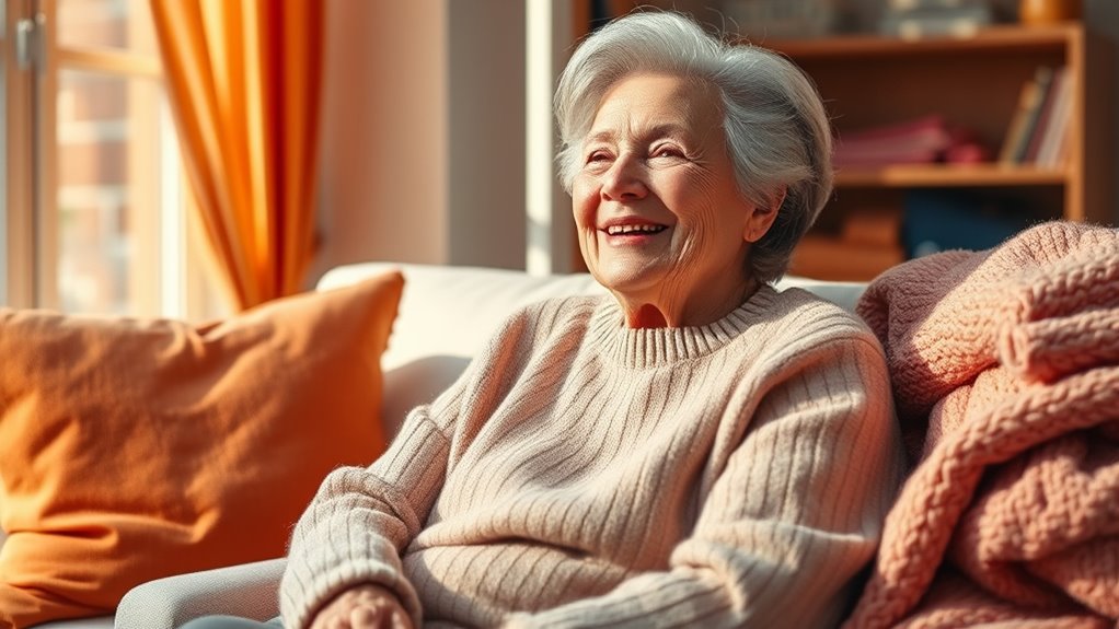
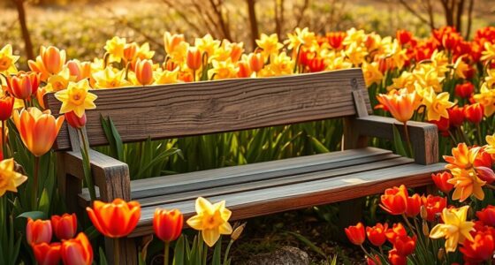
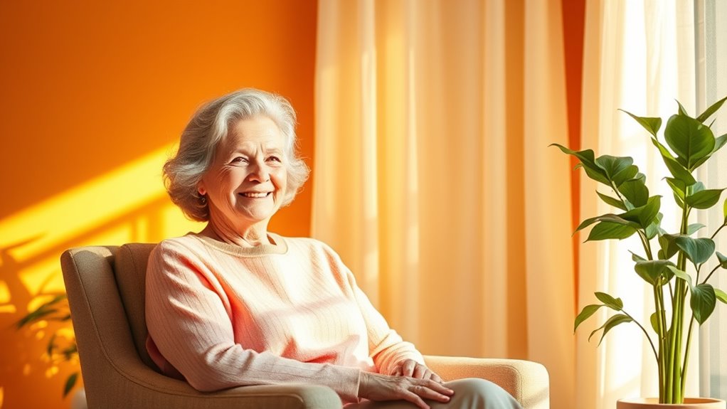
Colors play a crucial role in shaping the emotional and physical well-being of elderly individuals. Warm colors like red, orange, and yellow can energize you and encourage social interaction, helping reduce feelings of lethargy. Incorporating warm colors in communal spaces can boost mood and create a sense of warmth and comfort.
Conversely, cool colors such as blue, green, and purple promote relaxation and calmness, which support mental well-being in senior living environments. Color psychology shows that these tones influence emotional responses, with cool hues lowering blood pressure and heart rate, fostering relaxation. Understanding how color impacts mood can guide you in creating spaces that promote well-being and emotional resilience. Research also indicates that the visual environment significantly affects cognitive function and mood stability in elderly individuals. Recognizing the importance of color psychology can help in designing environments that improve overall quality of life for seniors.
How Bright and Saturated Hues Influence Energy Levels and Mood
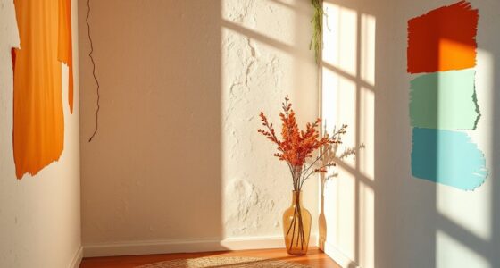
Bright and saturated hues like vibrant reds and oranges can instantly boost your energy levels and lift your mood. These bright colors have powerful psychological effects, increasing alertness and stimulating essentiality. Incorporating color psychology principles into your living space can further enhance these benefits. When incorporated into your living space, vivid hues can enhance mood and motivation, encouraging you to stay active and socially engaged. Additionally, understanding the impact of color saturation can help you select shades that are energizing without overwhelming your senses. Recognizing the importance of effective color balance can help prevent overstimulation and promote a calming environment. It’s also beneficial to consider how light exposure interacts with these colors, as natural and artificial lighting can influence their perceived intensity and effect. However, it’s important to use these colors thoughtfully, as overexposure to intense, saturated shades may cause overstimulation and anxiety in some seniors.
The key to effective mood enhancement lies in balancing vivid hues within your color scheme, pairing them with appropriate lighting and contrast. This approach helps prevent visual fatigue and maintains comfort, ensuring that the energizing benefits of bright colors support your well-being without becoming overwhelming.
The Impact of Neutral and Earth Tones on Calmness and Comfort
Neutral and earth tones like beige, taupe, and warm browns create a soothing environment that promotes relaxation and emotional stability for elderly individuals. These neutral colors are linked to nature, helping reduce anxiety and stress, which enhances comfort in living spaces. Incorporating attention in creative practice can also improve the way these colors are used to optimize calming effects. By incorporating earth tones, you foster calmness and a cozy atmosphere that supports relaxation and emotional well-being. Consider these benefits:
- Minimize visual overstimulation, making environments easier to navigate.
- Promote a sense of stability and peace.
- Enhance comfort and relaxation during rest periods.
- Help seniors feel more at ease and less anxious.
Adding color psychology principles can further refine the use of these tones to maximize their positive impact. Using earth tones in wall paint, furniture, and accessories creates a peaceful setting that encourages mental clarity and emotional balance, ultimately improving quality of life. Additionally, understanding the importance of retail environment design can assist caregivers and designers in selecting colors that foster a calming atmosphere in common areas. Incorporating environmental psychology insights can also guide the strategic placement of colors to enhance mood and well-being in elderly living spaces. Paying attention to visual harmony ensures that color combinations promote overall serenity and comfort.
Color Choices for Supporting Cognitive Function and Reducing Stress
Choosing the right hues can considerably enhance cognitive function and help reduce stress in elderly individuals. Calming colors like blue and soft pastel greens promote relaxation and emotional stability, making them ideal for stress reduction. Incorporating shades of red carefully can boost alertness and support cognitive engagement, especially when balanced with cool tones. High-contrast color schemes improve visual clarity, aiding those with vision challenges. Soft, muted shades of lavender and pastel greens foster a calming environment that lowers cortisol levels, supporting mental well-being. Using natural hues, such as earthy browns and leafy greens, further enhances mood and creates a sense of safety and comfort. Additionally, understanding divorce statistics can help caregivers appreciate the importance of creating a stable and supportive environment during transitional periods. Creating environments with appropriate color schemes can also promote a sense of visual comfort and reduce eye strain, which is especially beneficial for the elderly. Incorporating light therapy and color-enhanced lighting can further support cognitive activities and provide additional stimulation. Engaging with color psychology principles can optimize the environment to promote emotional resilience and overall well-being.
Practical Strategies for Incorporating Color Psychology Into Senior Living Spaces
Incorporating effective color strategies into senior living spaces can substantially enhance residents’ comfort, safety, and overall well-being. To do this, focus on key principles of color psychology.
First, use calming colors like soft blue, green, and lavender in common areas to promote relaxation and reduce stress.
Second, apply high-contrast color schemes, such as dark furniture against light walls, to improve visual contrast and aid navigation for those with declining eyesight.
Third, choose warm, inviting hues like gentle yellows and earthy browns in social spaces to foster a welcoming environment and encourage community.
Fourth, combine these colors with appropriate lighting to boost mood enhancement and safety.
These simple strategies help create spaces that support both physical and emotional needs of seniors.
Frequently Asked Questions
How Do Colors Affect a Person’s Mood?
Colors influence your mood by shaping your emotional responses. Bright, warm shades like red and orange boost your energy and excitement, making you feel more alert.
Cool tones such as blue and green help you relax and feel calmer. High-contrast colors improve your visibility, reducing frustration.
Natural hues evoke safety and comfort, but overly stimulating or dull colors can cause anxiety or sadness. Your surroundings can markedly impact how you feel throughout the day.
What Colors Do Elderly Have Trouble Seeing?
You might notice that elderly individuals often struggle to see pastel shades or light tones clearly. Diminished contrast sensitivity and changes in color perception make it hard for them to distinguish muted or similar hues, especially in low-light settings.
Bright, bold colors like red or dark blue stand out more and are easier to see, helping improve their visibility and safety. This can influence how they perceive their environment daily.
What Are the Color Preferences of the Elderly?
When you consider the color preferences of elderly individuals, you’ll notice they tend to favor soft, muted shades like pastel blues, greens, and lavenders that promote calmness.
Many find blue particularly soothing, reducing stress and boosting contentment.
Some also enjoy warm tones like yellow and orange, which evoke happiness and energy.
Keep in mind, personal and cultural backgrounds greatly influence these preferences, making each individual’s favorites unique.
What Colors Attract Seniors?
Imagine a gentle beacon guiding you through a sea of choices—those are the colors that attract seniors. You’ll find that deep greens and earthy browns feel like a cozy embrace, while soft yellows and oranges spark joyful energy.
Blues, like calm lakes, invite trust and relaxation. High-contrast combinations make everything clearer, helping you see beauty and safety in every hue that surrounds you.
Conclusion
By thoughtfully choosing colors, you can transform senior living spaces into vibrant havens that uplift spirits and soothe minds. Your color choices hold the power to turn a dull room into a sanctuary of joy and tranquility, like painting hope itself across walls. Embrace warm, calming, and energizing hues to support elderly well-being. With each hue, you’re crafting an environment where seniors feel truly alive, cherished, and at peace—more radiant than a sunrise bursting through the clouds.