
To choose easier-to-read labels, controls, and displays at home, focus on high-contrast colors, simple fonts, and large sizes to improve visibility. Opt for tactile features like raised symbols or textured surfaces for easy identification and use controls that respond well to voice commands or tactile feedback. Test everything in different lighting conditions and from various angles to guarantee clarity. If you want more tips, you’ll find useful strategies for making your home more accessible as you keep exploring.
Key Takeaways
- Use high-contrast colors and large, simple fonts to enhance readability and visibility.
- Incorporate tactile elements like raised symbols or textured surfaces for easier identification.
- Opt for intuitive, clearly labeled controls that respond well to voice commands and tactile feedback.
- Ensure displays have high contrast visuals, large fonts, and are easy to clean and maintain.
- Regularly inspect and update labels, controls, and displays for wear, clarity, and accessibility.

120PCS Home Moving Labels, 5 Color Coding Labels Packing Box Stickers with 20 Fragile Stickers & 20 Blank Ones, Apartment Moving Helper (Each Measures 2” x 3.6”)
Value Pack: It comes with 120pcs colorful Labels are aligning on 24 easily distributed sheets, each measures 2”…
As an affiliate, we earn on qualifying purchases.
As an affiliate, we earn on qualifying purchases.
How to Assess Your Home’s Lighting and Visibility Needs
Have you ever struggled to read a label or find a switch in your own home? Your visual acuity and lighting conditions play a big role in how easily you see controls and labels. Start by evaluating your current lighting; consider if areas are too dim or overly bright. Smart lighting can adapt to your needs, providing adjustable brightness and color temperature. This flexibility can enhance visual clarity and make daily tasks more comfortable. Pay attention to how well you see labels and controls during different times of the day. If you notice difficulty, it’s a sign you might need better lighting solutions or more contrast between labels and backgrounds. Additionally, understanding home design and architecture details can help you optimize control placement and lighting angles to improve visibility. Proper lighting design can also reduce glare and shadows that hinder visibility. Considering lighting controls can further help you tailor your environment for optimal visibility, ensuring you can easily see and operate your home controls without strain.

QTETAK 200 Pcs 10 Value Micro Momentary Tactile Push Button Switch Tact Assortment Kit
Micro Switch Car Remote Control Button Switches SMD DIP Assortment Kit with 10 values 200pcs in total
As an affiliate, we earn on qualifying purchases.
As an affiliate, we earn on qualifying purchases.
How to Design Labels That Are Easy to Read and Understand
To make your labels easy to read, start with clear, simple fonts that are easy on the eyes. Use high-contrast colors to guarantee text stands out from the background, making it easier to see at a glance. These choices help your labels communicate their message quickly and effectively. Incorporating color accuracy into your design can also improve how well the colors on your labels are perceived, ensuring they are both attractive and functional. Paying attention to digital concepts can further enhance the accessibility of your labels, especially for users with visual impairments. Additionally, considering sound healing science principles, such as subtle vibrations, can be an innovative way to make labels more engaging and memorable. Being aware of astrological signs and their perceived traits may also inspire creative design elements that resonate with different user preferences. Understanding visual perception can also aid in creating labels that are universally easier to interpret.
Use Clear Fonts
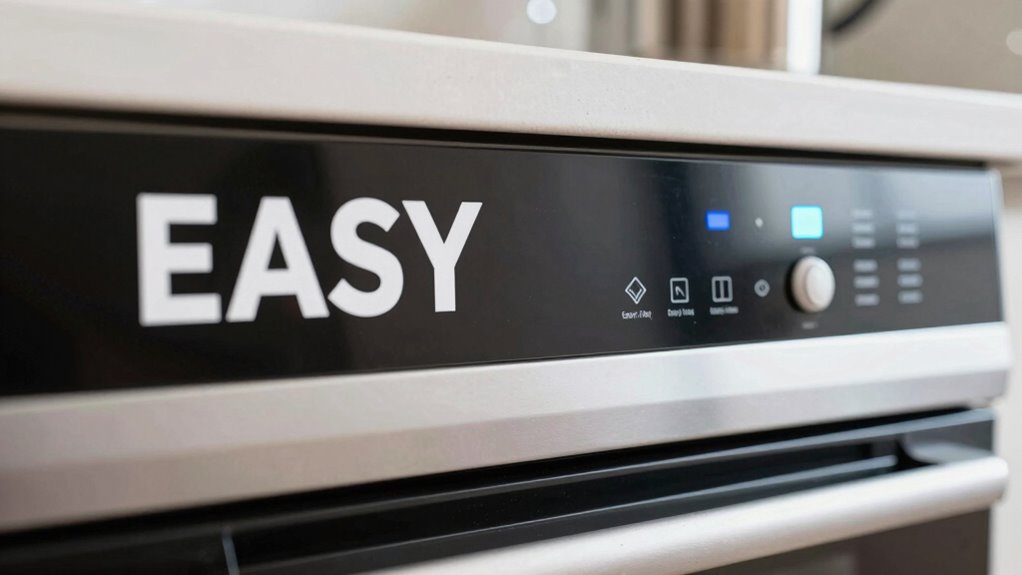
Ever wondered why some labels are easier to read than others? The key lies in using clear fonts. Font readability is essential—you want your labels to be instantly understandable without straining your eyes. Choose simple, sans-serif fonts like Arial or Helvetica, which are easier to read at a glance. Avoid decorative or cursive styles that can cause confusion. Additionally, select fonts that are large enough to read comfortably. Remember, a clear font not only improves readability but also enhances label durability; a well-designed font won’t fade or blur over time, making your labels last longer. Keep it straightforward and consistent to guarantee quick recognition and ease of use. Incorporating fire pits or outdoor ovens into your backyard can also benefit from clear labeling to ensure safety and proper use. Paying attention to font size and spacing can further improve the overall clarity of your labels, making them more accessible for everyone. Using contrast between text and background can also significantly boost readability, especially in different lighting conditions.
Choose High-Contrast Colors
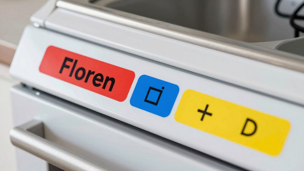
Choosing high-contrast colors is essential because it makes your labels stand out and easy to read at a glance. Using strong color contrasts creates a clear visual hierarchy, guiding your eye to important information quickly. Color psychology plays a role here—bright or bold colors can draw attention, while muted tones recede into the background. Stick to combinations like black on white or dark blue on light yellow for maximum readability. Avoid low-contrast pairings that make text hard to distinguish. High-contrast colors help users instantly identify controls and labels, reducing confusion. By thoughtfully applying contrast, you make your labels more accessible and user-friendly, ensuring everyone can easily understand and operate your household controls without frustration. Additionally, considering trusted market reviews can help you select labels and controls that prioritize clarity and customer satisfaction. Paying attention to visual accessibility standards can further enhance the effectiveness of your labels for all users. Incorporating ergonomic design principles can also improve overall usability and comfort. Moreover, understanding color contrast guidelines can help you adhere to best practices for accessibility and readability.

uyoyous 6+1 Panel Trade Show Presentation Board 70.8" x 70.8" SIX Folding Display Panel Poster Board Large Single Sided Tabletop Display Board for Event, School Project, Science Fair, Black
Large Display Area: The 6+1 panel tabletop presentation board is a folding display panel with a single panel…
As an affiliate, we earn on qualifying purchases.
As an affiliate, we earn on qualifying purchases.
Choosing User-Friendly Controls for Simple Operation

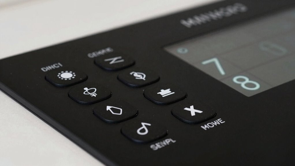
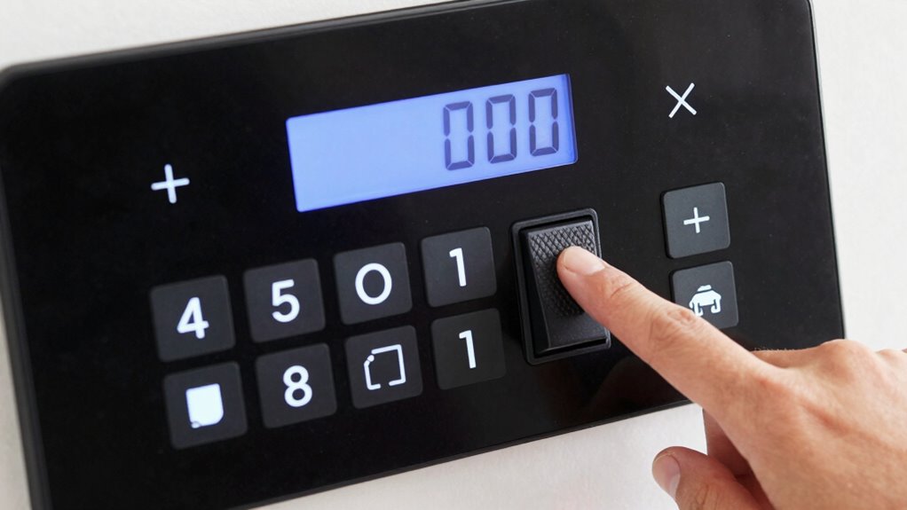
Selecting controls that are intuitive and easy to operate can make a big difference in how smoothly you use a device. Look for options that respond well to voice commands, allowing you to control gadgets hands-free and reduce errors. Tactile feedback is also important; it confirms your actions through physical responses like clicks or vibrations, so you know your input was registered. Choose controls with simple, clearly labeled buttons or switches that are easy to grasp and press. Avoid overly complex interfaces or tiny controls that require fine motor skills. Incorporating regional or specialty flavors, such as coffee or tea insights, into your device controls can also add a personalized touch. By prioritizing voice command compatibility and tactile feedback, you make device operation straightforward, even if you have limited dexterity or vision. Utilizing accessible household products can further enhance safety and ease of use. Paying attention to user interface design ensures that controls are straightforward and accessible for everyone. These features help you stay confident and independent when managing your home devices.
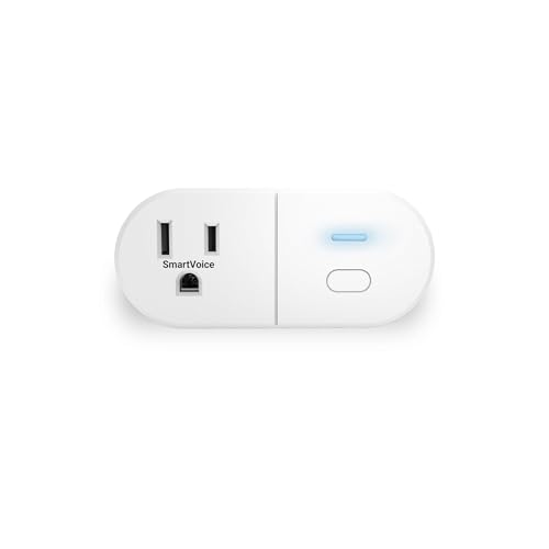
Emerson SmartVoice ES513 Wall Plug, Offline 30+ Voice Control Commands – No APP, No WiFi, No Setup, Smart Outlet Extender for Home and Office, Sleep & Wake Timer, ETL Listed
🔊 100% Offline Voice Control – Control any plugged-in device with simple voice commands using built-in SmartVoice Technology….
As an affiliate, we earn on qualifying purchases.
As an affiliate, we earn on qualifying purchases.
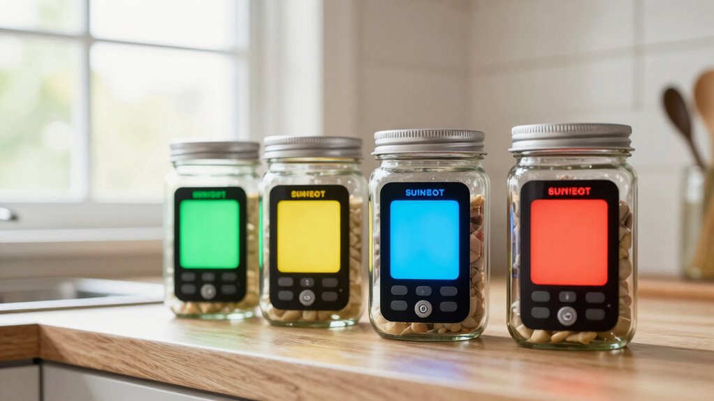
How to Select Readable and Intuitive Displays
When picking a display, it’s important to focus on readability and ease of understanding. An intuitive display minimizes confusion and enhances control. To choose the right one, consider these factors:
Prioritize readability and simplicity for a user-friendly, intuitive display that enhances control and accessibility.
- Clear visuals and large fonts: Opt for displays with high contrast and sizable text for easy reading.
- Smart home integration: Ensure the display connects seamlessly with your smart home devices, providing centralized control.
- Voice command options: Look for displays that support voice commands, offering hands-free operation and immediate feedback.
- User-friendly interface: Prioritize a simple and intuitive design that reduces learning curves and makes operation straightforward for everyone. Additionally, checking for template compatibility can help ensure the display works smoothly with your existing home automation setup. Incorporating visual cues can further enhance understanding, especially for users unfamiliar with complex controls.
These features help you navigate your controls effortlessly, making your home smarter and more accessible. Prioritize simplicity in design to ensure everyone can use the display comfortably and confidently.
Incorporating Accessibility Features Into Your Labels and Controls

To make your controls truly accessible, it’s essential to incorporate features that accommodate all users, including those with visual, hearing, or mobility impairments. Braille signage is a critical addition, allowing users who read Braille to identify controls easily. Tactile markings, such as raised symbols or textured surfaces, provide a tactile way to distinguish buttons, switches, or dials without relying on sight. These features help users with limited vision or dexterity navigate your controls confidently. When designing labels and controls, guarantee tactile elements are clear and placed consistently. Incorporating system monitoring features into your controls can also help identify and troubleshoot accessibility issues quickly. Using appropriate vinyl cutter settings ensures that tactile and Braille labels are durable and precise. Combining Braille signage with tactile markings creates an inclusive environment, making everyday tasks more manageable for everyone. Additionally, considering universal design principles can further enhance the usability of your controls for all individuals. Accessibility features like these promote independence and ensure your controls serve all household members effectively.
Using Color, Contrast, and Fonts to Improve Readability

Choosing the right color combinations makes your labels easier to read and understand quickly. Clear font choices help prevent confusion and guarantee everyone can access the information. When you focus on contrast and simplicity, your controls become more user-friendly.
Effective Color Combinations
Using effective color combinations is essential for making labels and controls easy to read. When selecting colors, focus on color harmony to create visually pleasing contrasts that don’t strain your eyes. Good contrast enhances visual ergonomics, making text stand out against backgrounds. Here are three tips:
- Use high contrast between text and background—dark text on a light background or vice versa.
- Choose colors with sufficient difference in hue and brightness to improve clarity.
- Avoid overly bright or clashing colors that can cause visual fatigue or confusion.
Clear Font Choices
Selecting the right fonts can make a significant difference in how easily labels and controls are understood. To enhance readability, choose clear, simple fonts with enough spacing. Use effective font pairing to combine a primary font for labels with a contrasting secondary font for instructions, creating a clear typography hierarchy. Avoid decorative or overly thin fonts that strain the eyes. High contrast between text and background improves legibility, so opt for dark text on a light background or vice versa. Consistent font styles and sizes help users quickly identify information, reducing confusion. Remember, clarity is key—simple, well-contrasted fonts guarantee everyone can read labels and controls comfortably, making your home safer and more accessible.
Testing Labels and Controls in Your Home Environment
Before finalizing labels and controls, it’s crucial to test them in your home environment to guarantee they’re truly easy to read and operate. This step helps you assess label placement for visibility and ease of access, ensuring controls aren’t hidden or awkwardly positioned. Consider material durability by simulating daily use; labels should withstand cleaning and wear without fading or peeling. To effectively test:
Test labels and controls in your home to ensure readability, accessibility, and durability before final installation.
- Check label placement from different angles and lighting conditions.
- Use controls as you normally would to verify ease of operation.
- Observe if labels remain intact and legible after repeated use or cleaning.
This process ensures your labels and controls are practical and reliable, making daily tasks simpler and more accessible. Proper testing helps you identify issues before final installation, saving time and effort later.
Tips for Maintaining and Updating Labels and Displays Over Time
Maintaining and updating labels and displays is essential to guarantee they remain clear and functional over time. To assure label durability, regularly inspect labels for signs of wear, fading, or peeling, replacing them when necessary. Proper signage maintenance involves cleaning displays gently to remove dust and grime, which can obscure information. Keep labels in a consistent location and avoid repositioning them unnecessarily, which can cause confusion. Use waterproof or laminated materials for labels exposed to moisture or frequent handling, extending their lifespan. When updating labels, simplify or clarify information to improve readability. Regular upkeep prevents confusion or mistakes, especially in critical areas like safety controls or medication labels. Consistent, mindful signage maintenance keeps your home environment safe, accessible, and easy to navigate.
Frequently Asked Questions
How Do I Determine Which Label Size Is Best for My Needs?
You should choose a label size that prioritizes font readability, making certain the text isn’t too small to read easily. Opt for larger labels with clear, bold fonts and high contrast between the text and background. Test different sizes in your home environment to see which one stands out best without overwhelming the space. This way, you’ll guarantee labels are accessible and easy to identify, improving overall usability.
What Materials Are Most Durable for Long-Lasting Labels?
You should opt for label materials like laminated paper, vinyl, or polyester for long-lasting labels. These materials are highly durable and resist moisture, tearing, and fading. Durability factors include resistance to water, UV exposure, and wear over time. Choose a material that matches your environment and usage needs, ensuring your labels stay clear and intact longer. Vinyl and polyester are especially good for high-traffic or outdoor areas.
How Can I Make Controls More Accessible for Elderly Users?
You can make controls more accessible for elderly users by incorporating voice commands and tactile feedback. Voice command allows them to operate devices hands-free, reducing physical strain, while tactile feedback provides physical confirmation of button presses or adjustments. Use large, clearly marked controls with textured surfaces, and guarantee devices are compatible with voice recognition technology. These features create a more intuitive and user-friendly experience, enhancing safety and independence.
What Are Common Mistakes to Avoid When Designing Displays?
Did you know poor display design causes 60% of user errors? When designing displays, avoid common mistakes like neglecting color contrast and font clarity. Using low contrast colors makes labels hard to read, especially for elderly users, while unclear fonts hinder quick understanding. Always guarantee high contrast and simple fonts to enhance readability, reducing confusion and mistakes. Clear, accessible displays improve user experience and safety at home.
How Often Should I Update or Replace My Labels and Controls?
You should update or replace your labels and controls whenever their color contrast dulls or tactile feedback weakens. Regular checks guarantee labels remain clear and controls stay functional, especially for those with visual impairments. If labels fade or controls become less responsive, it’s time for replacements. Keeping these elements in top condition ensures easy readability and operation, maintaining safety and convenience in your home.
Conclusion
Remember, “a stitch in time saves nine.” By choosing clear labels, intuitive controls, and readable displays now, you prevent confusion and frustration later. Regularly test and update your setup to keep everything accessible and easy to use. Your home should work for you, not against you. With a little effort, you’ll create a space where everything’s within reach and easy to understand—making daily life smoother and more comfortable.